
Your landing page’s weakest score is Value props.
How Vizion ranks
56Growth scoreupdated
category scores
category scoresShowHide
Value props
44PoorTitle, subtitle, hero — do they sell the product's true value?
Vizion’s headline vague
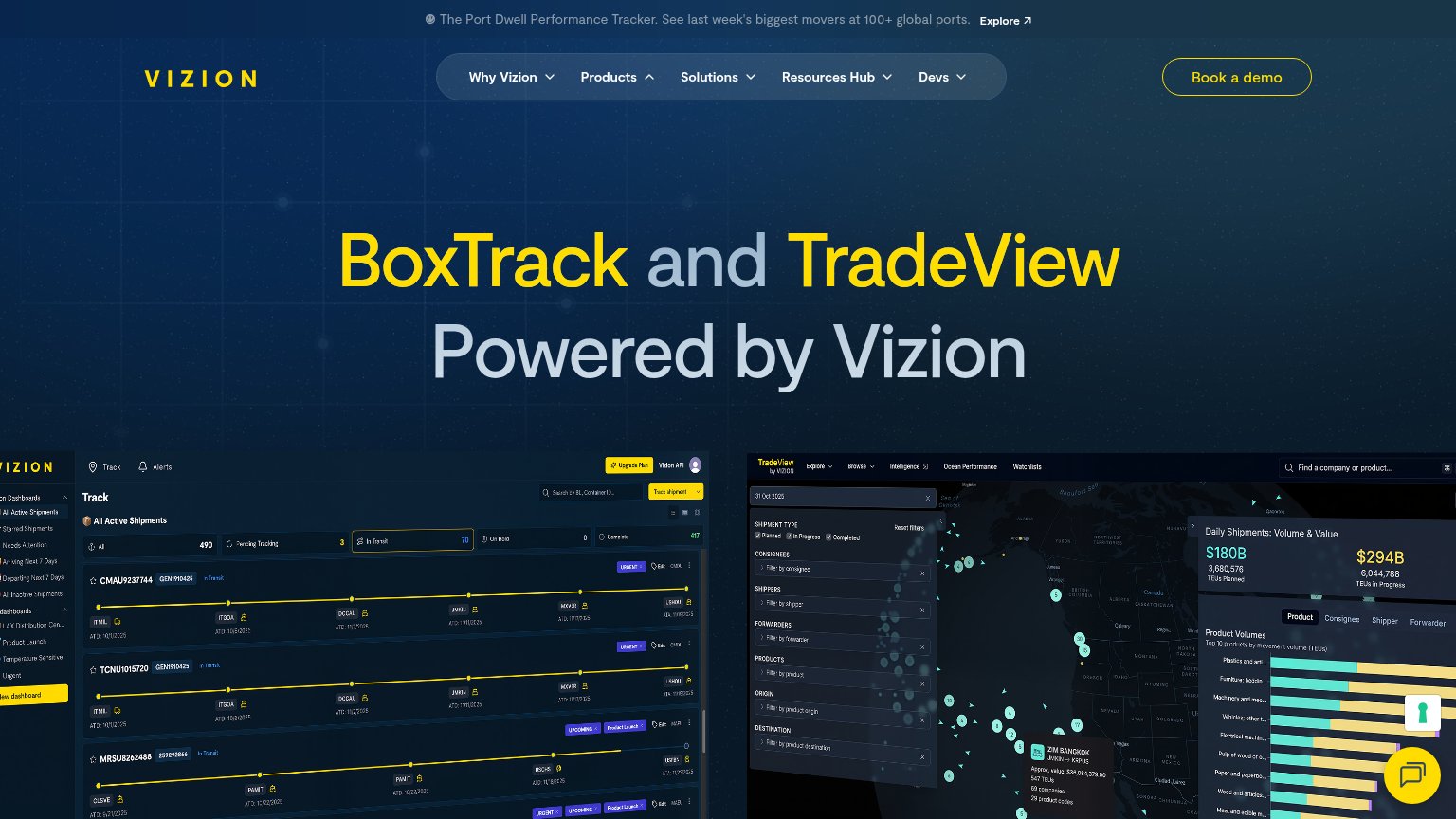
BoxTrack and TradeView Powered by Vizion
Working
- Product screenshots show real dashboards
- Banner cites 100+ global ports
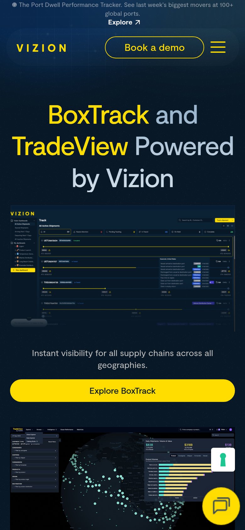
- Mobile copy names supply chain visibility
Could improve
- Headline is just product names
- No desktop subhead states the outcome
- Requires knowing BoxTrack/TradeView already
Information hierarchy
58FairDoes the design help or inhibit what the page is trying to say?
 1234
- Headline names products only — "BoxTrack and TradeView Powered by Vizion" carries no outcome or category, so the fold's largest element wastes its dominance on internal names.
- Announcement banner Explore link — The Port Dwell Tracker banner with its "Explore" link sits at the very top of the scan path and pulls attention away from "Book a demo" before the visitor reads the hero.
- Dual dashboard screenshots — Two dense, same-weight product screenshots crammed side by side at the fold edge compete with each other and render their tiny data unreadable at this scale.
- Five-item dropdown nav — Five dropdown menus (Why Vizion, Products, Solutions, Resources Hub, Devs) each hide multi-link trees, multiplying exit paths before the primary CTA.
CTA
58FairCopy, size, verb, cost-feel — does the primary CTA earn the click?
How Vizion compares
Recommended rewrites
Trust
58FairProof that the product is real, competent, and safe to try.
How Vizion compares
Trust read
Mobile web
64FairThe phone experience as a first-class citizen.
What works
What to improve