
Your landing page’s weakest score is Trust.
How Tive ranks
Trust
42PoorProof that the product is real, competent, and safe to try.
| Trust read | |
|---|---|
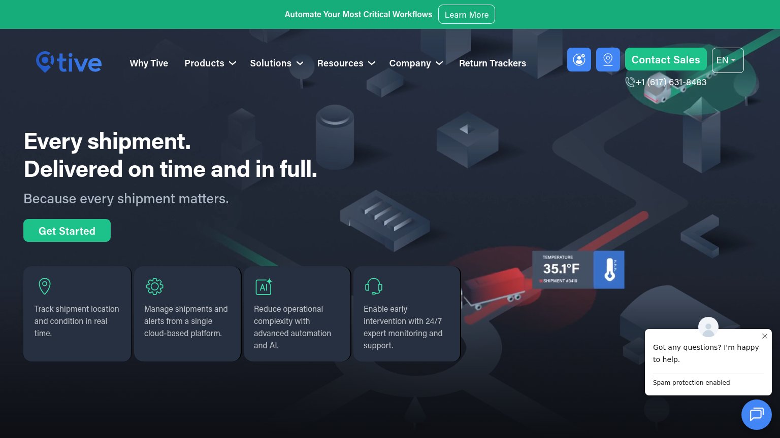
| Tive | Temperature readout overlay "35.1°F — SHIPMENT #3410" hinting at real-time condition monitoring |
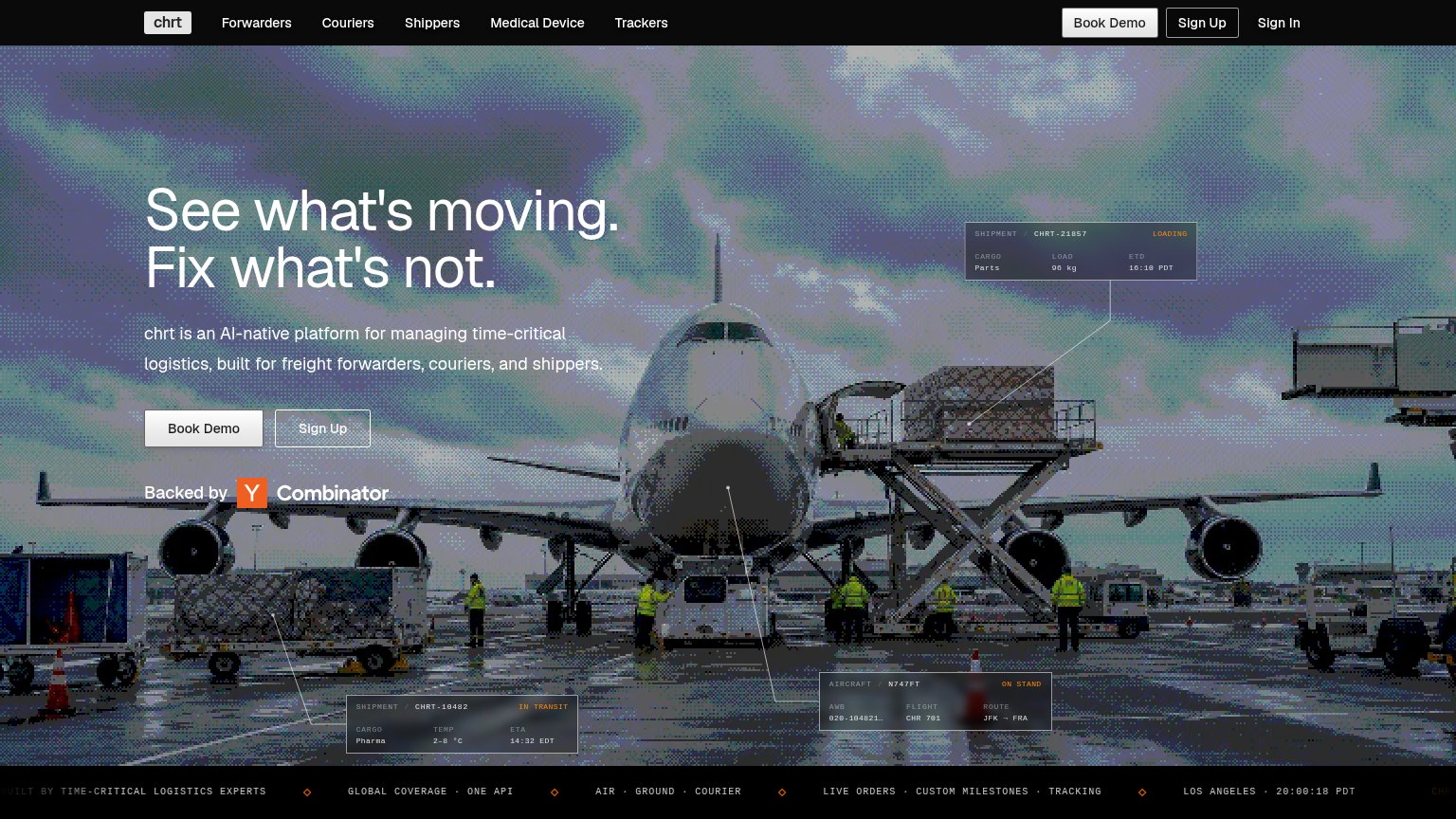
| "Backed by Y Combinator" badge below the hero CTAs | |
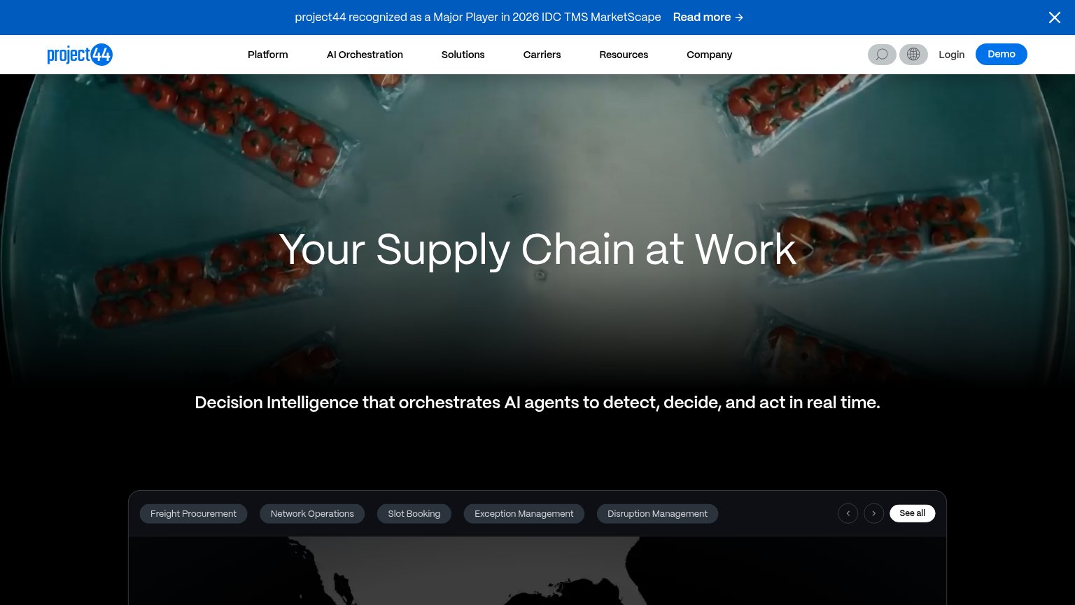
| "project44 recognized as a Major Player in 2026 IDC TMS MarketScape" banner | |
| implicit context FourKites may benefit from pre-existing familiarity among its target audience. | |
| "Customs Clearance — ETA: 18 MAR // 16:15" product-style ETA card in the hero | |
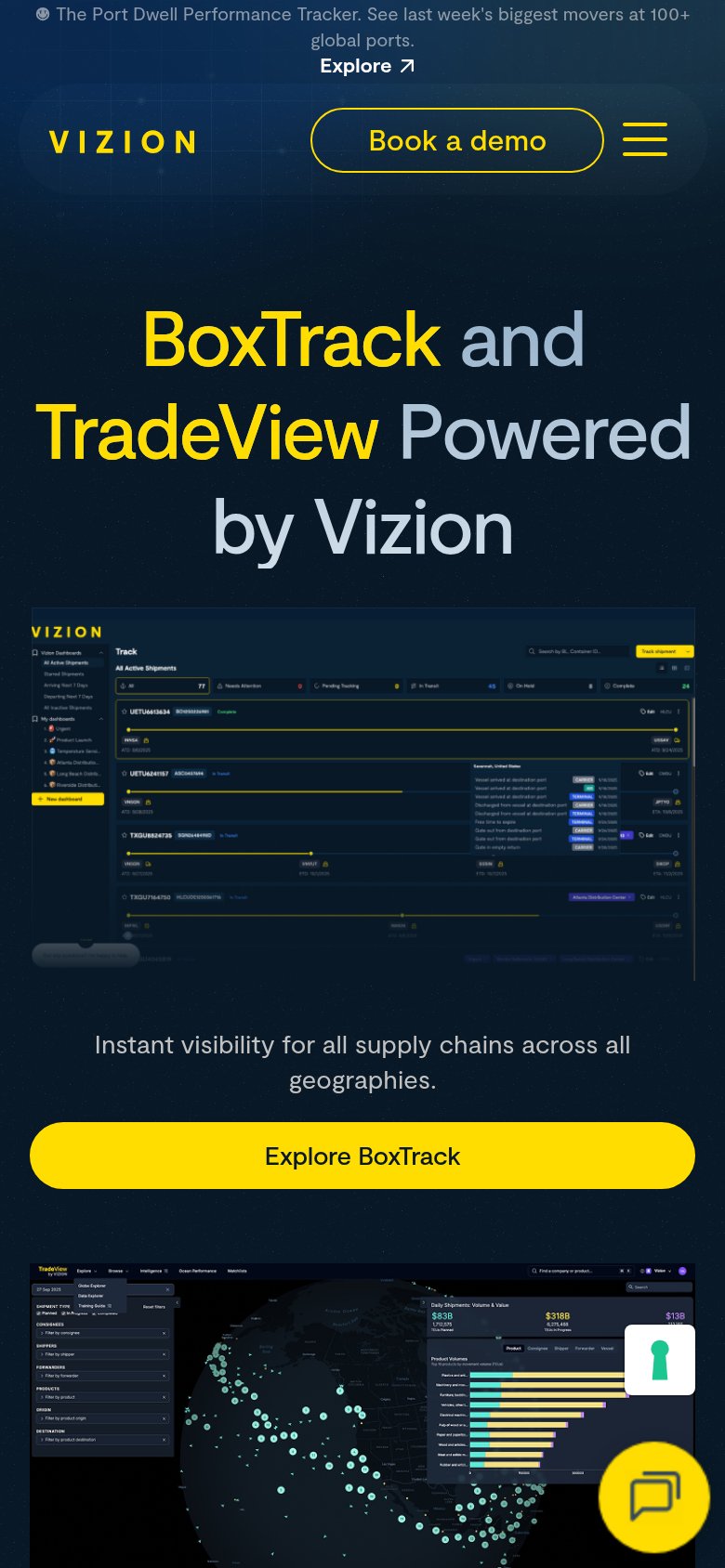
| Detailed BoxTrack product UI showing real shipment tracking rows with container IDs, statuses, and ETAs |
Mobile web
62FairThe phone experience as a first-class citizen.
 123
- Auto-opened chat prompt — Dead blocker covering the feature cards and clipping 'Manage shipments' text mid-sentence.
- Promo banner with button — Two-row banner plus 'Learn More' button consumes the top of the viewport before the header.
- Duplicate contact controls — Phone icon and 'Contact Sales' button crowd the collapsed header with two versions of one action.
Information hierarchy
70FairDoes the design help or inhibit what the page is trying to say?
What works
What to improve
CTA
72FairCopy, size, verb, cost-feel — does the primary CTA earn the click?
How Tive compares
Recommended rewrites
Value props
76FairTitle, subtitle, hero — do they sell the product's true value?
Tive’s headline
Every shipment. Delivered on time and in full.
Because every shipment matters.
Working
Could improve