
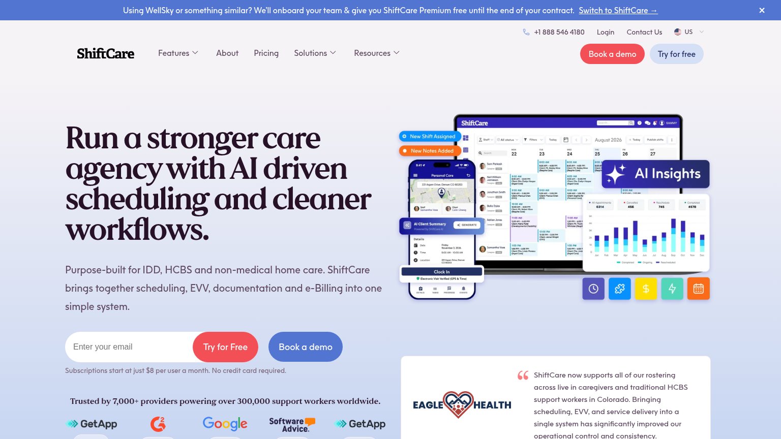
Your landing page’s weakest score is Information hierarchy.
How ShiftCare ranks
79Growth scoreupdated
category scores
category scoresShowHide
Information hierarchy
66FairDoes the design help or inhibit what the page is trying to say?
 1234
- Dual hero CTAs — 'Try for Free' and 'Book a demo' sit side by side at equal size and weight, forcing a choice instead of one action.
- WellSky switcher banner — The underlined 'Switch to ShiftCare →' link is the first clickable element on the page, pulling attention before the value prop lands.
- Header utility cluster — Phone number, Login, Contact Us, and locale picker stack four exits above the nav before the visitor reads a word of the pitch.
- Header CTA pair — 'Book a demo' and 'Try for free' duplicate the hero buttons, doubling the competing conversion paths in one viewport.
Mobile web
76FairThe phone experience as a first-class citizen.
 123
- WellSky promo banner — Wraps to five lines and eats ~10% of the first viewport before the logo appears — desktop copy never resized for the phone.
- Book a demo button — A second, equally weighted CTA directly under the email form splits the tap decision away from "Try for Free".
- Email + Try for Free — The button is a pill fused to a narrow email field rather than a full-bleed thumb target, and it demands typing before tapping.
Trust
83StrongProof that the product is real, competent, and safe to try.
How ShiftCare compares
Trust read
CTA
84StrongCopy, size, verb, cost-feel — does the primary CTA earn the click?
How ShiftCare compares
Recommended rewrites
Value props
84StrongTitle, subtitle, hero — do they sell the product's true value?
ShiftCare’s headline
Run a stronger care agency with AI driven scheduling and cleaner workflows.
Purpose-built for IDD, HCBS and non-medical home care. ShiftCare brings together scheduling, EVV, documentation and e-Billing into one simple system.
Working
Could improve