
Your landing page’s weakest score is Trust.
How Brevity ranks
Trust
36PoorProof that the product is real, competent, and safe to try.


| Trust read | |
|---|---|
| Brevity | Top-bar contact details: "Sales: 1300 58 58 87" and "Level 45, World Square, Sydney NSW 2000" |
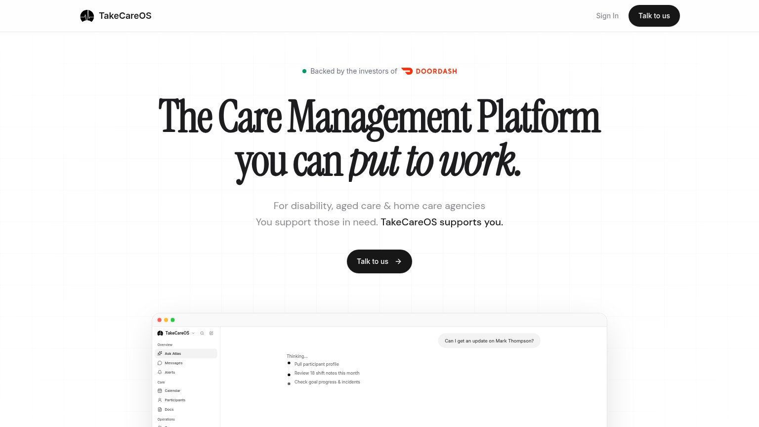
| Product UI demo showing "Ask Atlas" answering "Can I get an update on Mark Thompson?" with shift and goal details | |
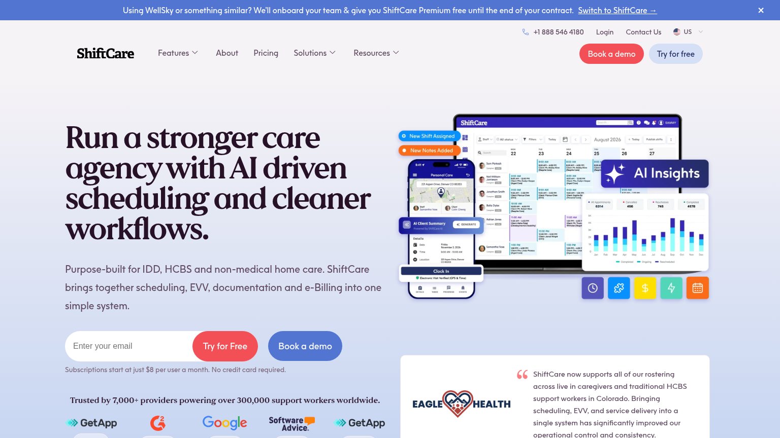
| Trusted by 7,000+ providers powering over 300,000 support workers worldwide. | |
| "$4 billion+ in annual claim amounts processed" stat row with 200+, 500K+, 80K+ usage numbers | |
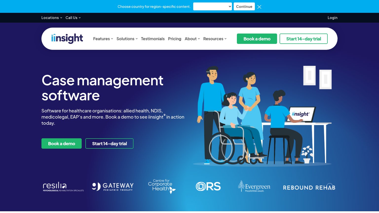
| Customer logo strip: Resilia, Gateway Pediatric Therapy, Centre for Corporate Health, ORS, Evergreen, Rebound Rehab | |
| No visible trust signal identified. |
Mobile web
48PoorThe phone experience as a first-class citizen.
 123
- Hero laptop illustration — Decorative graphic fills most of the first viewport, pushing the headline and Start Now CTA below the fold.
- Oversized headline — Desktop-scale type wraps into seven lines and still is not fully visible; no CTA follows within the viewport.
- Uppercase eyebrow text — Long all-caps kicker wraps to two lines and delays the actual value statement further down the page.
Value props
56FairTitle, subtitle, hero — do they sell the product's true value?
Brevity’s headline
Seamless NDIS Software & End-to-End Cloud Technology – Made for Community Care Organisations.
The only software you need to run your organisation
Working
Could improve
Information hierarchy
63FairDoes the design help or inhibit what the page is trying to say?
What works
What to improve
CTA
63FairCopy, size, verb, cost-feel — does the primary CTA earn the click?
How Brevity compares
Recommended rewrites