
Your landing page’s weakest score is CTA.
How Lumary ranks
CTA
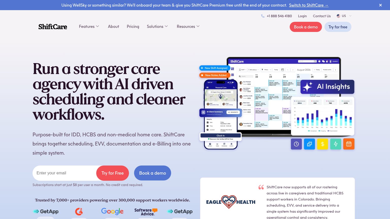
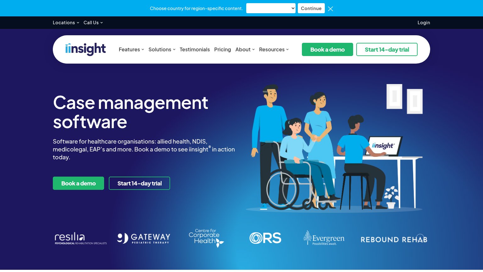
62FairCopy, size, verb, cost-feel — does the primary CTA earn the click?


Problems
- 'Request' feels costly, sales-gated
- no CTA in the hero itself
- small nav-sized button on desktop
- no low-commitment alternative
Mobile web
62FairThe phone experience as a first-class citizen.
 1234
- Seven-line subheadline paragraph — Desktop-length copy wraps into seven cramped lines, burying the value statement in a wall of text.
- Stats grid in fold — Four stat blocks crowd the first viewport, competing with the headline instead of supporting one message.
- Header demo button — Primary CTA sits desktop-proportioned in the header instead of a full-bleed thumb-friendly button.
- Scroll chevron button — Oversized scroll indicator overlaps the $4 billion stat text, obscuring content.
Information hierarchy
64FairDoes the design help or inhibit what the page is trying to say?
What works
What to improve
Value props
64FairTitle, subtitle, hero — do they sell the product's true value?
Lumary’s headline
ABA Practice Management Software
Lumary is built on and invested in by Salesforce. With proven success in enterprise size organizations, our ABA practice management software optimizes operations to drive better outcomes and increase revenue.
Working
Could improve
Trust
78FairProof that the product is real, competent, and safe to try.
How Lumary compares
Trust read