
Your landing page’s weakest score is Information hierarchy.
How Parrot ranks
74Growth scoreupdated
category scores
category scoresShowHide
Information hierarchy
68FairDoes the design help or inhibit what the page is trying to say?
 123
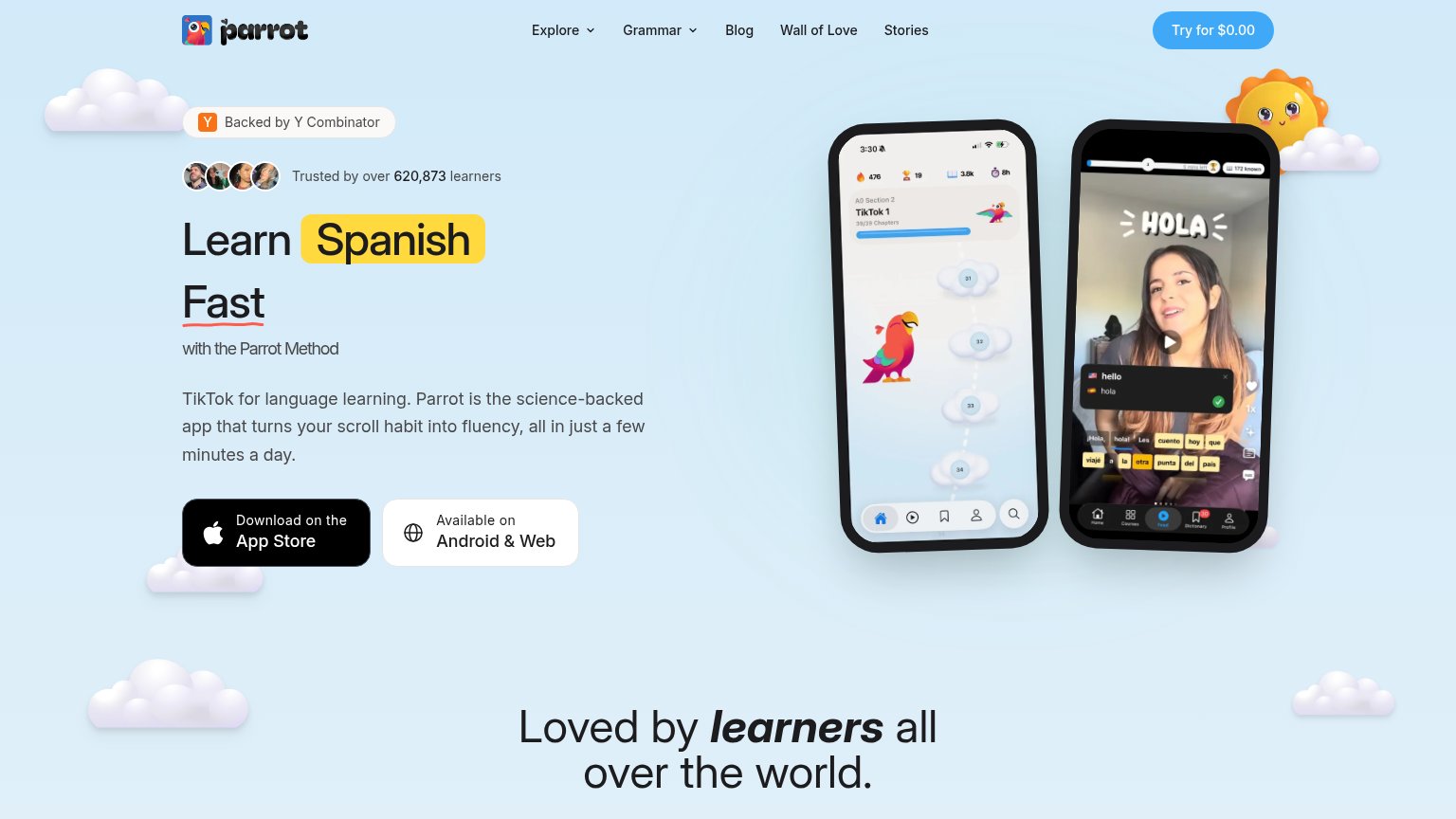
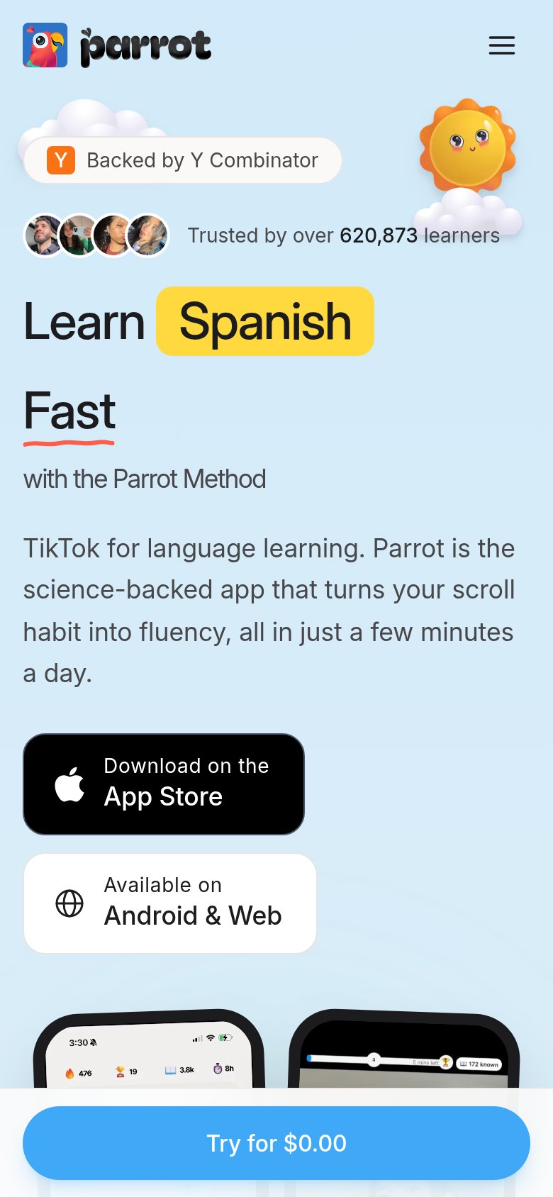
- Two equal download buttons — "Download on the App Store" and "Available on Android & Web" sit side by side at equal size, splitting the click and neither matching the nav's "Try for $0.00" action.
- Nav link row — Five exits (Explore, Grammar, Blog, Wall of Love, Stories) plus two dropdowns sit at the same eye level as the hero, leaking attention before the pitch lands.
- Try for $0.00 button — The strongest-styled CTA is tucked in the top-right corner, outside the hero scan path and disconnected from the download buttons below the headline.
CTA
68FairCopy, size, verb, cost-feel — does the primary CTA earn the click?
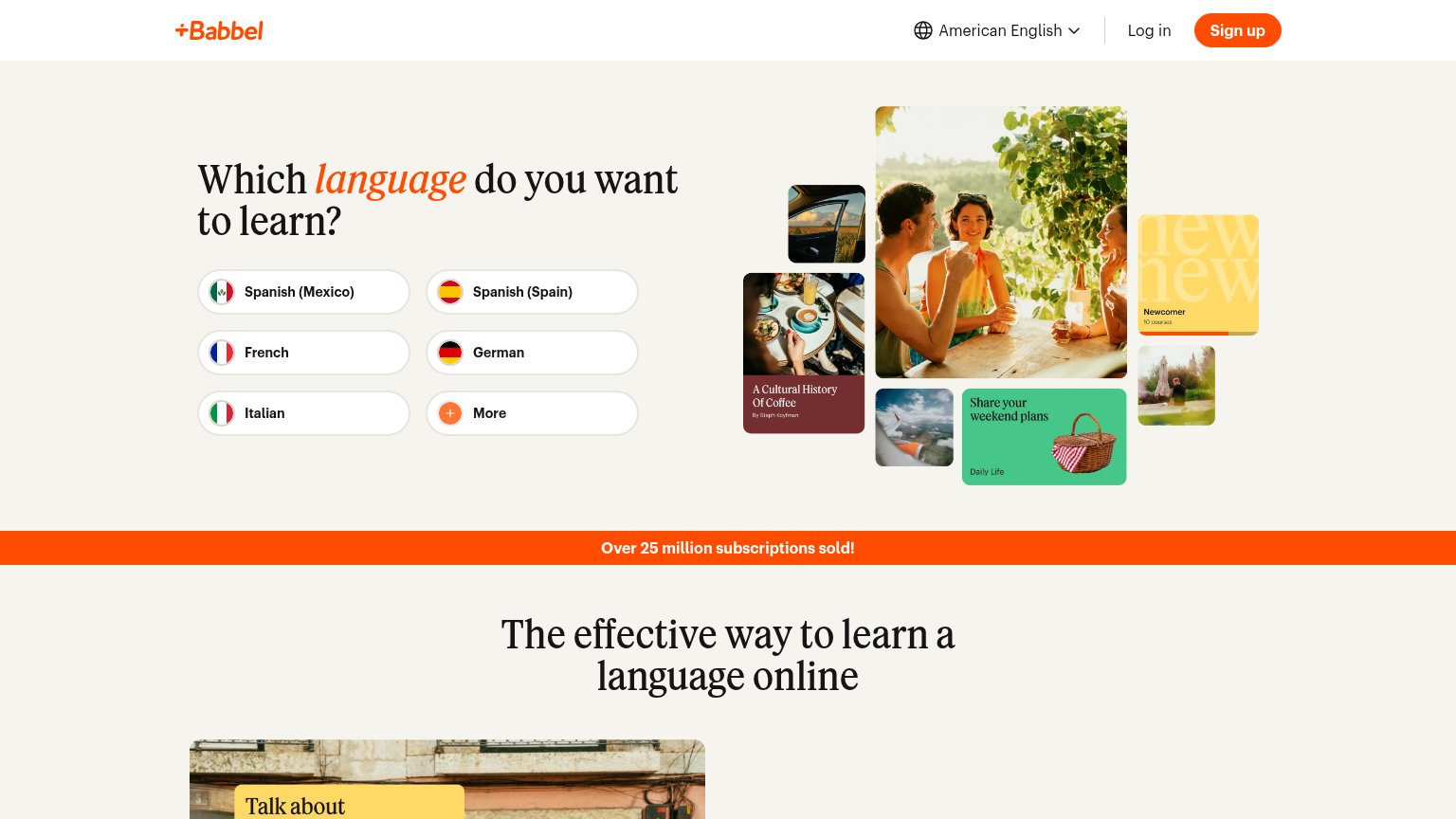
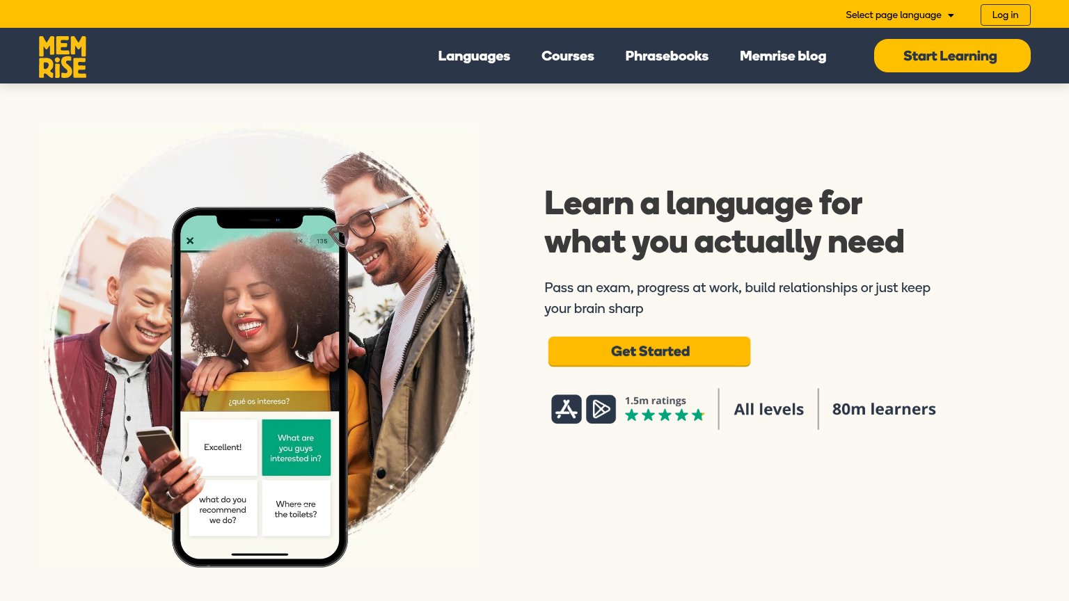
Problems
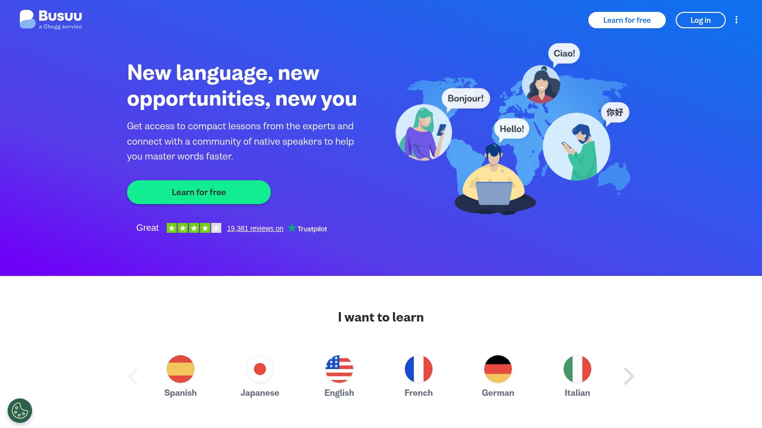
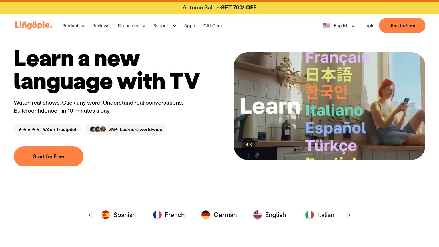
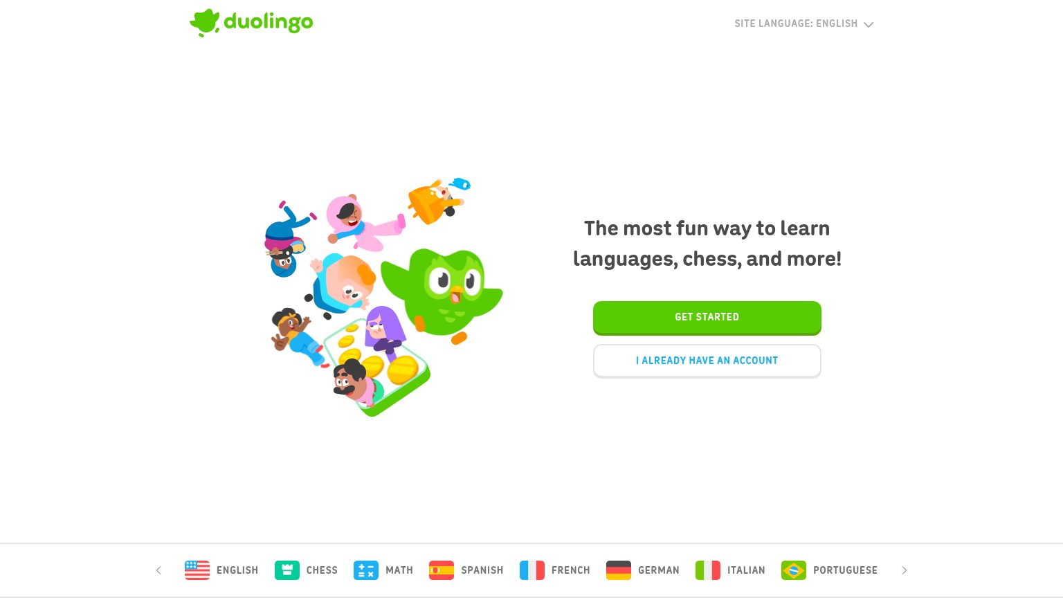
- '$0.00' reads as a price, not free
- hero buttons are store badges, not CTA
- desktop CTA is a small nav button
- competes with two download buttons
Mobile web
72FairThe phone experience as a first-class citizen.
What works
What to improve
Trust
76FairProof that the product is real, competent, and safe to try.
How Parrot compares
Trust read
Value props
84StrongTitle, subtitle, hero — do they sell the product's true value?
Parrot’s headline
Learn Spanish Fast
with the Parrot Method
Working
Could improve