
Your landing page’s weakest score is CTA.
How Memrise ranks
79Growth scoreupdated
category scores
category scoresShowHide
CTA
72FairCopy, size, verb, cost-feel — does the primary CTA earn the click?
Problems
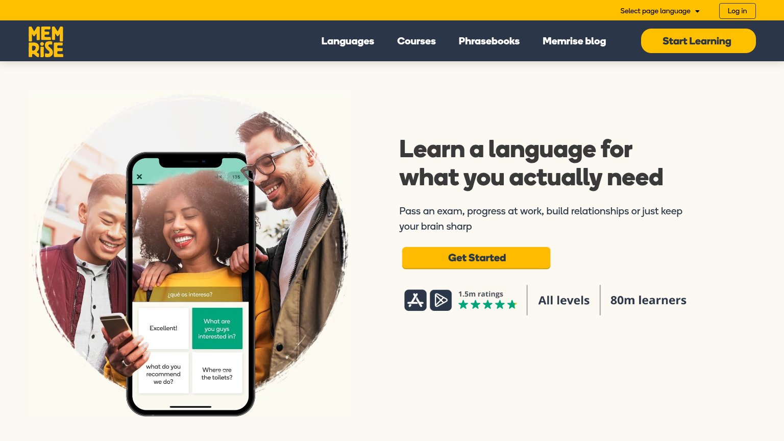
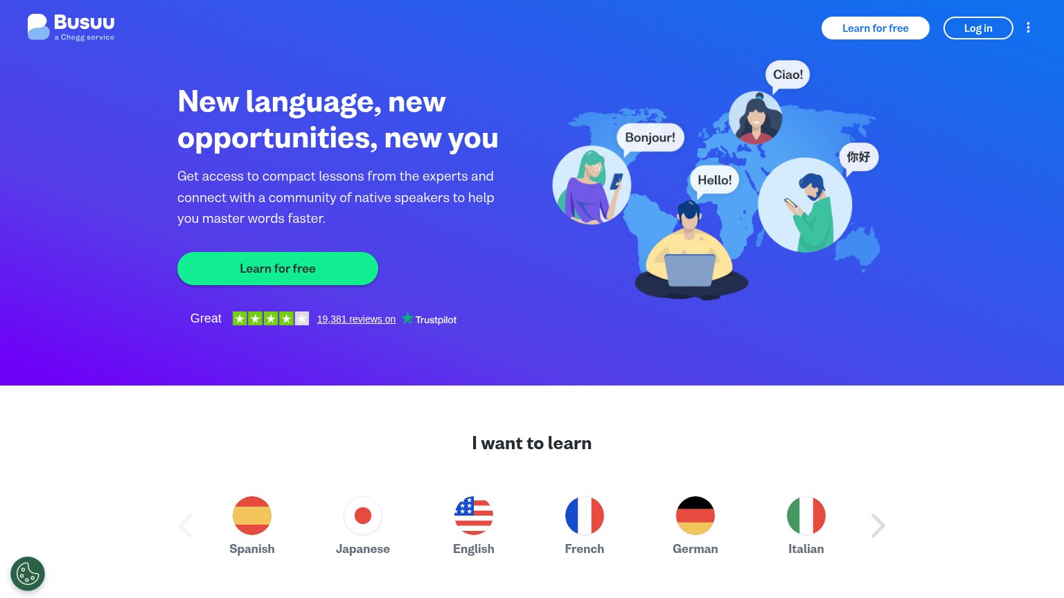
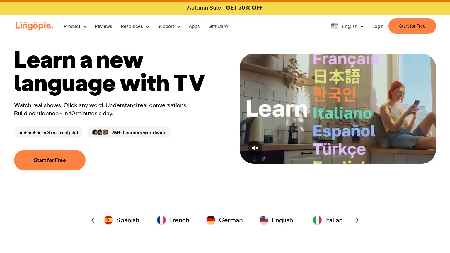
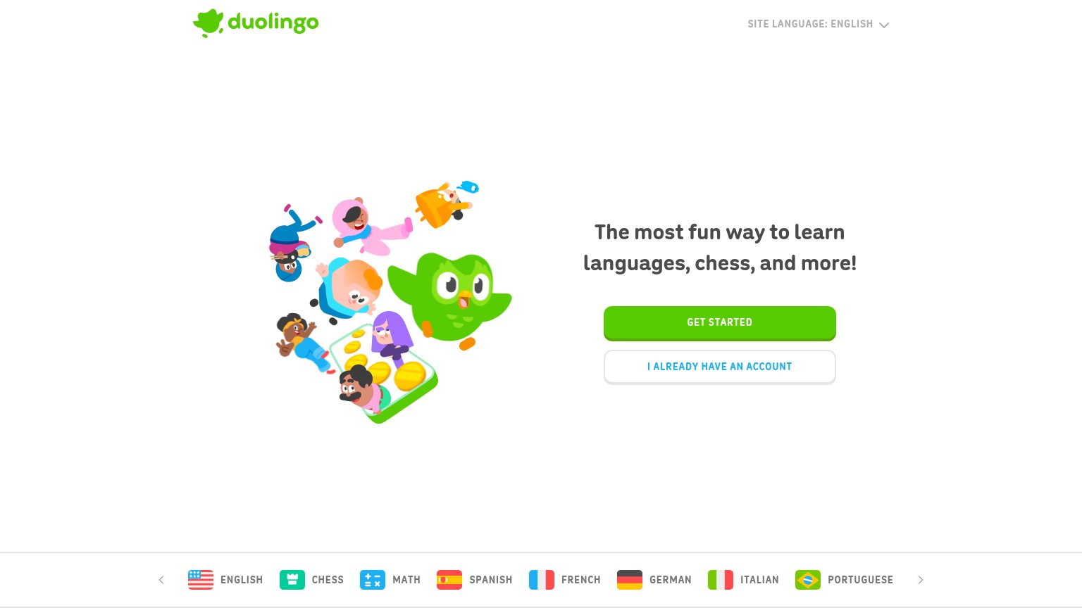
- no 'free' despite free tier
- nav says 'Start Learning' instead
- casing differs: 'Get Started'/'Get started'
- generic — no echo of learning promise
Information hierarchy
78FairDoes the design help or inhibit what the page is trying to say?
123- Start Learning nav button — Same yellow weight as the hero's Get Started but a different label — two competing primaries split the action.
- Nav links row — Languages, Courses, Phrasebooks, and Memrise blog give four equal-weight exits before the visitor reaches the value prop.
- Top utility bar — Log in and the language selector add two more leak points stacked above the nav, tripling the header's exit surface.
Trust
78FairProof that the product is real, competent, and safe to try.
How Memrise compares
Trust read
Mobile web
83StrongThe phone experience as a first-class citizen.

What works
What to improve
Value props
84StrongTitle, subtitle, hero — do they sell the product's true value?
Memrise’s headline
Learn a language for what you actually need
Pass an exam, progress at work, build relationships or just keep your brain sharp
Working
Could improve