
Your landing page’s weakest score is Information hierarchy.
How Lingopie ranks
- 1.
Lingopie82
- 2.
Doomersion68
- 3.
FluentU67
- 4.
Language Reactor60
82Growth scoreupdated
category scores
category scoresShowHide
Information hierarchy
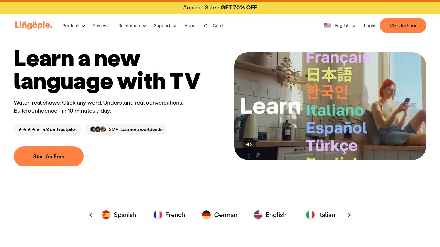
72FairDoes the design help or inhibit what the page is trying to say?
 1234
- Six-item nav row — Product, Reviews, Resources, Support, Apps, and Gift Card give attention six exits before the hero CTA.
- Header Start for Free — Styled identically to the hero CTA, splitting the primary action's visual weight across two buttons.
- Language carousel arrows — Interactive carousel controls in the fold invite browsing flags instead of clicking Start for Free.
- Autumn Sale banner — GET 70% OFF is the topmost message but links to nothing visible tying it to the CTA path.
Trust
78FairProof that the product is real, competent, and safe to try.
| Trust read | |
|---|---|
| Lingopie | "★★★★★ 4.8 on Trustpilot" badge next to "2M+ Learners worldwide" with learner avatars |
| No visible trust signal identified. | |
| "Rated 4.8 out of 5" star rating beneath the free-trial CTA | |
| "2,000,000+ users" beneath the Install Chrome extension button |
CTA
86StrongCopy, size, verb, cost-feel — does the primary CTA earn the click?
How Lingopie compares
Recommended rewrites
Value props
86StrongTitle, subtitle, hero — do they sell the product's true value?
Lingopie’s headline
Learn a new language with TV
Watch real shows. Click any word. Understand real conversations. Build confidence - in 10 minutes a day.
Working
Could improve
Mobile web
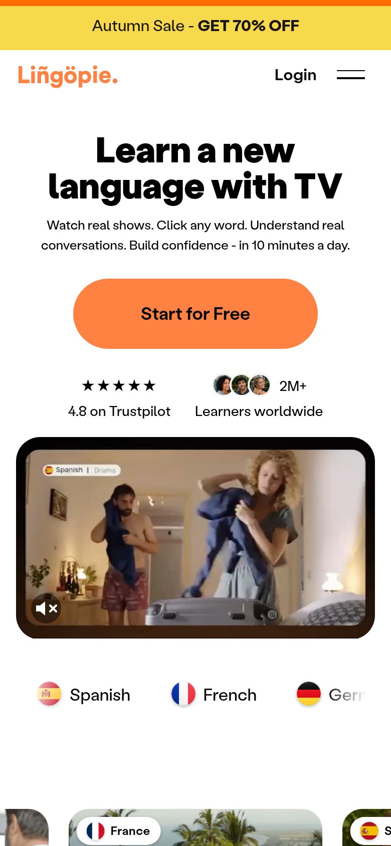
86StrongThe phone experience as a first-class citizen.
What works
What to improve