
Your landing page’s weakest score is Value props.
How NEXT Insurance ranks
71Growth scoreupdated
category scores
category scoresShowHide
Value props
62FairTitle, subtitle, hero — do they sell the product's true value?
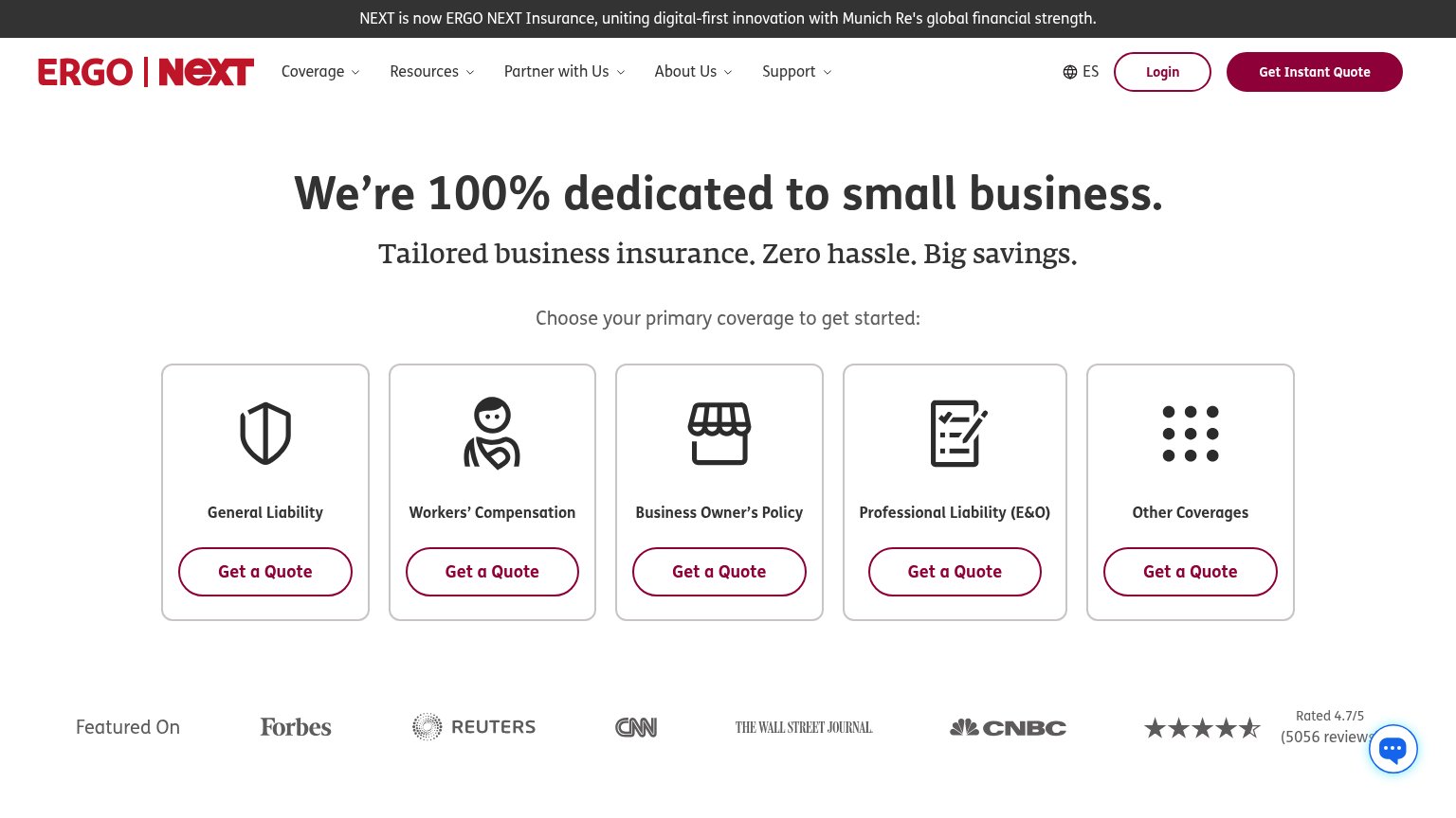
NEXT Insurance’s headline undersells
We’re 100% dedicated to small business.
Tailored business insurance. Zero hassle. Big savings.
Working
- Audience named instantly: small business
- "Zero hassle. Big savings." hits pain points
- 4.7/5 rating and press logos add proof
Could improve
- Headline states focus, not customer outcome
- No numbers on speed, price, or coverage
- "Instant quote" edge buried in nav button
Trust
68FairProof that the product is real, competent, and safe to try.

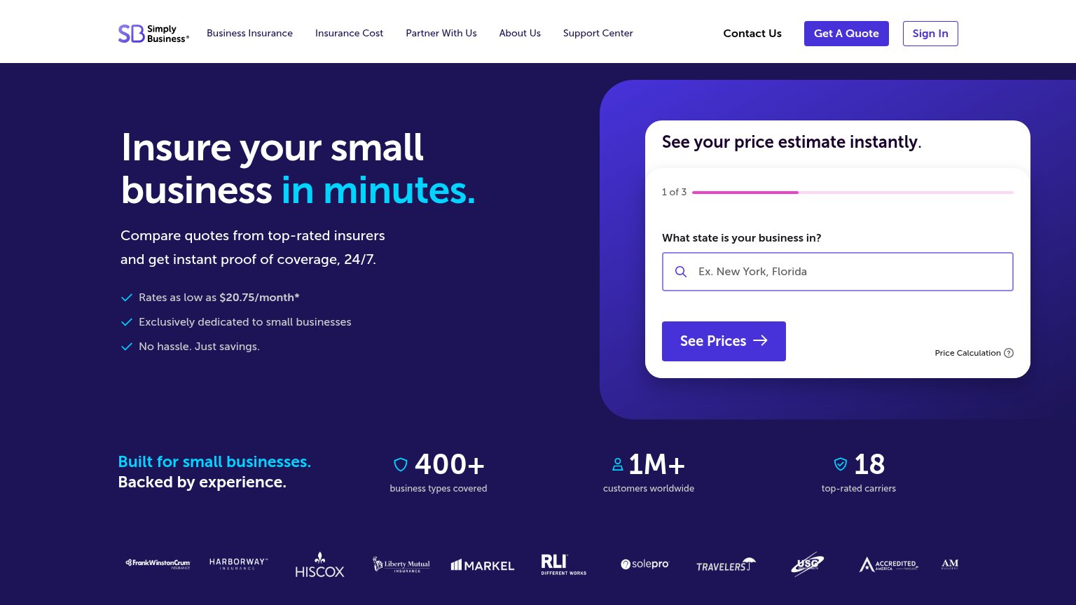
| Trust read | |
|---|---|
| NEXT Insurance | Rated 4.7/5 (5056 reviews) |
| "Backed by Y Combinator" badge above the hero headline | |
| "TRUSTED BY LEADING RETAIL BROKERAGES" logo strip (NFP, IMA, Howden, HUB, Gallagher) | |
| "Coverages" dashboard UI with Active / Expired / Expiring Soon / Waived status pills and an insurance tracking table | |
| "An Aon Company" branding on the CoverWallet and NFP logos, with the Aon logo centered in the header | |
| "1M+ customers worldwide" stat alongside "18 top-rated carriers" and a carrier logo wall (Hiscox, Liberty Mutual, Markel |
Mobile web
68FairThe phone experience as a first-class citizen.
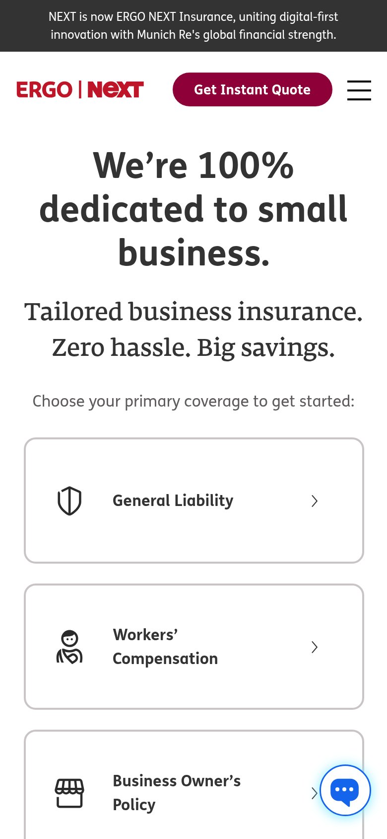
What works
What to improve
Information hierarchy
78FairDoes the design help or inhibit what the page is trying to say?
What works
What to improve
CTA
78FairCopy, size, verb, cost-feel — does the primary CTA earn the click?
How NEXT Insurance compares
Recommended rewrites