
Your landing page’s weakest score is CTA.
How METR ranks
73Growth scoreupdated
category scores
category scoresShowHide
CTA
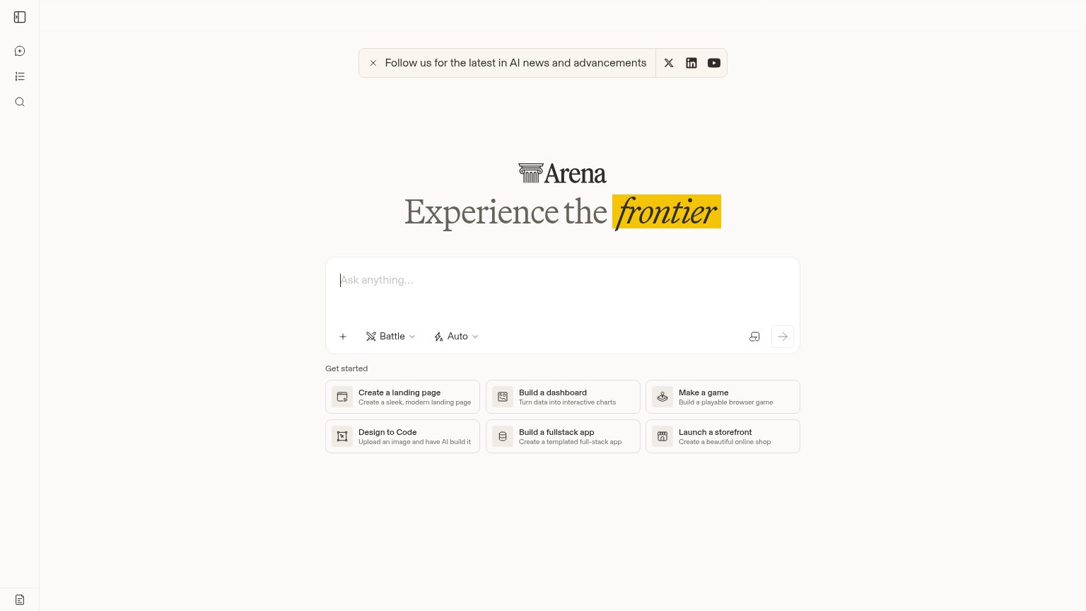
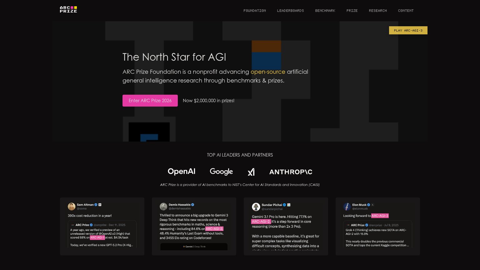
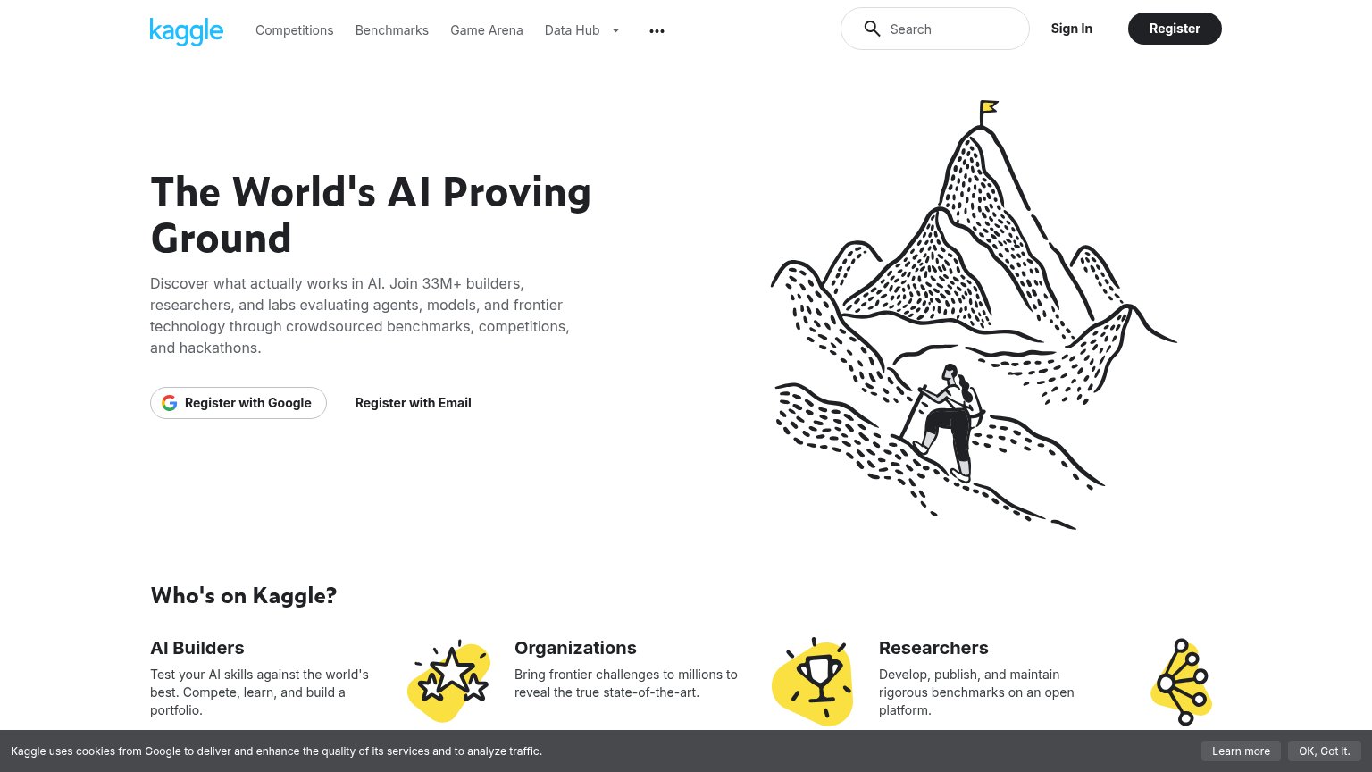
64FairCopy, size, verb, cost-feel — does the primary CTA earn the click?


Problems
- No action verb — reads as a label
- Weaker than card CTAs ("Read Report")
- Inconsistent casing: Report vs report
Information hierarchy
72FairDoes the design help or inhibit what the page is trying to say?
123- Read Report cards — Two saturated dark-green report panels carry more visual weight than the headline and 'Our research' CTA, splitting the fold's focus.
- Read Report link — Same-weight 'Read Report' exits on both cards compete directly with the primary 'Our research' button; the duplicate below repeats the leak.
- Truncated chart section — A cut-off chart with 'Measurements above 16 hrs are unreliable' creeps into the fold as a stray, context-free fragment.
Value props
72FairTitle, subtitle, hero — do they sell the product's true value?
METR’s headline
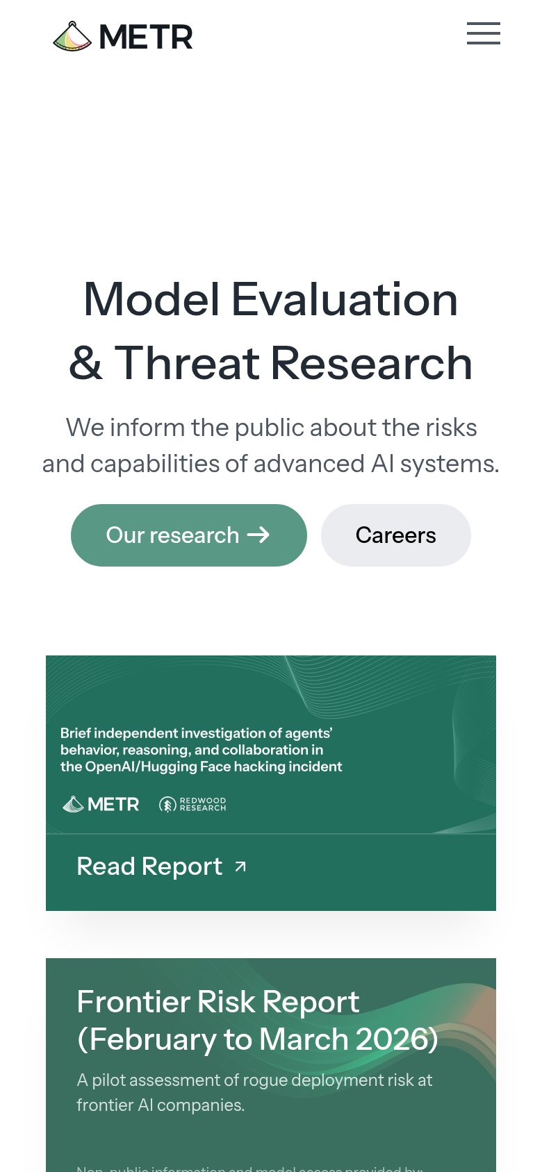
Model Evaluation & Threat Research
We inform the public about the risks and capabilities of advanced AI systems.
Working
Could improve
Trust
76FairProof that the product is real, competent, and safe to try.
How METR compares
Trust read
Mobile web
82StrongThe phone experience as a first-class citizen.
What works
What to improve