
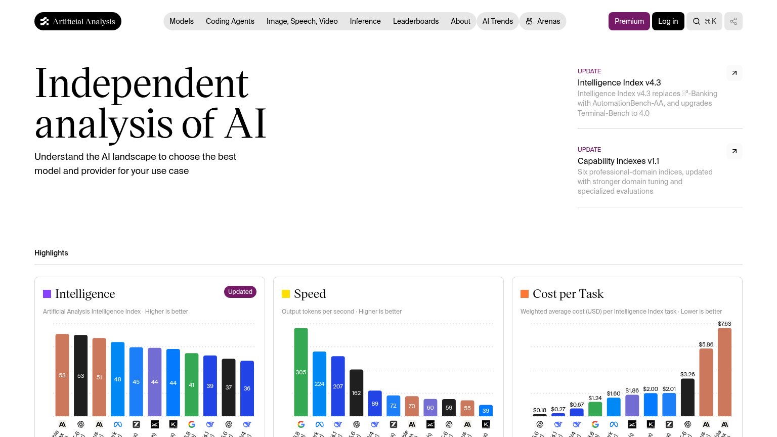
Your landing page’s weakest score is CTA.
How Artificial Analysis ranks
65Growth scoreupdated
category scores
category scoresShowHide
CTA
48PoorCopy, size, verb, cost-feel — does the primary CTA earn the click?


Problems
- no hero CTA at all
- no action verb — reads as a label
- 'Premium' signals cost, not value
- nav-pill size, easy to miss
Information hierarchy
62FairDoes the design help or inhibit what the page is trying to say?
123- Top navigation row — Eight nav items plus search, share, and two account buttons — a dozen exits compete before any primary action is offered.
- Update cards column — Two same-weight 'UPDATE' cards with external-link icons pull attention off the headline and lead away from the page's core content.
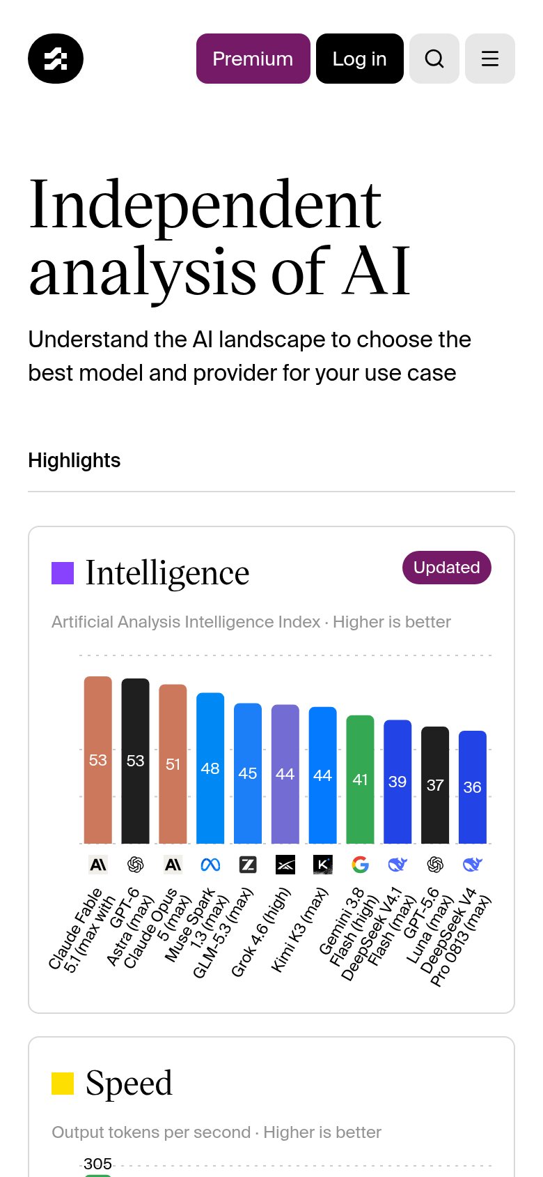
- Chart axis labels — Rotated, truncated model names under all three charts are illegible at fold size, weakening the data-first value pitch.
Mobile web
68FairThe phone experience as a first-class citizen.
What works
What to improve
Trust
72FairProof that the product is real, competent, and safe to try.
How Artificial Analysis compares
Trust read
Value props
76FairTitle, subtitle, hero — do they sell the product's true value?
Artificial Analysis’s headline
Independent analysis of AI
Understand the AI landscape to choose the best model and provider for your use case
Working
Could improve