
Your landing page’s weakest score is CTA.
How ARC Prize Foundation ranks
76Growth scoreupdated
category scores
category scoresShowHide
CTA
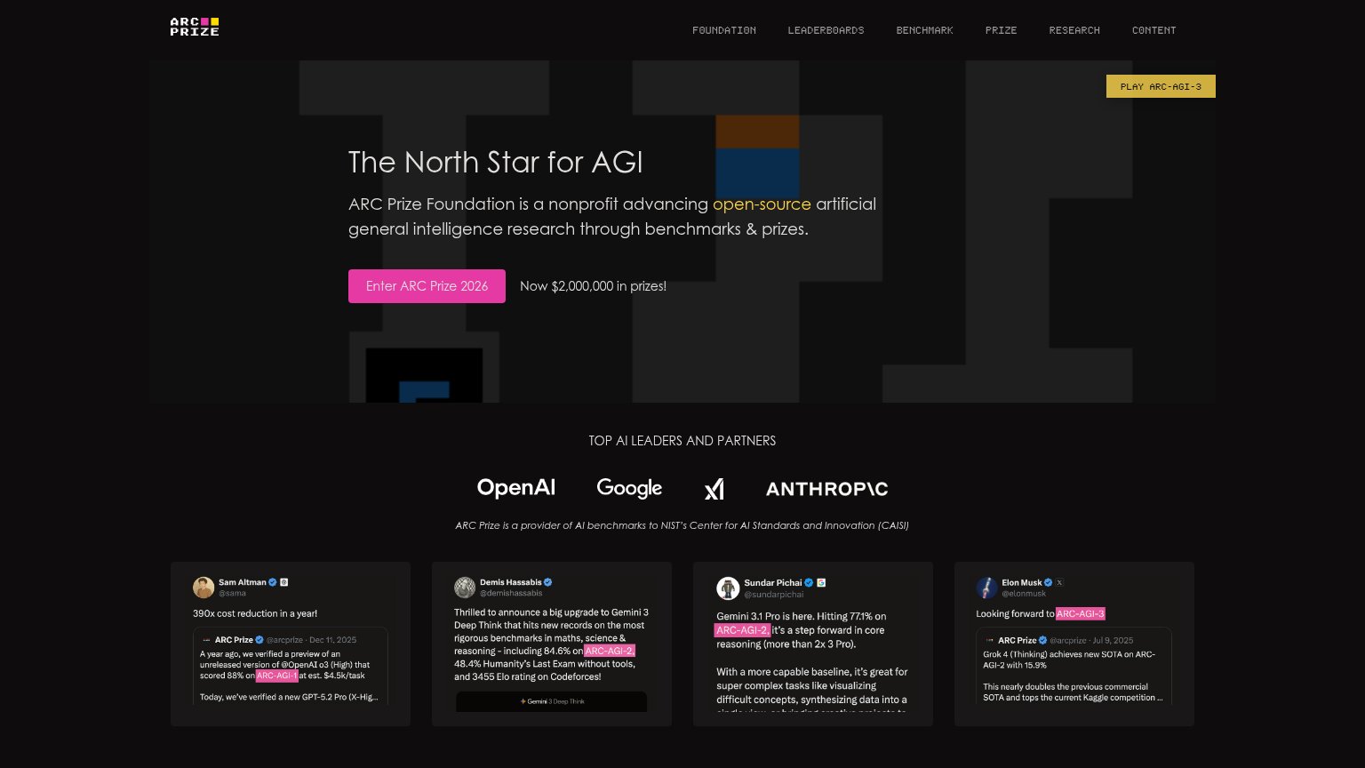
68FairCopy, size, verb, cost-feel — does the primary CTA earn the click?
Problems
- 4 words, over the 3-word ideal
- 'Enter' a contest feels committal
- yellow PLAY chip competes for the click
- no zero-cost cue on the button
Information hierarchy
72FairDoes the design help or inhibit what the page is trying to say?
123- Play ARC-AGI-3 button — Yellow high-contrast button in the top-right corner competes with the pink primary CTA and pulls attention off-scan-path.
- Six-item nav row — Six equal-weight uppercase links (Foundation through Content) offer exits before the visitor reaches the hero promise.
- Faded hero grid graphic — The ARC puzzle-grid motif is dimmed to near-invisibility, so the brand's most distinctive visual reads as random dark blocks.
Value props
78FairTitle, subtitle, hero — do they sell the product's true value?
ARC Prize Foundation’s headline
The North Star for AGI
ARC Prize Foundation is a nonprofit advancing open-source artificial general intelligence research through benchmarks & prizes.
Working
Could improve
Mobile web
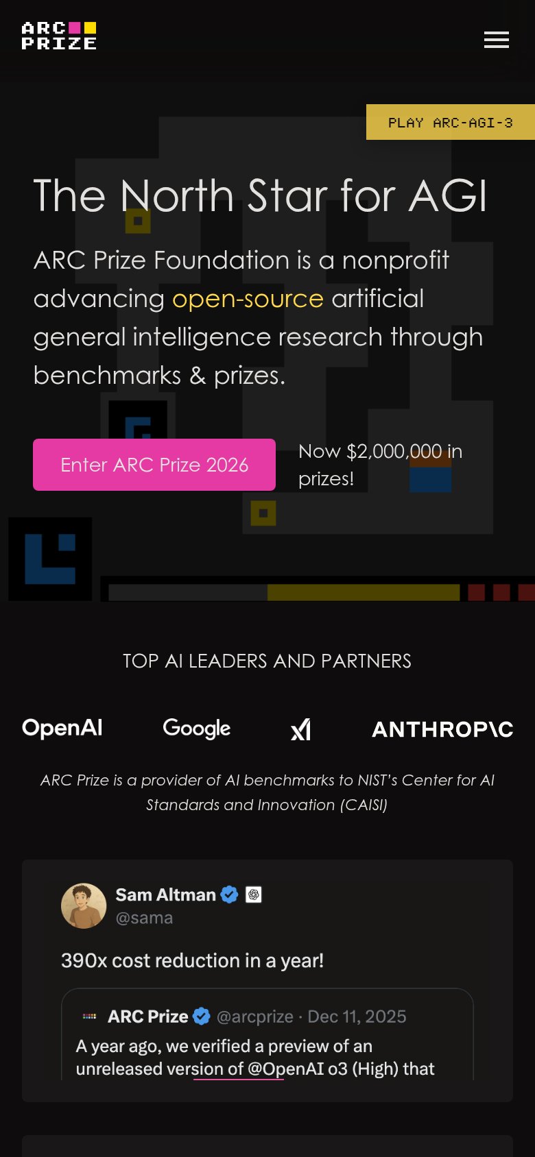
78FairThe phone experience as a first-class citizen.
What works
What to improve
Trust
86StrongProof that the product is real, competent, and safe to try.
How ARC Prize Foundation compares
Trust read