
Your landing page’s weakest score is Mobile web.
How IronLedger.ai ranks
Mobile web
54FairThe phone experience as a first-class citizen.
 12
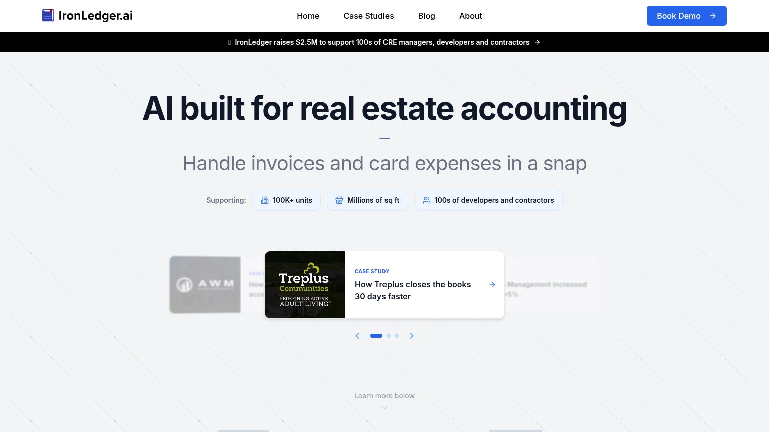
- Announcement banner — The funding banner wraps to two lines and, combined with the header, eats roughly 15% of the first viewport before the hero starts.
- Stacked supporting chips — Three proof chips stack vertically and push the case-study carousel and any CTA further down the fold.
CTA
62FairCopy, size, verb, cost-feel — does the primary CTA earn the click?
Problems
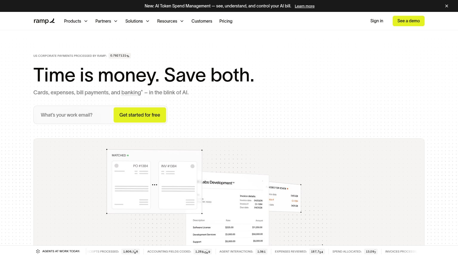
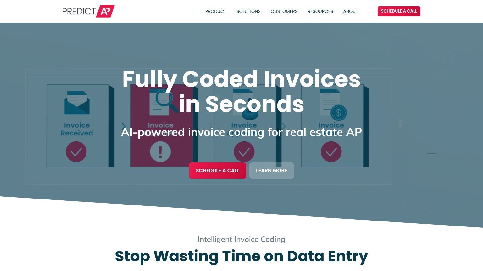
- no CTA in hero on either viewport
- hidden behind hamburger on mobile
- demo booking feels costly
- nav-sized, small vs hero elements
Information hierarchy
66FairDoes the design help or inhibit what the page is trying to say?
What works
What to improve
Value props
72FairTitle, subtitle, hero — do they sell the product's true value?
IronLedger.ai’s headline
AI built for real estate accounting
Handle invoices and card expenses in a snap
Working
Could improve
Trust
72FairProof that the product is real, competent, and safe to try.
How IronLedger.ai compares
Trust read