
Your landing page’s weakest score is Trust.
How Ramp ranks
82Growth scoreupdated
category scores
category scoresShowHide
Trust
70FairProof that the product is real, competent, and safe to try.
| Trust read | |
|---|---|
| Ramp | "US CORPORATE PAYMENTS PROCESSED BY RAMP: 0.7927%" stat above the headline |
| "Protected by reCAPTCHA" line with Privacy and Terms links beneath the signup form | |
| "Banking services provided through Choice Financial Group and Column N.A., Members FDIC." disclosure banner | |
| implicit context Brex may benefit from pre-existing familiarity among its target audience. | |
| No visible trust signal identified. | |
| "Relay is a financial technology company and is not an FDIC-insured bank. Banking services provided by Thread Bank, Memb |
Information hierarchy
80StrongDoes the design help or inhibit what the page is trying to say?
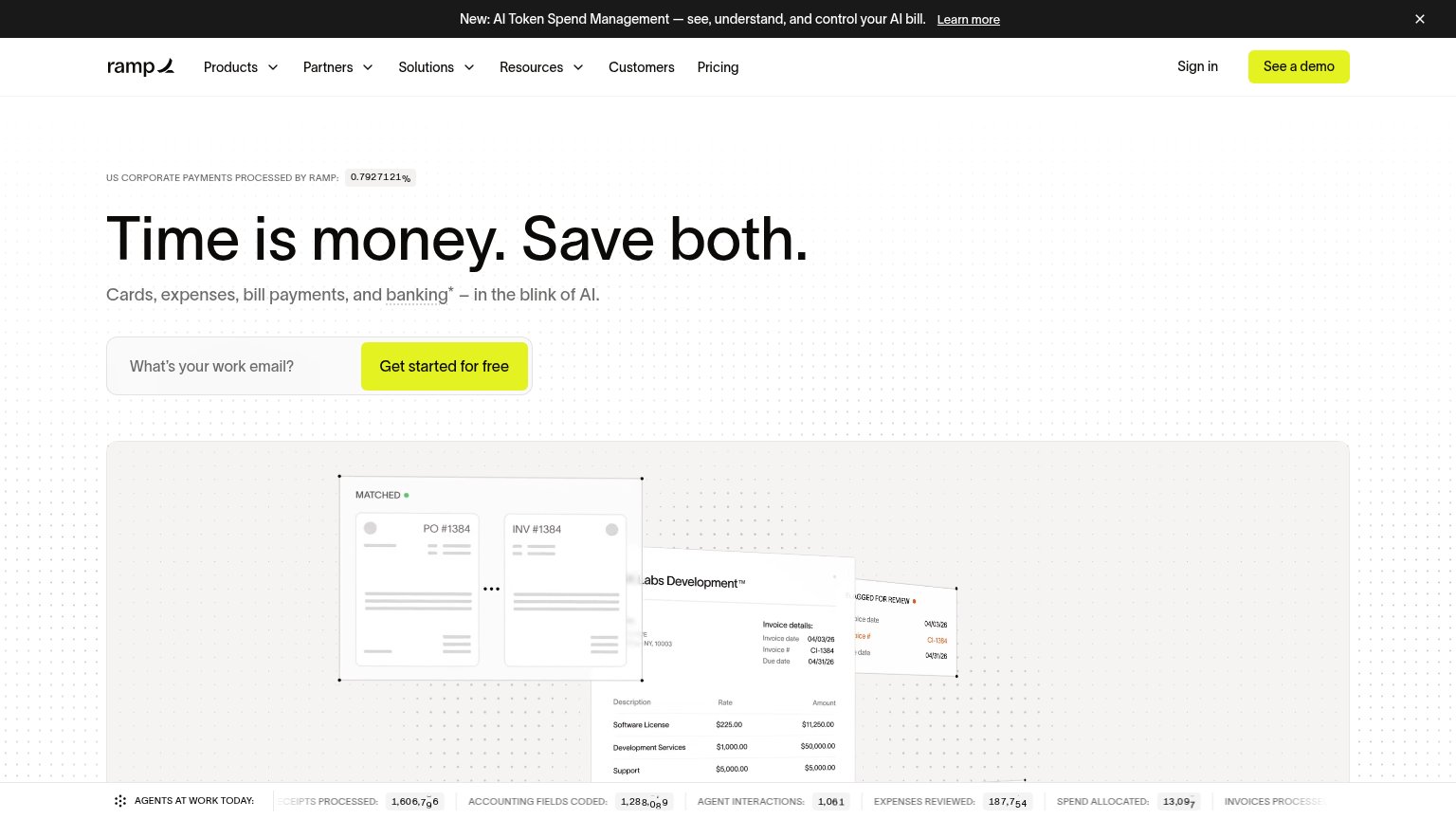 1234
- See a demo button — Identical lime styling to "Get started for free" makes two competing primary CTAs in the same glance.
- Top navigation row — Six dropdown menus plus "Sign in" create most of the nine exit paths before the email capture.
- Announcement banner — The "Learn more" link is the first interactive element visitors meet, pulling clicks away before the headline lands.
- Invoice hero illustration — Cropped, faint invoice mockups read as clutter rather than a clear picture of the product outcome.
CTA
86StrongCopy, size, verb, cost-feel — does the primary CTA earn the click?
How Ramp compares
Recommended rewrites
Value props
86StrongTitle, subtitle, hero — do they sell the product's true value?
Ramp’s headline
Time is money. Save both.
Cards, expenses, bill payments, and banking* – in the blink of AI.
Working
Could improve
Mobile web
86StrongThe phone experience as a first-class citizen.
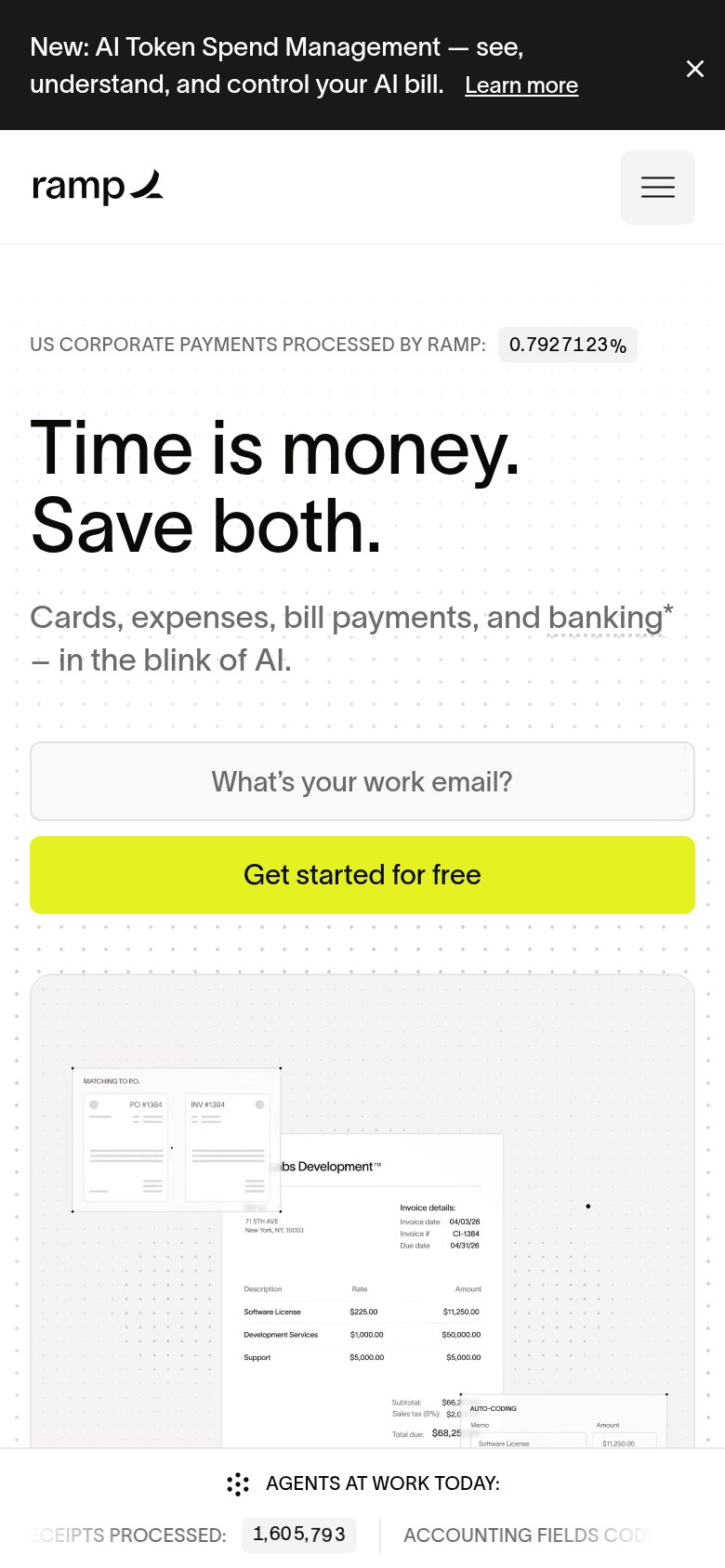
What works
What to improve