
Your landing page’s weakest score is Information hierarchy.
How Happenstance ranks
- 1.
Exa82
- 2.
Happenstance78
- 3.
FullEnrich76
- 4.
Autumn AI70
- 5.
Clay66
- 6.
People Data Labs56
78Growth scoreupdated
category scores
category scoresShowHide
Information hierarchy
72FairDoes the design help or inhibit what the page is trying to say?
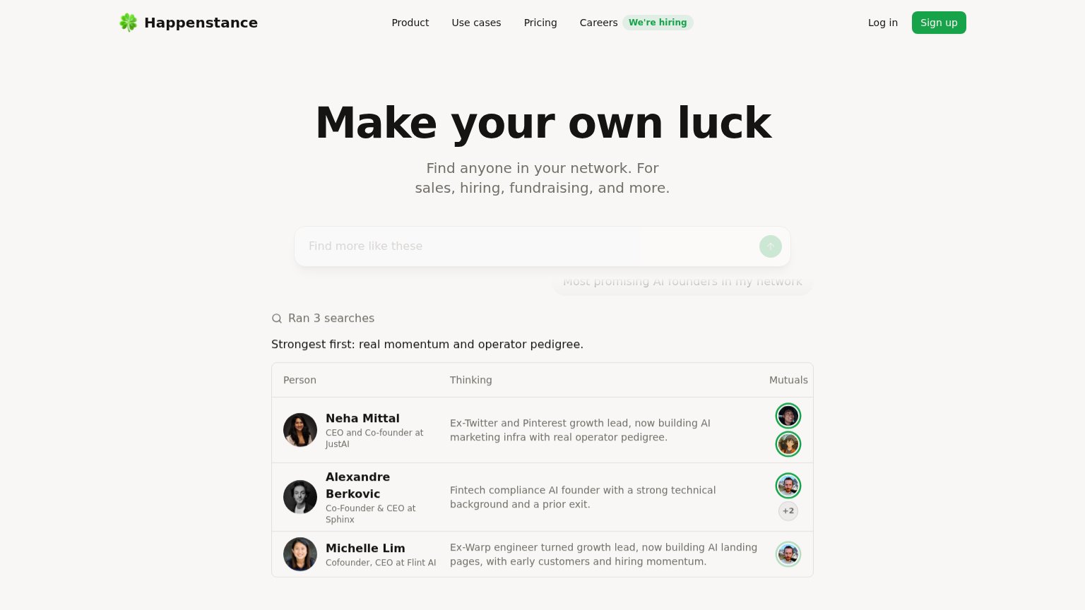 1234
- Faded search input — The primary search box and "Find more like these" prompt render at near-invisible opacity, hiding the core action mid-transition.
- Ghosted query chip — "Most promising AI founders in my network" is barely legible gray-on-white, wasting the strongest demo copy on the page.
- Results table dominance — The dense three-row results table carries more visual weight than the CTA, pulling scan attention to reading instead of acting.
- Nav plus hiring badge — Five nav links plus a "We're hiring" badge and Log in create seven exits before the visitor reaches the search demo.
Trust
74FairProof that the product is real, competent, and safe to try.
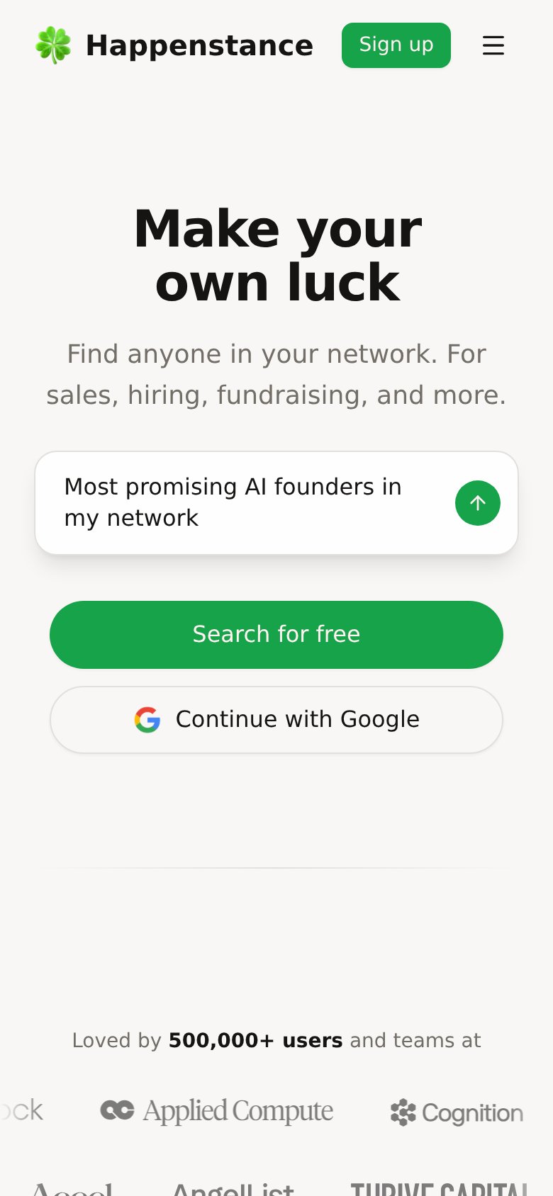
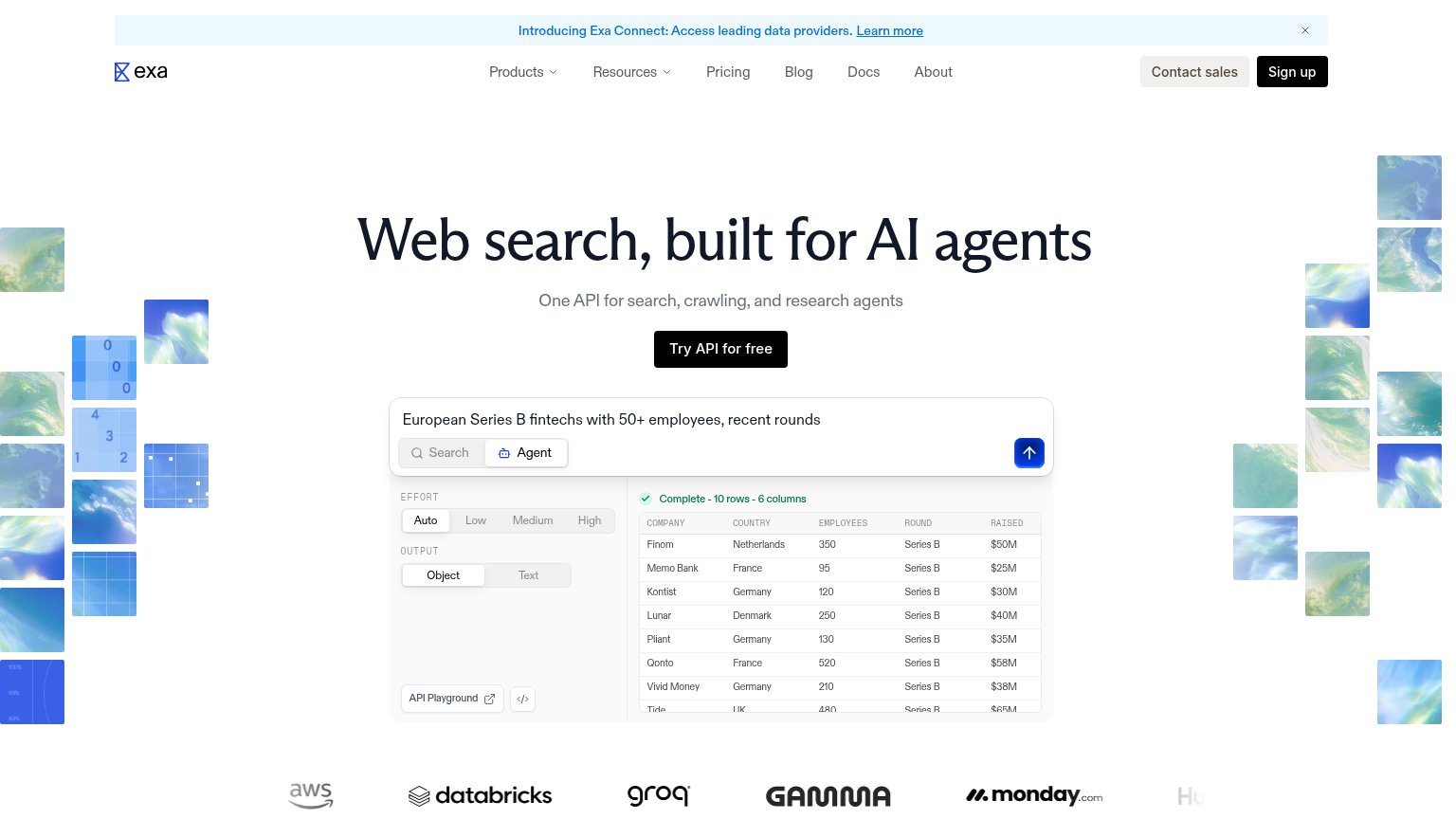
| Trust read | |
|---|---|
| Happenstance | "Loved by 500,000+ users and teams at" with logos including Applied Compute and Cognition |
| "1,060,831,012 people indexed" / "109,851,694 companies indexed" stat block beside the hero | |
| "or install directly with" row showing Anthropic and OpenAI integration icons next to the CTAs | |
| No visible trust signal identified. | |
| Customer logo wall showing AWS, Databricks, Groq, Gamma, and monday.com | |
| "GDPR & CCPA compliant" badge beside the "Get Started for Free" CTA |
CTA
78FairCopy, size, verb, cost-feel — does the primary CTA earn the click?
How Happenstance compares
Recommended rewrites
Value props
78FairTitle, subtitle, hero — do they sell the product's true value?
Happenstance’s headline
Make your own luck
Find anyone in your network. For sales, hiring, fundraising, and more.
Working
Could improve
Mobile web
88StrongThe phone experience as a first-class citizen.
What works
What to improve