
Your landing page’s weakest score is Trust.
How Clay ranks
Trust
44PoorProof that the product is real, competent, and safe to try.

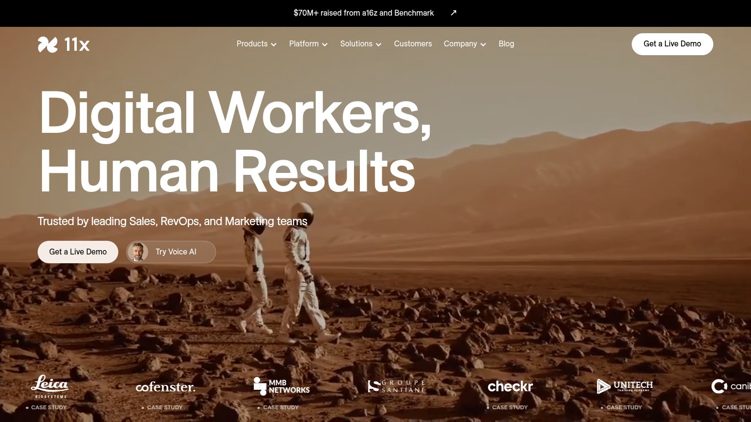
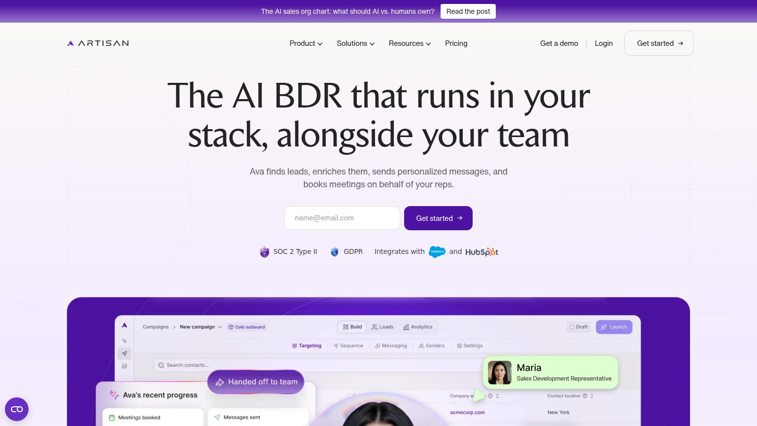
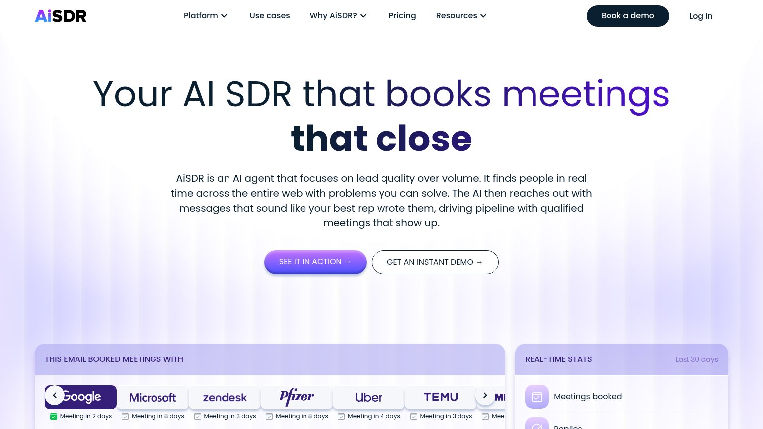
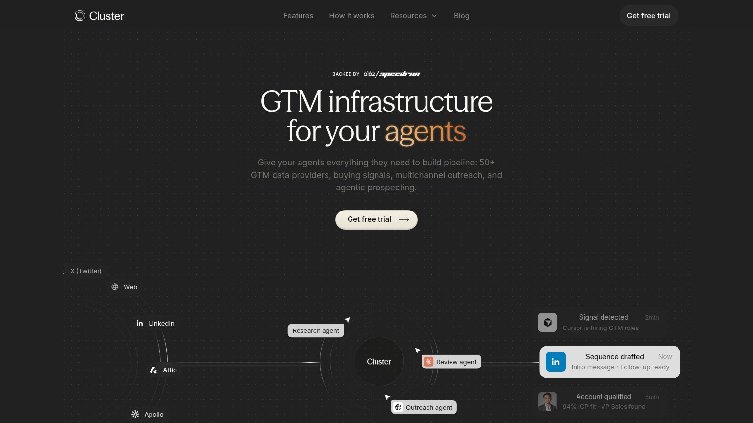
| Trust read | |
|---|---|
| Clay | "or install directly with" row showing Anthropic and OpenAI integration icons next to the CTAs |
| "BACKED BY a16z / speedrun" investor badge above the headline | |
| "$70M+ raised from a16z and Benchmark" banner | |
| "SOC 2 Type II" and "GDPR" compliance badges with "Integrates with Salesforce and HubSpot" directly beneath the Get star | |
| "THIS EMAIL BOOKED MEETINGS WITH" strip showing Google, Microsoft, Zendesk, Pfizer, Uber, Temu with tags like "Meeting i | |
| Live agent prompt demo: "Write personalized emails to the CEOs of Linear and Sierra" |
Mobile web
62FairThe phone experience as a first-class citizen.
 12
- Cookie consent banner — Dead blocker eating the bottom third of the viewport with no conversion-valuable CTA.
- Split CTA pair — Two side-by-side half-width buttons compete; neither gets the full-bleed thumb target mobile deserves.
Value props
68FairTitle, subtitle, hero — do they sell the product's true value?
Clay’s headline
Build systems to grow revenue
Infrastructure to get any data, run agentic workflows, and launch GTM plays.
Working
Could improve
Information hierarchy
72FairDoes the design help or inhibit what the page is trying to say?
What works
What to improve
CTA
84StrongCopy, size, verb, cost-feel — does the primary CTA earn the click?
How Clay compares
Recommended rewrites