
Your landing page’s weakest score is Trust.
How FullEnrich ranks
76Growth scoreupdated
category scores
category scoresShowHide
Trust
58FairProof that the product is real, competent, and safe to try.
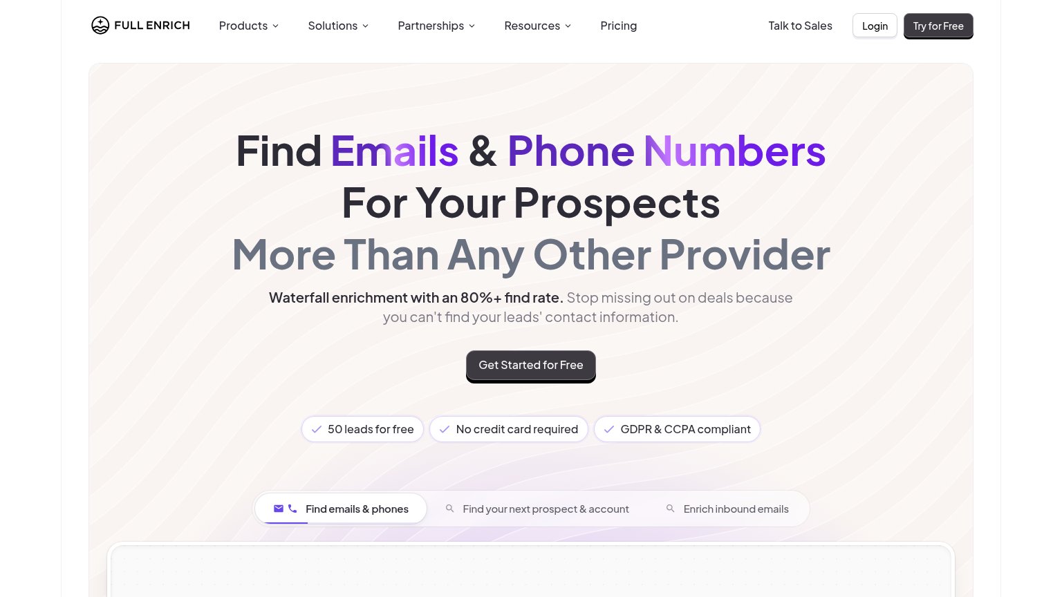
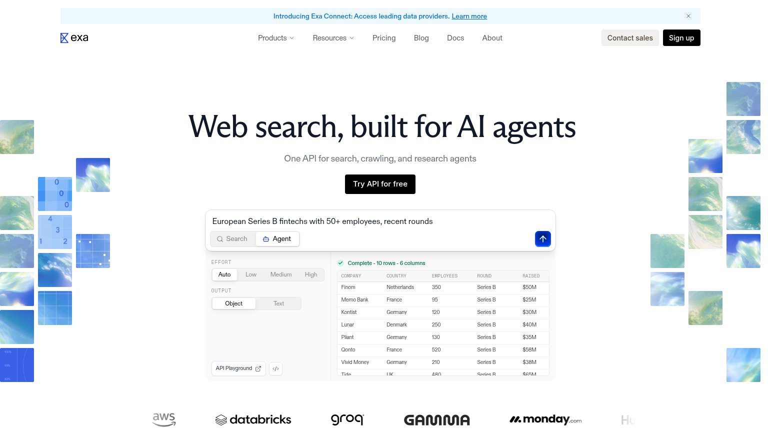
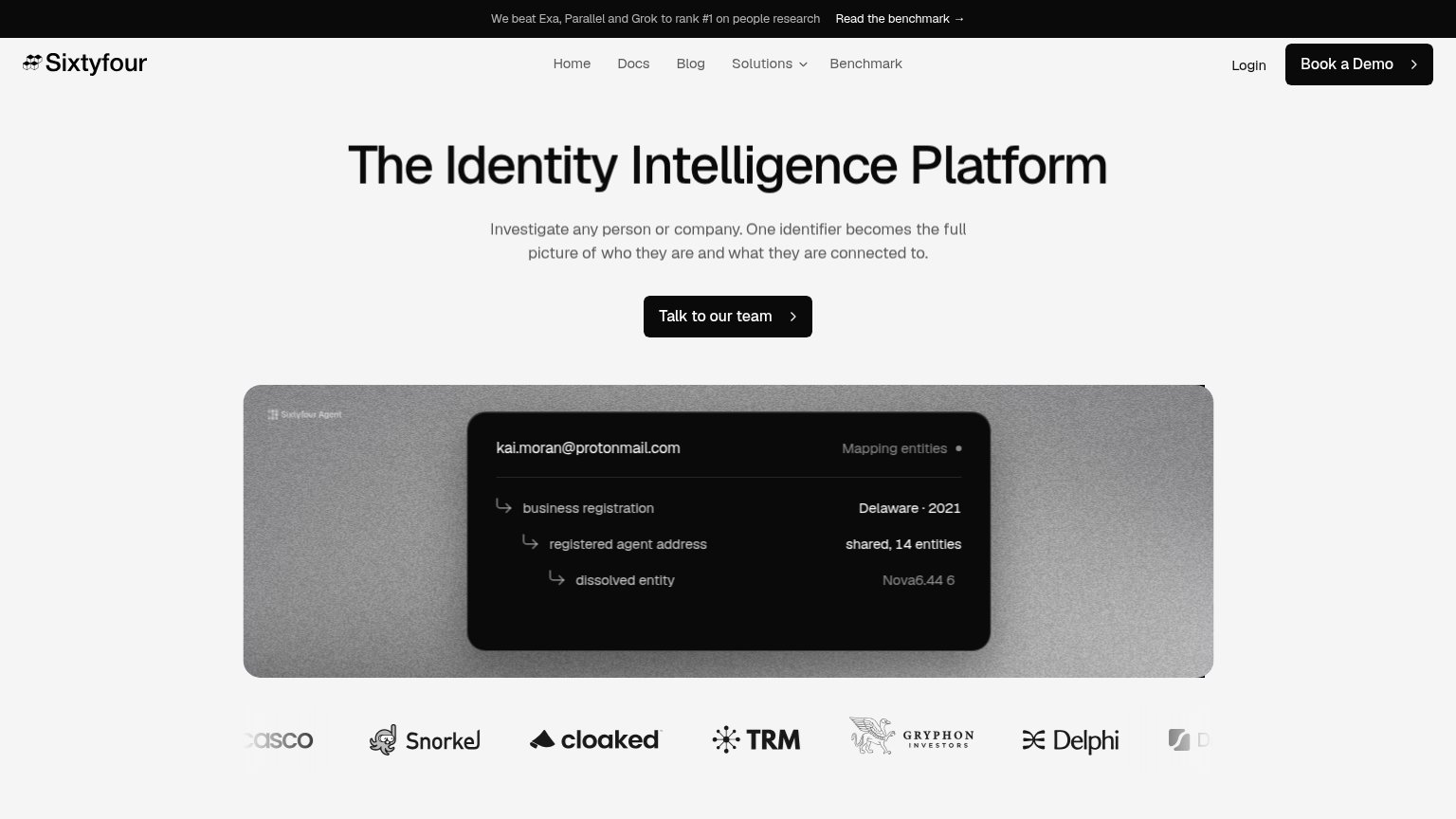
| Trust read | |
|---|---|
| FullEnrich | "GDPR & CCPA compliant" badge beside the "Get Started for Free" CTA |
| Announcement bar: "We beat Exa, Parallel and Grok to rank #1 on people research — Read the benchmark →" | |
| Customer logo wall showing AWS, Databricks, Groq, Gamma, and monday.com | |
| Interactive product demo with Research/Monitor/Search/Extract tabs and "Monitor new product release" query UI | |
| "or install directly with" row showing Anthropic and OpenAI integration icons next to the CTAs | |
| No visible trust signal identified. |
Information hierarchy
76FairDoes the design help or inhibit what the page is trying to say?
123- Try for Free button — Same dark pill styling as the hero CTA creates two equal-weight primary actions in the fold.
- Nav dropdown row — Five menu items (four with dropdowns) plus Talk to Sales and Login give eight exit paths before the hero CTA.
- Tab switcher row — Three same-weight tabs beneath the trust badges add a second decision point competing with the CTA above.
Mobile web
76FairThe phone experience as a first-class citizen.
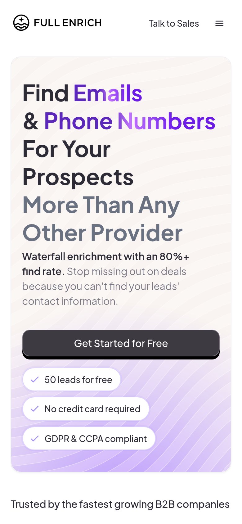
What works
What to improve
CTA
84StrongCopy, size, verb, cost-feel — does the primary CTA earn the click?
How FullEnrich compares
Recommended rewrites
Value props
86StrongTitle, subtitle, hero — do they sell the product's true value?
FullEnrich’s headline
Find Emails & Phone Numbers For Your Prospects More Than Any Other Provider
Waterfall enrichment with an 80%+ find rate. Stop missing out on deals because you can't find your leads' contact information.
Working
Could improve