
Your landing page’s weakest score is Mobile web.
How Dashlane ranks
50Growth scoreupdated
category scores
category scoresShowHide
Mobile web
38PoorThe phone experience as a first-class citizen.
 123
- Chat bubble covers CTA — The auto-opened greeting bubble sits on top of the teal button and hides its label entirely.
- Risk graphic half fold — The 'MODERATE RISK' illustration eats the top ~45% of the phone screen with no message or action.
- Hidden teal button — The only visible CTA-shaped element has no readable label, leaving zero legible actions on the fold.
Information hierarchy
42PoorDoes the design help or inhibit what the page is trying to say?
 1234
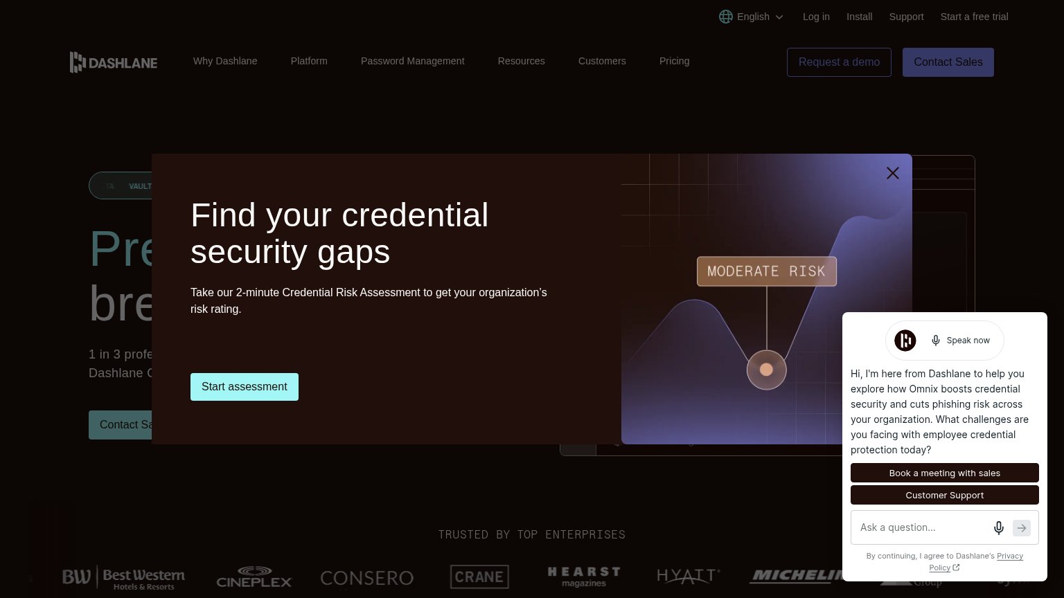
- Chatbot panel overlay — Auto-opens over the modal and page, adding a third competing message and two more buttons to the fold.
- Risk assessment modal — Covers the hero headline and primary CTA, replacing the page's core argument with a secondary offer.
- Obscured hero headline — The value proposition is cut to unreadable fragments behind the modal, so the promise never lands.
- Dual header CTAs — "Request a demo" and "Contact Sales" sit side by side at equal weight, splitting the primary action.
Value props
52FairTitle, subtitle, hero — do they sell the product's true value?
Dashlane’s headline
Find your credential security gaps
Take our 2-minute Credential Risk Assessment to get your organization’s risk rating.
Working
Could improve
CTA
58FairCopy, size, verb, cost-feel — does the primary CTA earn the click?
How Dashlane compares
Recommended rewrites
Trust
58FairProof that the product is real, competent, and safe to try.
How Dashlane compares
Trust read