
Your landing page’s weakest score is Mobile web.
How 1Password ranks
Mobile web
44PoorThe phone experience as a first-class citizen.
 123
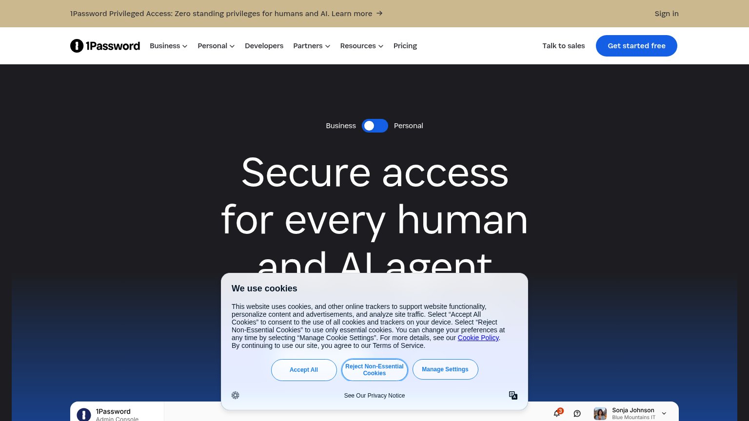
- Cookie consent modal — Dead blocker covering ~70% of the viewport with three stacked buttons and no conversion-valuable CTA — pure friction before any tap.
- Promo announcement banner — Wraps to three lines and eats the top fifth of the phone screen before the logo even appears.
- Truncated hero headline — "Secure access for every…" is cut mid-sentence by the cookie modal, so the value statement never completes.
Trust
52FairProof that the product is real, competent, and safe to try.
| Trust read | |
|---|---|
| 1Password | Real 1Password Admin Console product shot with named user "Sonja Johnson, Blue Mountains IT" emerging at the bottom of t |
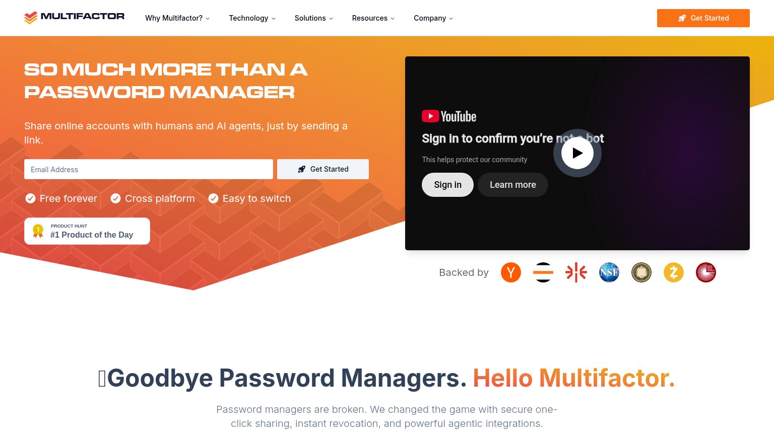
| "Backed by" investor logo row including Y Combinator and NSF badges | |
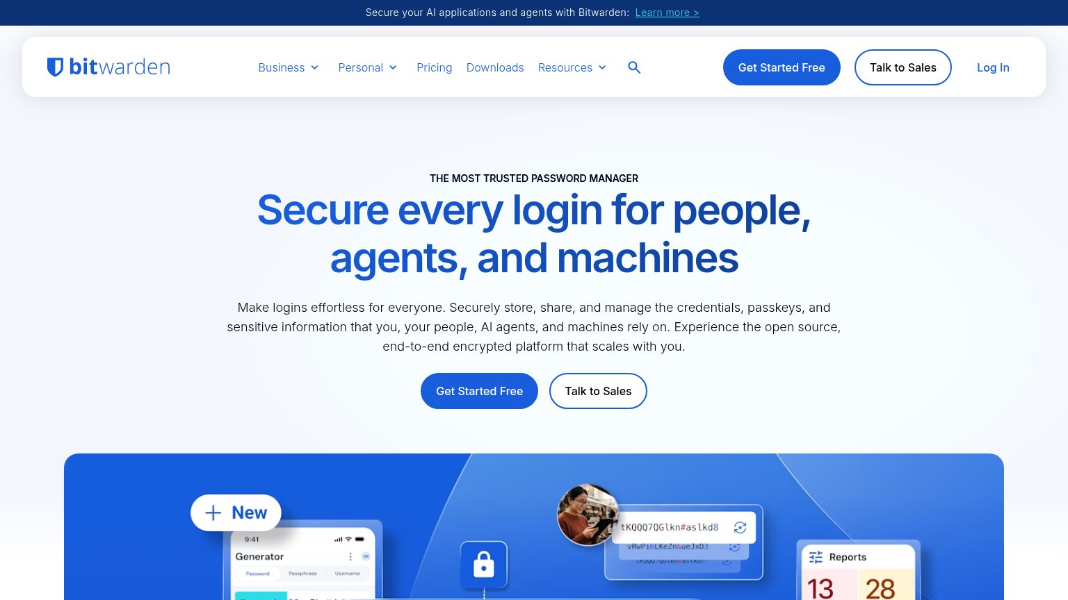
| Real product UI mosaic showing the password generator, autofill credential popup, and reports panel | |
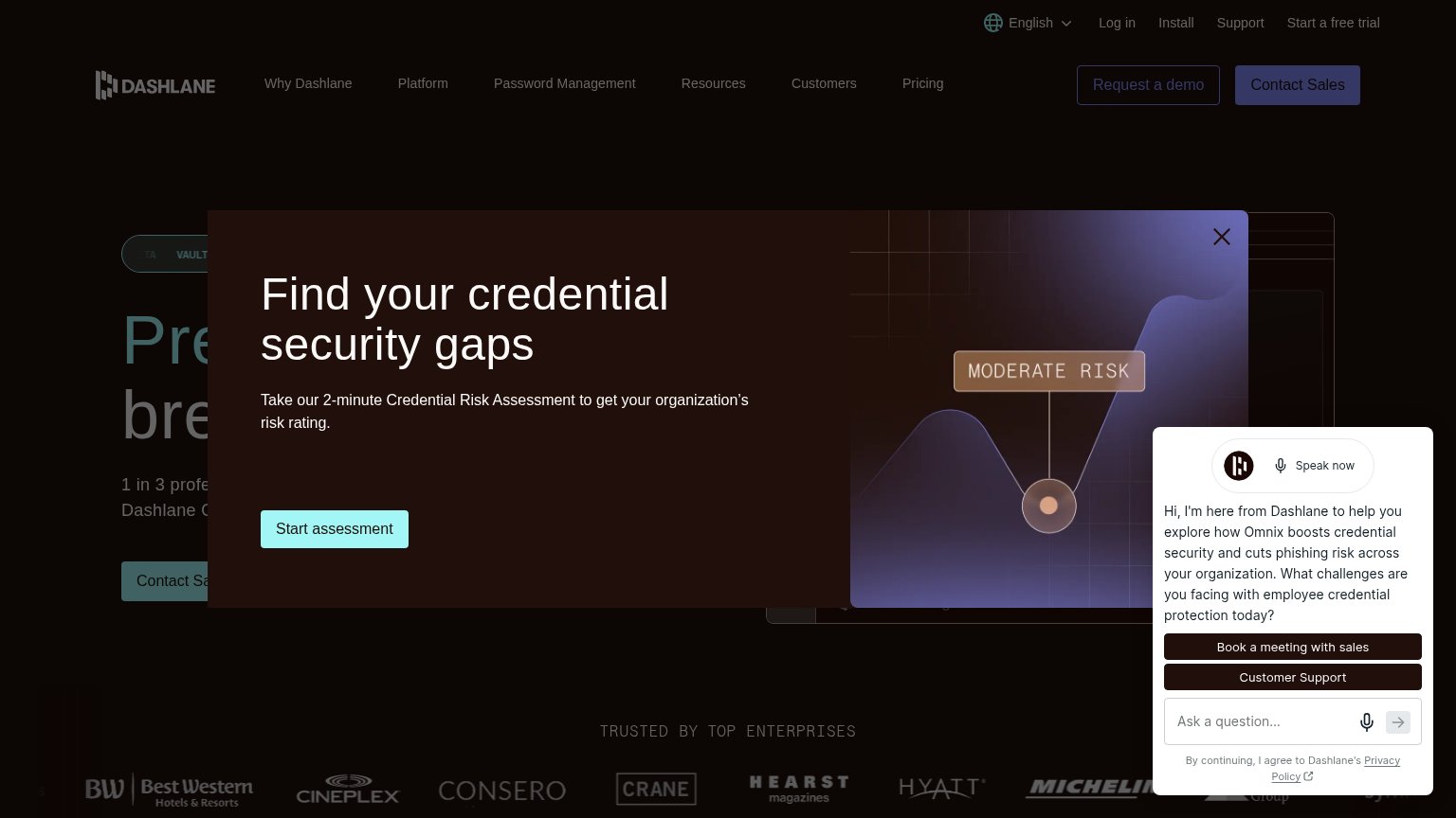
| "TRUSTED BY TOP ENTERPRISES" logo strip (Best Western, Cineplex, Hearst, Hyatt, Michelin) | |
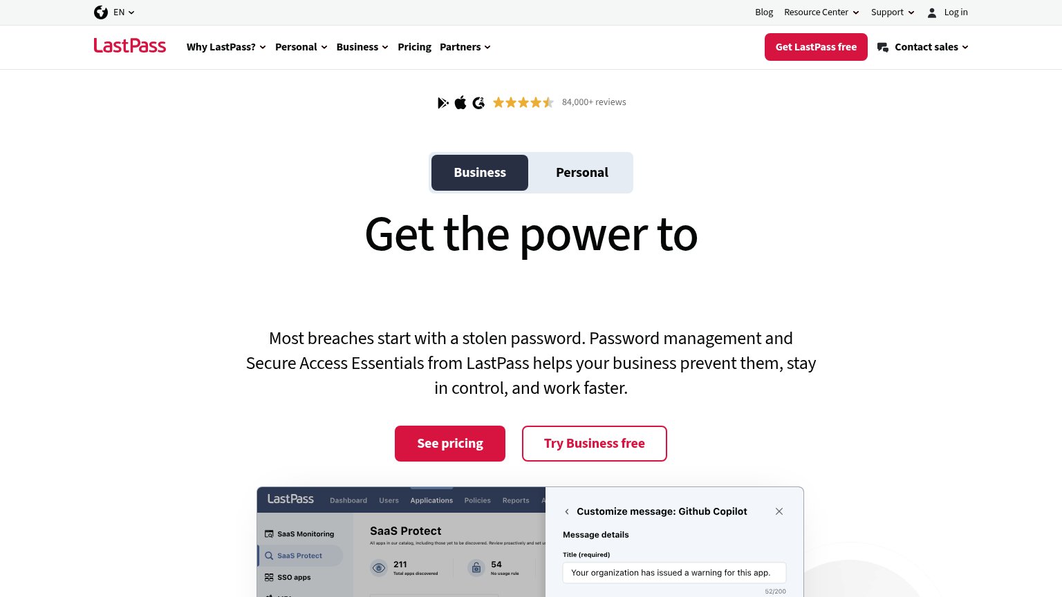
| 84,000+ reviews rating strip with Google Play, Apple, and G2 icons | |
| "POWERED BY NordVPN" badge above the headline |
Information hierarchy
62FairDoes the design help or inhibit what the page is trying to say?
What works
What to improve
Value props
64FairTitle, subtitle, hero — do they sell the product's true value?
1Password’s headline
Secure access for every human and AI agent
Working
Could improve
CTA
72FairCopy, size, verb, cost-feel — does the primary CTA earn the click?
How 1Password compares
Recommended rewrites