
Your landing page’s weakest score is Trust.
How Bitwarden ranks
77Growth scoreupdated
category scores
category scoresShowHide
Trust
68FairProof that the product is real, competent, and safe to try.
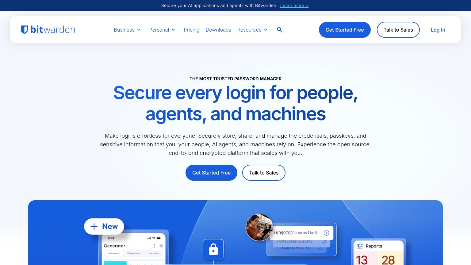
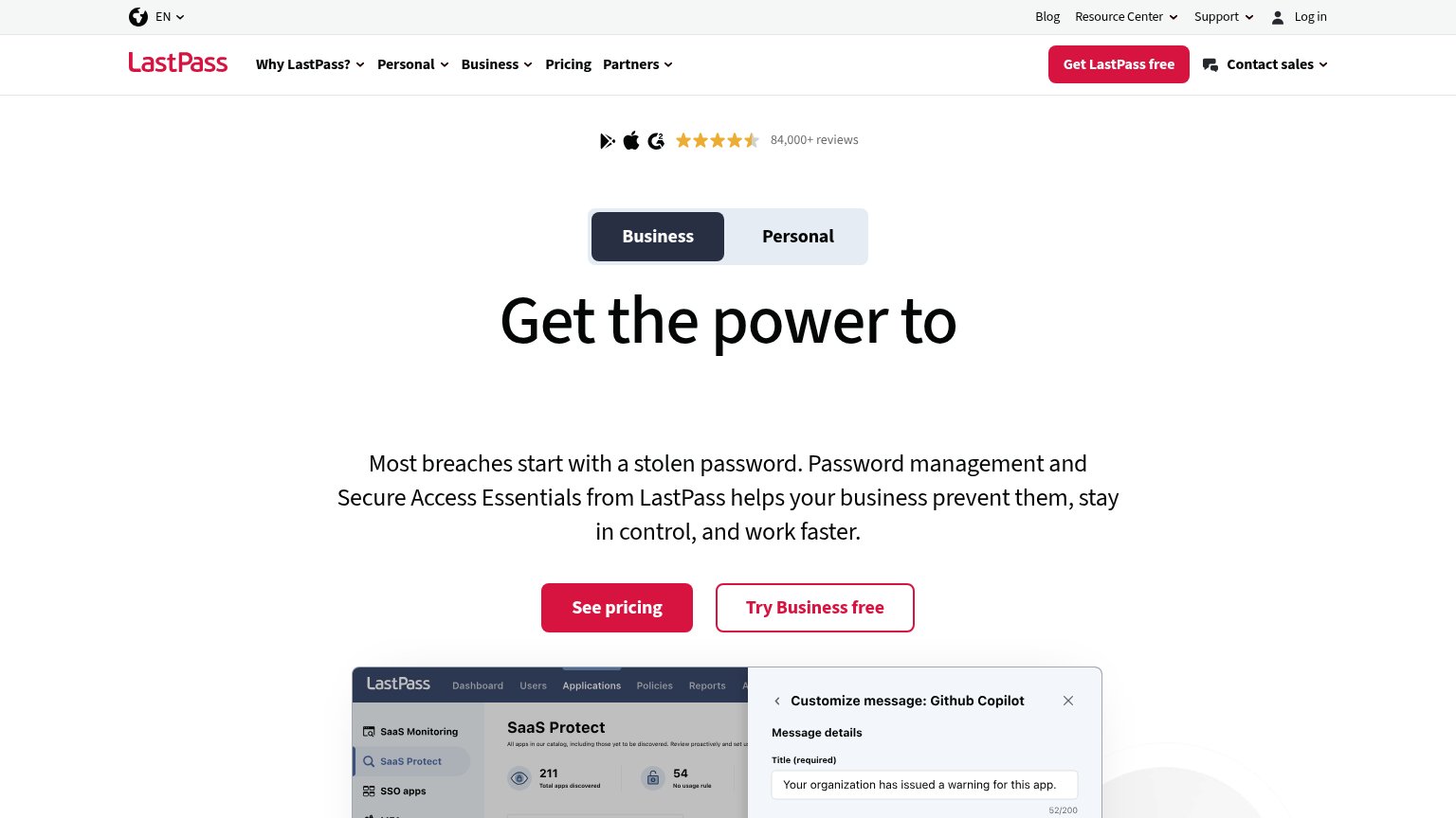
| Trust read | |
|---|---|
| Bitwarden | Real product UI mosaic showing the password generator, autofill credential popup, and reports panel |
| "Backed by" investor logo row including Y Combinator and NSF badges | |
| Real 1Password Admin Console product shot with named user "Sonja Johnson, Blue Mountains IT" emerging at the bottom of t | |
| "TRUSTED BY TOP ENTERPRISES" logo strip (Best Western, Cineplex, Hearst, Hyatt, Michelin) | |
| 84,000+ reviews rating strip with Google Play, Apple, and G2 icons | |
| "POWERED BY NordVPN" badge above the headline |
Information hierarchy
78FairDoes the design help or inhibit what the page is trying to say?
1234- Hero Talk to Sales — Equal-weight secondary button beside the primary CTA splits the fold's one action — duplicated again in the nav.
- Nav CTA pair — Repeats the hero's Get Started Free / Talk to Sales at full button weight, doubling competing targets in one viewport.
- Announcement banner link — Underlined 'Learn more >' sits at the very top of the scan path and leaks attention before the pitch is read.
- Cropped product collage — The illustration that proves the product is cut off at the fold edge, so its detail barely registers.
Value props
78FairTitle, subtitle, hero — do they sell the product's true value?
Bitwarden’s headline
Secure every login for people, agents, and machines
Make logins effortless for everyone. Securely store, share, and manage the credentials, passkeys, and sensitive information that you, your people, AI agents, and machines rely on. Experience the open source, end-to-end encrypted platform th
Working
Could improve
Mobile web
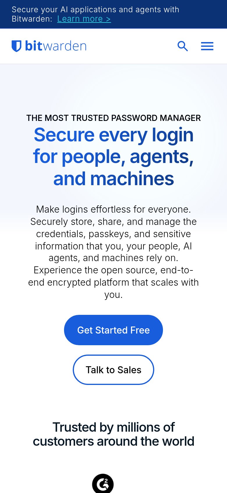
78FairThe phone experience as a first-class citizen.
What works
What to improve
CTA
84StrongCopy, size, verb, cost-feel — does the primary CTA earn the click?
How Bitwarden compares
Recommended rewrites