
Your landing page’s weakest score is Mobile web.
How Intuit ProConnect Tax ranks
63Growth scoreupdated
category scores
category scoresShowHide
Mobile web
52FairThe phone experience as a first-class citizen.
 1234
- Oversized hero headline — Wraps into six huge lines and pushes every CTA below the first viewport.
- Promo banner block — Two-decker offer bar eats the top of the screen before the nav or hero appears.
- Lock in offer button — The only visible CTA is a secondary promo, small and awkwardly wrapped to two lines.
- Long subhead paragraph — Seven lines of body copy further delay any action beneath the giant headline.
Information hierarchy
62FairDoes the design help or inhibit what the page is trying to say?
 123
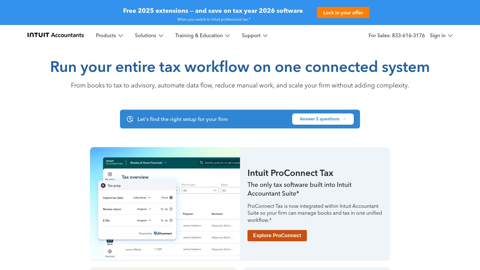
- Orange promo banner — The brightest element on the page is a promo bar at the very top, pulling the eye away from the headline and ProConnect card before either is read.
- Mid-page quiz strip — The blue "Let's find the right setup" band interrupts the scan path between headline and product card, splitting the fold into two disconnected arguments.
- Nav with four dropdowns — Products, Solutions, Training & Education, and Support plus a phone number and Sign in offer seven-plus exits before any conversion element.
CTA
62FairCopy, size, verb, cost-feel — does the primary CTA earn the click?
How Intuit ProConnect Tax compares
Recommended rewrites
Trust
62FairProof that the product is real, competent, and safe to try.
How Intuit ProConnect Tax compares
Trust read
Value props
76FairTitle, subtitle, hero — do they sell the product's true value?
Intuit ProConnect Tax’s headline
Run your entire tax workflow on one connected system
From books to tax to advisory, automate data flow, reduce manual work, and scale your firm without adding complexity.
Working
Could improve