
Your landing page’s weakest score is Trust.
How Luca IQ ranks
62Growth scoreupdated
category scores
category scoresShowHide
Score over time
Trust
42PoorProof that the product is real, competent, and safe to try.

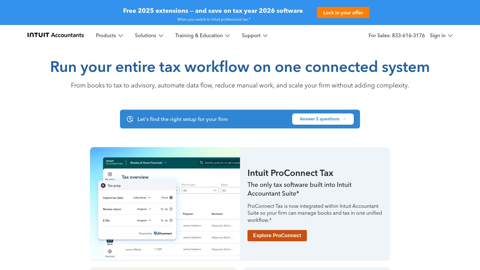
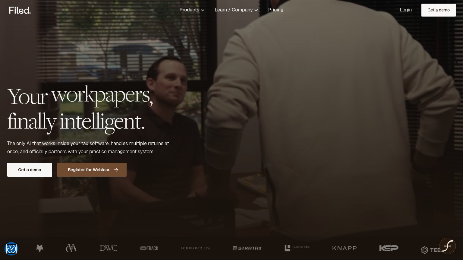
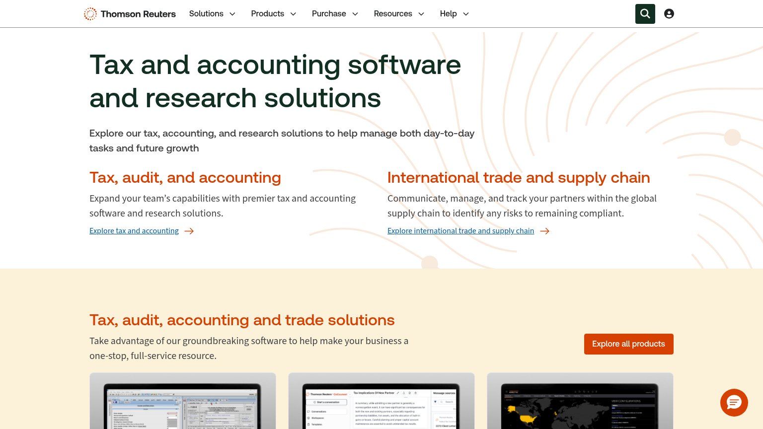
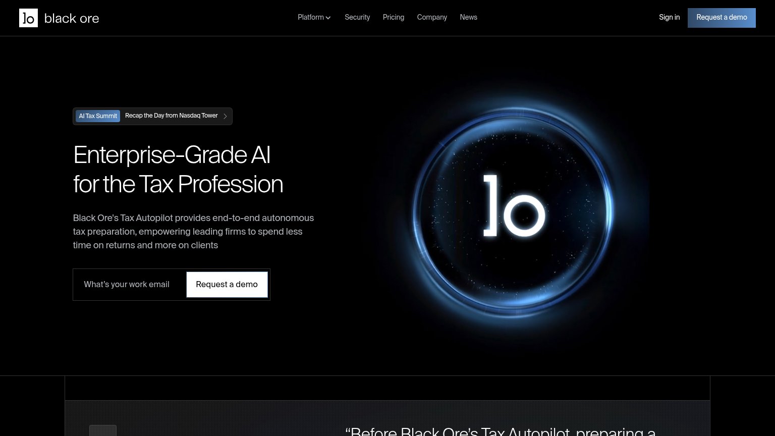
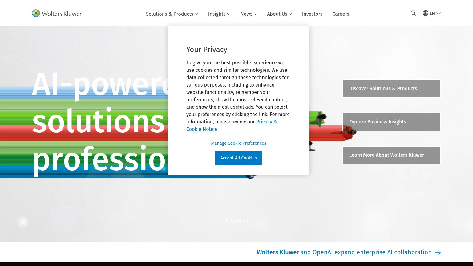
| Trust read | |
|---|---|
| Luca IQ | "Backed by Y Combinator" badge |
| Product screenshot of the Intuit Accountant Suite dashboard showing a "Tax overview" table and "Tax prep" workflow panel | |
| "Wolters Kluwer and OpenAI expand enterprise AI collaboration" news banner | |
| Row of real product screenshots showing tax-form software UI and a CoCounsel conversation panel | |
| Customer logo strip with named CPA firms (DWC, Schwarcz CPA, Stratax, Lagow CPA, Knapp, KSP) | |
| "AI Tax Summit — Recap the Day from Nasdaq Tower" event banner |
Value props
62FairTitle, subtitle, hero — do they sell the product's true value?
Luca IQ’s headline undersells
First Modern Professional Tax Software Made Exclusively for Firms
From client intake and tax preparation through e-filing, review, and delivery, Luca IQ helps your firm complete accurate returns without disconnected tools or manual busywork.
Working
- Subhead maps the full tax workflow
- Names real pain: disconnected tools
- Clear audience: firms, not consumers
Could improve
- 'First Modern' is an empty boast
- No numbers or proof points in fold
- Stock photo shows nothing of product
Information hierarchy
68FairDoes the design help or inhibit what the page is trying to say?
123- Headline over busy photo — White serif headline sits directly on mid-tone figures and glass, so contrast varies word by word and legibility drops at a glance.
- Join The Waitlist button — White pill blends with the pale photo background and sits at the fold edge, so the sole conversion surface reads quieter than the nav Login button.
- Six-item nav row — Platform, Developers, Demo, Blog, Company, and a boxed Login give six equal-weight exits before the waitlist ask on a pre-launch page.
CTA
68FairCopy, size, verb, cost-feel — does the primary CTA earn the click?
Problems
- click yields waiting, not value
- no demo path from the hero
- no incentive for joining list
Mobile web
68FairThe phone experience as a first-class citizen.
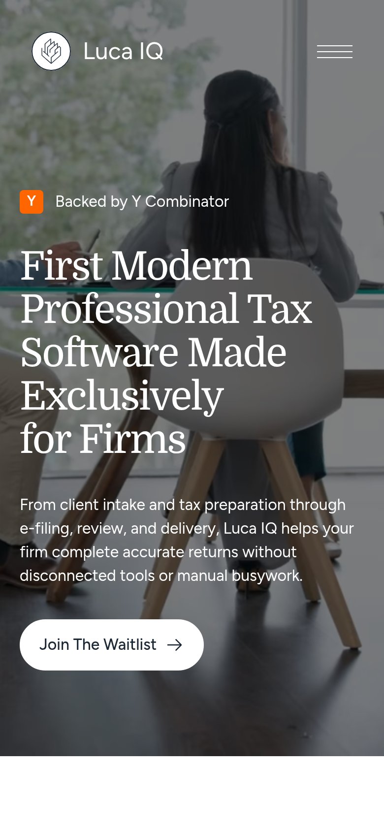 123
- Join The Waitlist button — Half-width, desktop-proportioned and sitting at the fold's bottom edge instead of full-bleed and safely in view.
- Six-line hero headline — Headline barely scaled down from desktop, wrapping into six lines and pushing the CTA to the viewport edge.
- Four-line subheadline — Long paragraph stacked under the oversized headline crowds the column and displaces the CTA downward.