
Your landing page’s weakest score is Value props.
How Riverbank ranks
- 1.
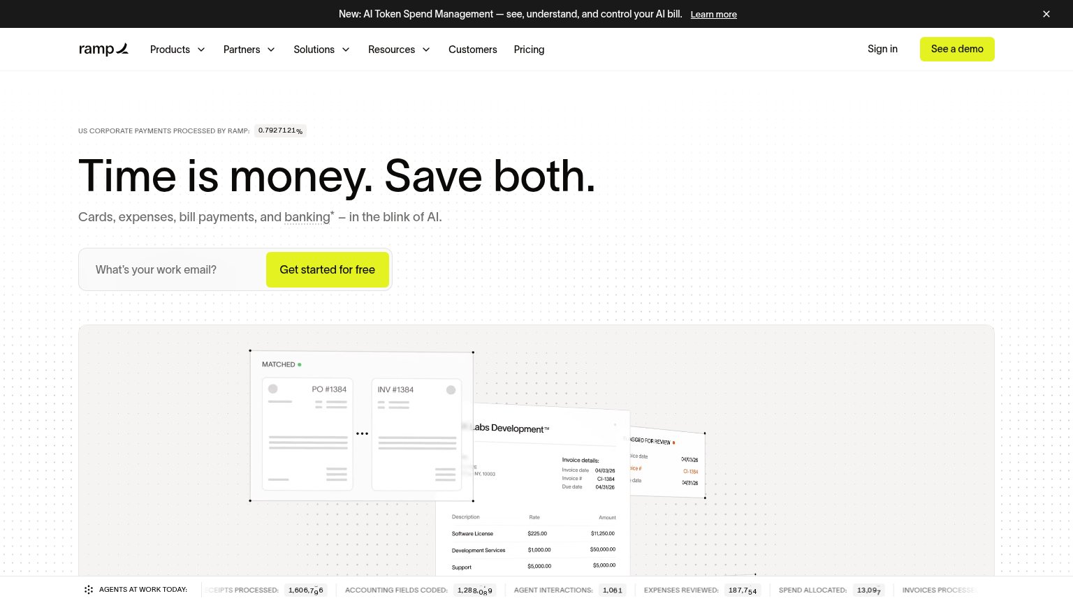
Ramp82
- 2.
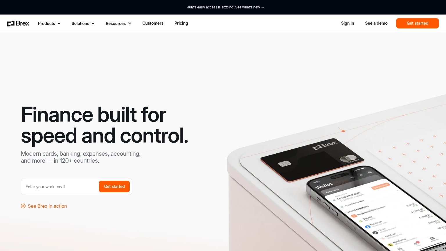
Brex78
- 3.
Novo76
- 4.
Relay73
- 5.
Mercury72
- 6.
Riverbank17
17Growth scoreupdated
category scores
category scoresShowHide
Score over time
Value props
10PoorTitle, subtitle, hero — do they sell the product's true value?
Working
- Clean, distraction-free canvas
- Memorable, distinctive logo mark
Could improve
- No headline or value claim at all
- Nothing says what the product does
- Logo decorates instead of demonstrates
CTA
15PoorCopy, size, verb, cost-feel — does the primary CTA earn the click?


Problems
- no CTA anywhere on the fold
- no headline or product context
- logo-only splash, nothing clickable
Trust
15PoorProof that the product is real, competent, and safe to try.
| Trust read | |
|---|---|
| Riverbank | No visible trust signal identified. |
| "Banking services provided through Choice Financial Group and Column N.A., Members FDIC." disclosure banner | |
| implicit context Brex may benefit from pre-existing familiarity among its target audience. | |
| "US CORPORATE PAYMENTS PROCESSED BY RAMP: 0.7927%" stat above the headline | |
| "Relay is a financial technology company and is not an FDIC-insured bank. Banking services provided by Thread Bank, Memb | |
| No visible trust signal identified. |
Mobile web
22PoorThe phone experience as a first-class citizen.
 12
- Logomark hero — The fold's only content is a logo with no headline, copy, or tappable CTA — nothing converts.
- RIVERBANK wordmark — Tiny letterspaced text at the bottom edge is the only words on the page and gives no value statement or action.
Information hierarchy
25PoorDoes the design help or inhibit what the page is trying to say?
 12
- Logo mark only — The fold's sole element is an unlabeled logo with no headline, value prop, or CTA to act on.
- RIVERBANK wordmark — The only text on the page is a tiny low-contrast wordmark tucked in the bottom-right corner, outside the scan path.