
Your landing page’s weakest score is Trust.
How Relay ranks
73Growth scoreupdated
category scores
category scoresShowHide
Trust
52FairProof that the product is real, competent, and safe to try.

| Trust read | |
|---|---|
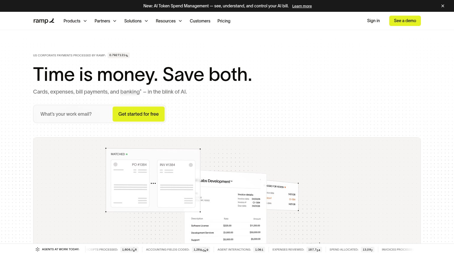
| Relay | "Relay is a financial technology company and is not an FDIC-insured bank. Banking services provided by Thread Bank, Memb |
| "Protected by reCAPTCHA" line with Privacy and Terms links beneath the signup form | |
| "Banking services provided through Choice Financial Group and Column N.A., Members FDIC." disclosure banner | |
| implicit context Brex may benefit from pre-existing familiarity among its target audience. | |
| "US CORPORATE PAYMENTS PROCESSED BY RAMP: 0.7927%" stat above the headline | |
| No visible trust signal identified. |
Information hierarchy
74FairDoes the design help or inhibit what the page is trying to say?
1234- Duplicate account CTAs — Header "Open an account" duplicates the hero button, splitting the primary action across two same-label targets.
- Request a demo button — Outlined pill sits beside the primary CTA at near-equal weight, adding a competing conversion path in the header.
- Hero email button contrast — Pale lime "Open an account" fill nearly matches the cream field and background, muting the fold's single conversion moment.
- FDIC disclosure banner — Full-width dark banner inside the fold pulls the eye downward with legal copy before the CTA has landed.
CTA
76FairCopy, size, verb, cost-feel — does the primary CTA earn the click?
How Relay compares
Recommended rewrites
Value props
76FairTitle, subtitle, hero — do they sell the product's true value?
Relay’s headline
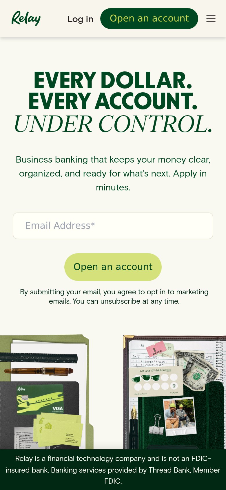
EVERY DOLLAR. EVERY ACCOUNT. UNDER CONTROL.
Business banking that keeps your money clear, organized, and ready for what's next. Apply in minutes.
Working
Could improve
Mobile web
86StrongThe phone experience as a first-class citizen.
What works
What to improve