
Your landing page’s weakest score is Trust.
How TakeCareOS ranks
65Growth scoreupdated
category scores
category scoresShowHide
Score over time
Trust
52FairProof that the product is real, competent, and safe to try.

| Trust read | |
|---|---|
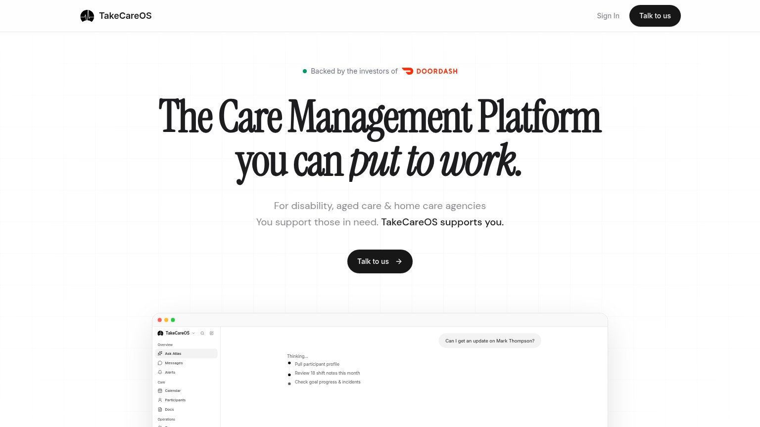
| TakeCareOS | Product UI demo showing "Ask Atlas" answering "Can I get an update on Mark Thompson?" with shift and goal details |
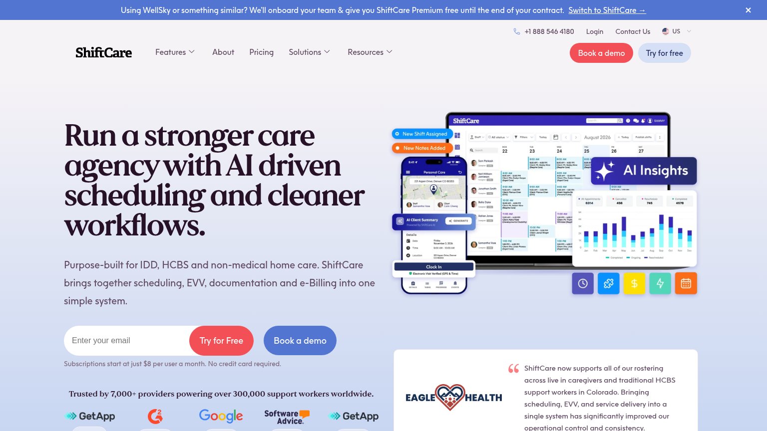
| Trusted by 7,000+ providers powering over 300,000 support workers worldwide. | |
| "$4 billion+ in annual claim amounts processed" stat row with 200+, 500K+, 80K+ usage numbers | |
| Top-bar contact details: "Sales: 1300 58 58 87" and "Level 45, World Square, Sydney NSW 2000" | |
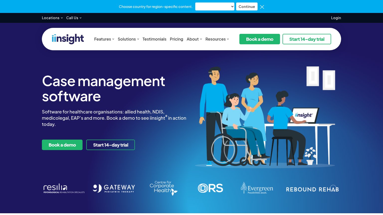
| Customer logo strip: Resilia, Gateway Pediatric Therapy, Centre for Corporate Health, ORS, Evergreen, Rebound Rehab | |
| No visible trust signal identified. |
CTA
62FairCopy, size, verb, cost-feel — does the primary CTA earn the click?

Problems
- click feels like a sales call
- no product value in the label
- demo shown but not tryable
Value props
64FairTitle, subtitle, hero — do they sell the product's true value?
TakeCareOS’s headline undersells
The Care Management Platform you can put to work.
For disability, aged care & home care agencies You support those in need. TakeCareOS supports you.
Working
- Names the exact ICP: disability & home care agencies
- "TakeCareOS support those in need" line hits the right emotion
- Hero screenshot demonstrates real AI participant query
Could improve
- "put to work" is vague without seeing the demo
- Zero numbers or proof points in the copy
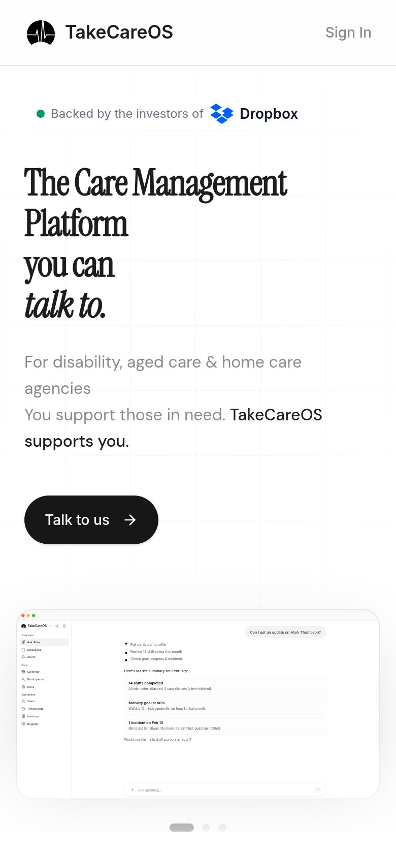
- Investor badge differs desktop vs mobile (DoorDash/Dropbox)
Mobile web
64FairThe phone experience as a first-class citizen.
 1234
- Primary CTA below fold — The 'Talk to us' button sits far down the page after a six-line headline and two-sentence subcopy, likely pushed near or past the first viewport on many phones.
- Headline wraps six lines — "The Care Management Platform TakeCareOS can talk to." scales down poorly, wrapping into six tall serif lines that consume most of the fold's message space.
- Talk to us button — Button is desktop-proportioned and floats left at roughly 40% width instead of a thumb-friendly near-full-bleed tap target.
- Header missing CTA — Mobile header keeps only 'Sign In' and drops the 'Talk to us' CTA, so no conversion action is instantly reachable at the top.
Information hierarchy
82StrongDoes the design help or inhibit what the page is trying to say?
123- Duplicate Talk to us — Nav 'Talk to us' pill matches the hero CTA weight, splitting one action across two equal buttons.
- Investor badge line — 'Backed by the investors of DOORDASH' sits above the headline, making borrowed credibility the first thing read instead of the value prop.
- Cropped product screenshot — The app UI is cut mid-sidebar at the fold, so its 'Ask Atlas' payoff (the chat answer) never lands above the fold.