How does Cal AI build a personalized plan before asking users to sign up?
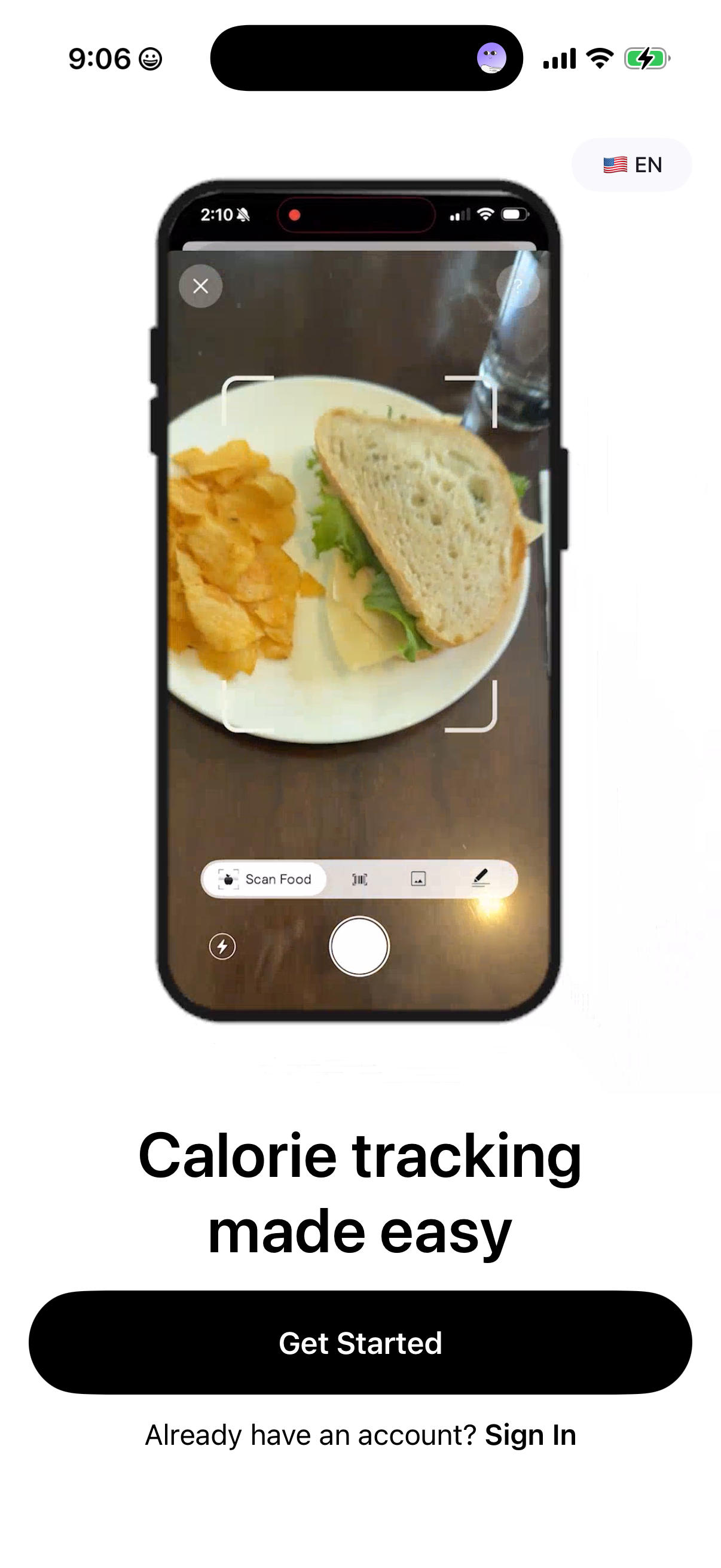
Cal AI’s August 2026 capture shows a product preview, profile and goal questions, preference choices, permissions, and an editable plan preview before the save-progress sign-in screen. The sequence makes the proposed output visible before the account decision. It is one recorded path with 45 frames, including repeated states—not 45 unique questions. [1][2][3]
The sequence, with evidence boundaries
| Captured frames | What Cal AI presents | Design role |
|---|---|---|
| 1 | A food-scanning product preview | Makes the core interaction tangible |
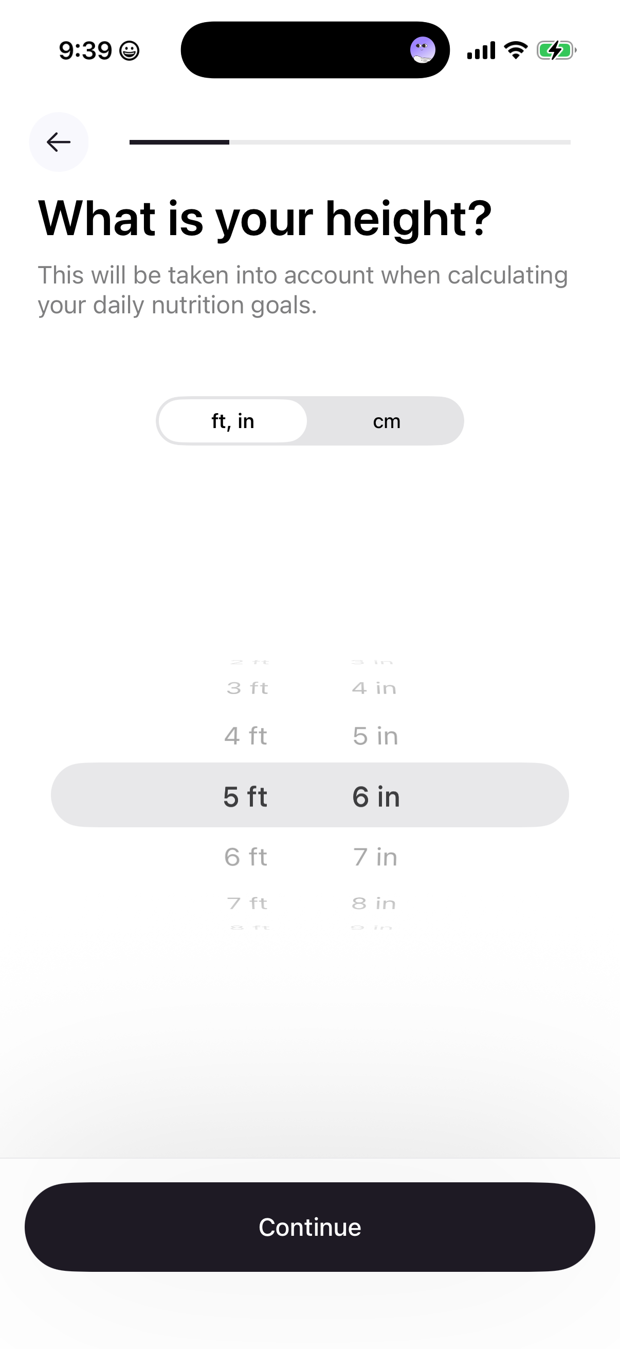
| 2–20 | Profile, activity, experience and goal questions, interleaved with encouragement | Collects inputs and frames an intended outcome |
| 21–29 | Obstacles, diet, desired benefit and reassurance | Connects the intake to motivation |
| 30–37 | Health connection, calorie preferences, social proof, notifications and referral | Introduces integrations and optional decisions |
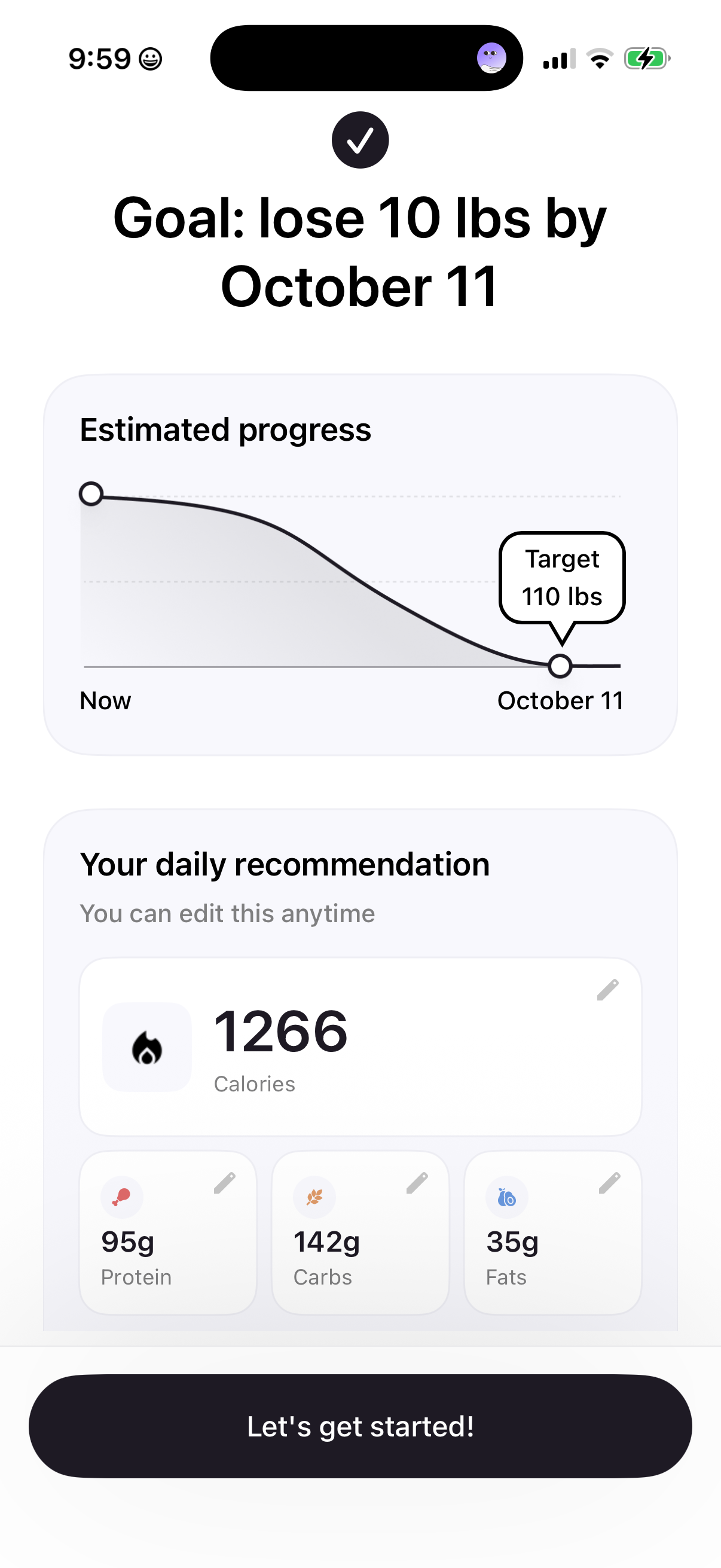
| 38–40 | Plan generation, tracking prompt and editable plan preview | Shows a proposed personalized result |
| 41–45 | Sign-in, trial reassurance, plan selection and App Store sheet | Moves from saving progress to a subscription decision |
This is an editorial grouping of the exact recorded frames. Several adjacent frames are the same question before and after selection; other frames contain a system overlay. [1][2][3][4]
The output gives the intake a purpose
The height and weight screens explain that their inputs inform daily goals. Later, the plan preview exposes calories and macronutrients with edit affordances. That creates a visible relationship between the preceding work and the output being offered. The capture shows the relationship in the UI; it does not verify the underlying calculations or health suitability. [2]
The important placement decision
The save-progress screen follows the visible plan preview in this path. That makes account creation a way to retain something the user has already seen. It is different from requiring an account before presenting the product’s value. A screenshot cannot prove that every user reaches the same sequence or that the placement raises completion. [2][3]
Friction to examine before copying it
The path asks about discovery source early, introduces several permissions, and includes an optional referral-code screen before signup. Those steps may serve business or personalization goals, but each also asks for attention. A consumer app with a simpler output may not need this much intake. Audit each question against the result it changes; measure abandonment and later use of the resulting plan separately. [1][4]
A transferable hypothesis
Let users see a concrete personalized result before requesting persistence or payment when that result can be delivered safely and cheaply. Keep edits available so the preview remains useful when an answer was wrong. Validate the proposed sequence in your own product instead of treating Cal AI’s onboarding length as a target.
Sources & citations
- [1] Full path begins with a product preview Open source. Pinned August 2026 screenshot, visually reviewed September 9, 2026. An observed interface, not a measured experiment result. ↩
- [2] Editable personalized plan preview Open source. Pinned August 2026 screenshot, visually reviewed September 9, 2026. An observed interface, not a measured experiment result. ↩
- [3] Save-progress sign-in screen Open source. Pinned August 2026 screenshot, visually reviewed September 9, 2026. An observed interface, not a measured experiment result. ↩
- [4] Notification and referral portion of the path Open source. Pinned August 2026 screenshot, visually reviewed September 9, 2026. An observed interface, not a measured experiment result. ↩
Source: Lazyweb Research — proprietary analysis of real, in-market app screens. Cite as Lazyweb Research, 2026-09-09.