
Your landing page’s weakest score is Mobile web.
How Zonneplan ranks
74Growth scoreupdated
category scores
category scoresShowHide
Mobile web
68FairThe phone experience as a first-class citizen.
 12
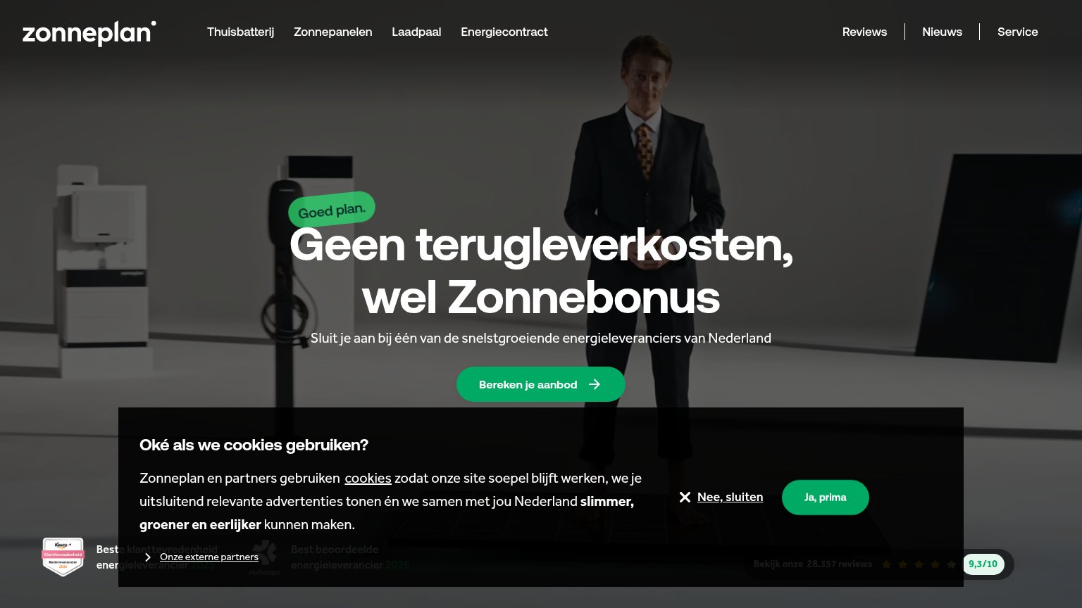
- Cookie consent banner — Dead blocker covering the bottom 55% of the fold, burying the reviews strip and trust badges with no conversion-valuable CTA.
- Badge over headline — The 'Goed plan.' badge overlaps the headline's first line, clipping 'Geen' and making the hero read as a rendering glitch.
Information hierarchy
72FairDoes the design help or inhibit what the page is trying to say?
 1234
- Cookie consent panel — Covers a third of the fold, burying the review-score trust strip beneath it.
- Ja, prima button — Same green pill styling as the primary CTA, creating two equal-weight buttons in the fold.
- Trust badge strip — Award badges and 28.357-review score are half-obscured and unreadable behind the overlay.
- Seven-link nav row — Reviews, Nieuws and Service links add exits at equal weight before the visitor reaches the CTA.
Value props
72FairTitle, subtitle, hero — do they sell the product's true value?
Zonneplan’s headline
Geen terugleverkosten, wel Zonnebonus
Sluit je aan bij één van de snelstgroeiende energieleveranciers van Nederland
Working
Could improve
Trust
76FairProof that the product is real, competent, and safe to try.
How Zonneplan compares
Trust read
CTA
82StrongCopy, size, verb, cost-feel — does the primary CTA earn the click?
How Zonneplan compares
Recommended rewrites