
Your landing page’s weakest score is Trust.
How NODI Energy ranks
- 1.
Zonneplan74
- 2.
1KOMMA5°66
- 3.
Sunrun63
- 4.
NODI Energy58
- 5.
Sonnen53
- 6.
Tibber45
Trust
48PoorProof that the product is real, competent, and safe to try.
| Trust read | |
|---|---|
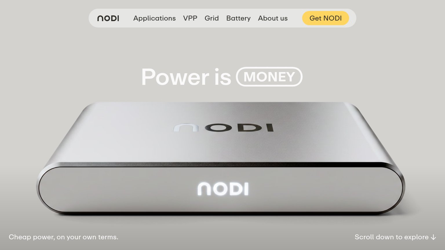
| NODI Energy | Realistic product shot of the physical NODI device with illuminated logo |
| Hero product render of the sonnen home battery unit | |
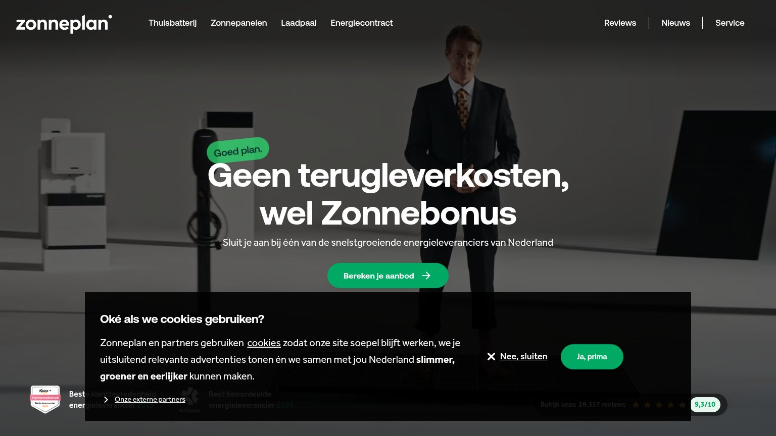
| "Bekijk onze 28.357 reviews" with five stars and "9,3/10" score bar | |
| App UI screenshot showing "ID4" vehicle with "Smart Charging: On" and "20% 69km" battery status | |
| implicit context 1KOMMA5° may benefit from pre-existing familiarity among its target audience. | |
| implicit context Sunrun may benefit from pre-existing familiarity among its target audience. |
Mobile web
52FairThe phone experience as a first-class citizen.
 123
- Header without CTA — The yellow "Get NODI" button from desktop is dropped on mobile, leaving no tappable CTA in the first viewport.
- Clipped tagline text — "Cheap power, on NODI Energy's own terms" is cut off at the right edge, reading "tbrm" where it overlaps the scroll arrow.
- Overlapping scroll arrow — The scroll-down arrow sits on top of the tagline's final word instead of its own clear tap zone.
Value props
55FairTitle, subtitle, hero — do they sell the product's true value?
NODI Energy’s headline
Power is MONEY
Cheap power, on your own terms.
Working
Could improve
CTA
58FairCopy, size, verb, cost-feel — does the primary CTA earn the click?
How NODI Energy compares
Recommended rewrites
Information hierarchy
76FairDoes the design help or inhibit what the page is trying to say?
What works
What to improve