
Your landing page’s weakest score is Information hierarchy.
How Sonnen ranks
53Growth scoreupdated
category scores
category scoresShowHide
Information hierarchy
38PoorDoes the design help or inhibit what the page is trying to say?
 1234
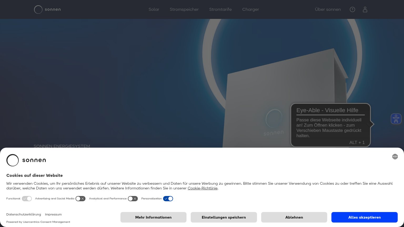
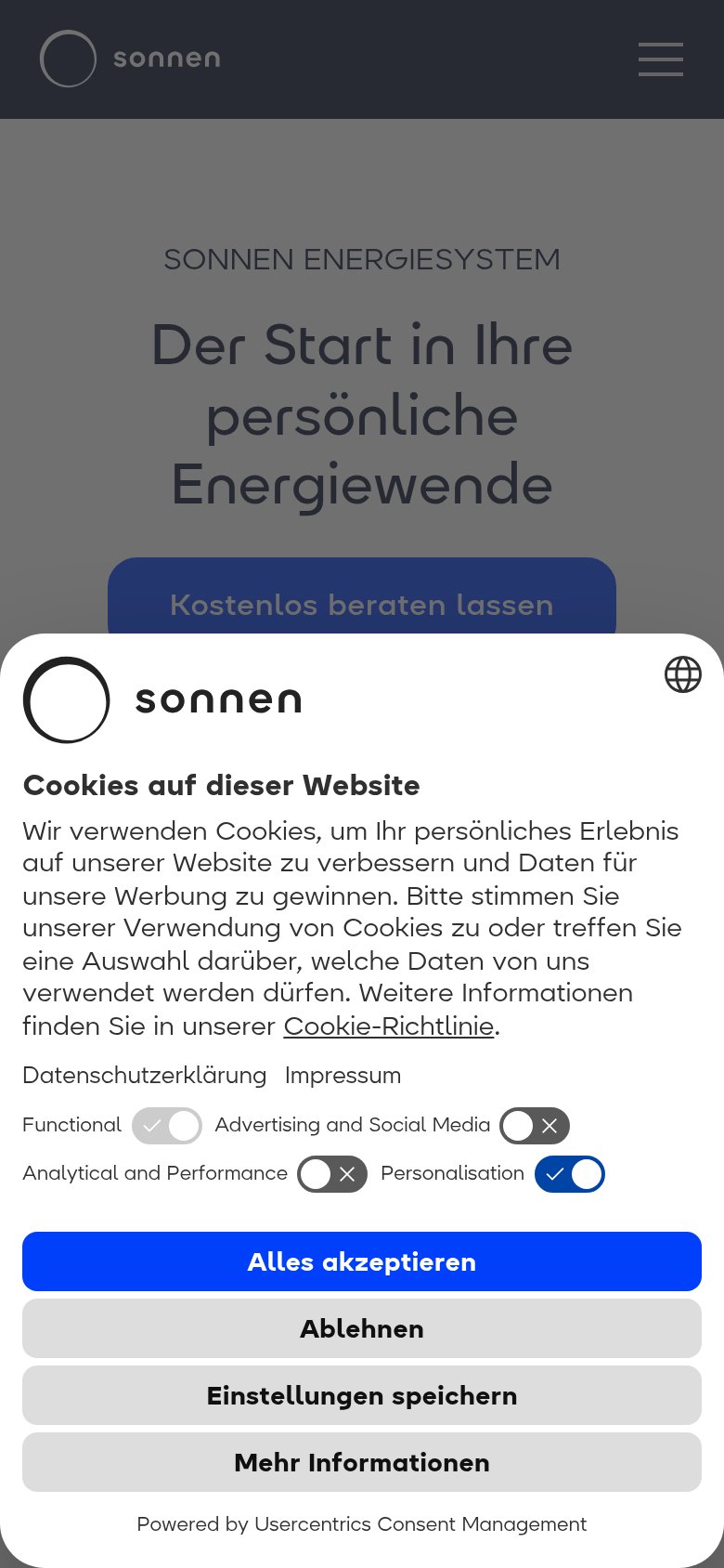
- Cookie consent banner — Full-width consent panel with four equal-weight buttons covers the lower third of the fold and blocks the hero CTA.
- Eye-Able tooltip popup — Accessibility tooltip overlays the hero product image and adds a second competing panel to an already occluded fold.
- Hero headline text — "SONNEN ENERGIESYSTEM" eyebrow is clipped at the fold edge behind the consent banner, so the value proposition never lands on desktop.
- Consent button row — Four same-size buttons — "Mehr Informationen", "Einstellungen speichern", "Ablehnen", "Alles akzeptieren" — read at near-equal weight and stall the visitor before any product action.
Trust
44PoorProof that the product is real, competent, and safe to try.
| Trust read | |
|---|---|
| Sonnen | Hero product render of the sonnen home battery unit |
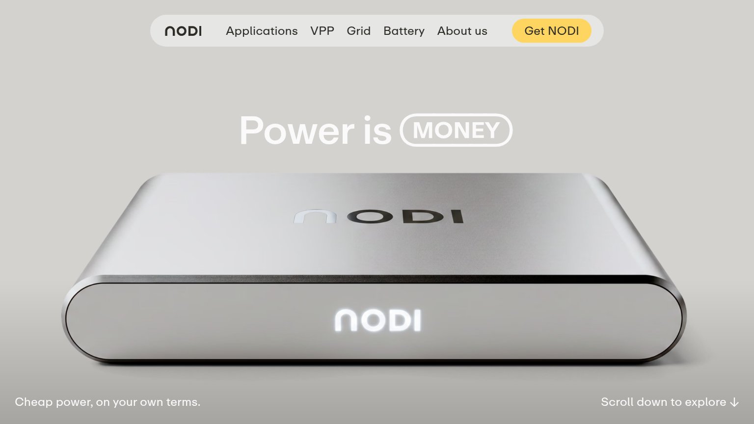
| Realistic product shot of the physical NODI device with illuminated logo | |
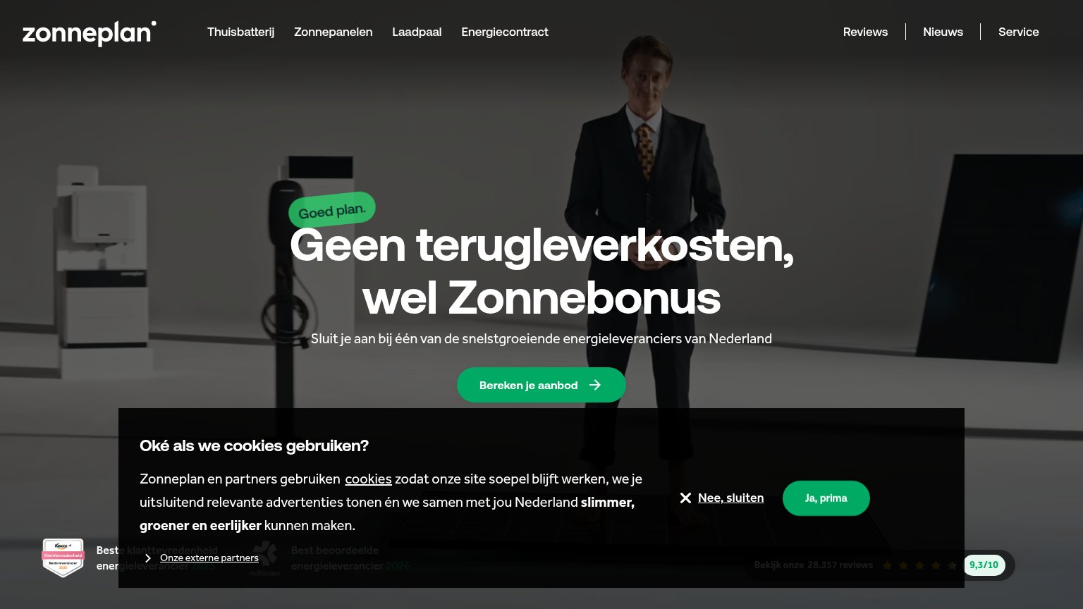
| "Bekijk onze 28.357 reviews" with five stars and "9,3/10" score bar | |
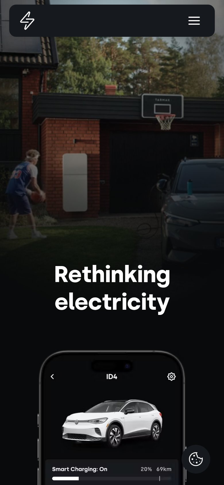
| App UI screenshot showing "ID4" vehicle with "Smart Charging: On" and "20% 69km" battery status | |
| implicit context 1KOMMA5° may benefit from pre-existing familiarity among its target audience. | |
| implicit context Sunrun may benefit from pre-existing familiarity among its target audience. |
Value props
52FairTitle, subtitle, hero — do they sell the product's true value?
Sonnen’s headline
Der Start in Ihre persönliche Energiewende
Working
Could improve
Mobile web
58FairThe phone experience as a first-class citizen.
What works
What to improve
CTA
72FairCopy, size, verb, cost-feel — does the primary CTA earn the click?
How Sonnen compares
Recommended rewrites