
Your landing page’s weakest score is Mobile web.
How Persona ranks
72Growth scoreupdated
category scores
category scoresShowHide
Mobile web
64FairThe phone experience as a first-class citizen.
 1234
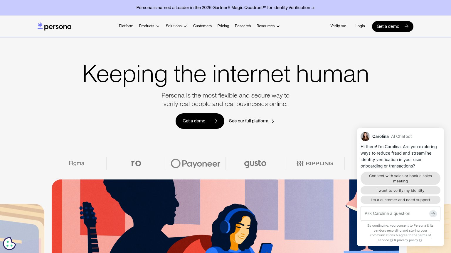
- Carolina chat pop-up — Auto-opened chat bubble covers a third of the viewport over the hero image, with no conversion-valuable CTA.
- Ask Carolina pill — Second sticky chat control stacked below the pop-up, doubling the interruption and hiding more of the page.
- Gartner announcement banner — Two-line promo banner eats the top of the first viewport and pushes the hero down.
- Cookie/consent icon — Floating consent widget overlaps the hero illustration in the bottom-left corner, adding a third overlay element.
Information hierarchy
72FairDoes the design help or inhibit what the page is trying to say?
 1234
- Carolina chatbot panel — Auto-expanded with three quick-reply buttons, it commands the right third of the fold and competes with the hero CTA at equal visual weight.
- Seven-item nav row — Platform, Products, Solutions, Customers, Pricing, Research, Resources plus dropdowns offer a dozen exits before the demo CTA.
- Gartner announcement banner — A full-width linked banner sits above the brand and pulls the first click away from the conversion path.
- See our full platform — Secondary link sits directly beside the primary CTA at similar size, splitting the single decision point.
CTA
72FairCopy, size, verb, cost-feel — does the primary CTA earn the click?
How Persona compares
Recommended rewrites
Value props
72FairTitle, subtitle, hero — do they sell the product's true value?
Persona’s headline
Keeping the internet human
Persona is the most flexible and secure way to verify real people and real businesses online.
Working
Could improve
Trust
78FairProof that the product is real, competent, and safe to try.
How Persona compares
Trust read