
Your landing page’s weakest score is Trust.
How Didit ranks
73Growth scoreupdated
category scores
category scoresShowHide
Trust
62FairProof that the product is real, competent, and safe to try.
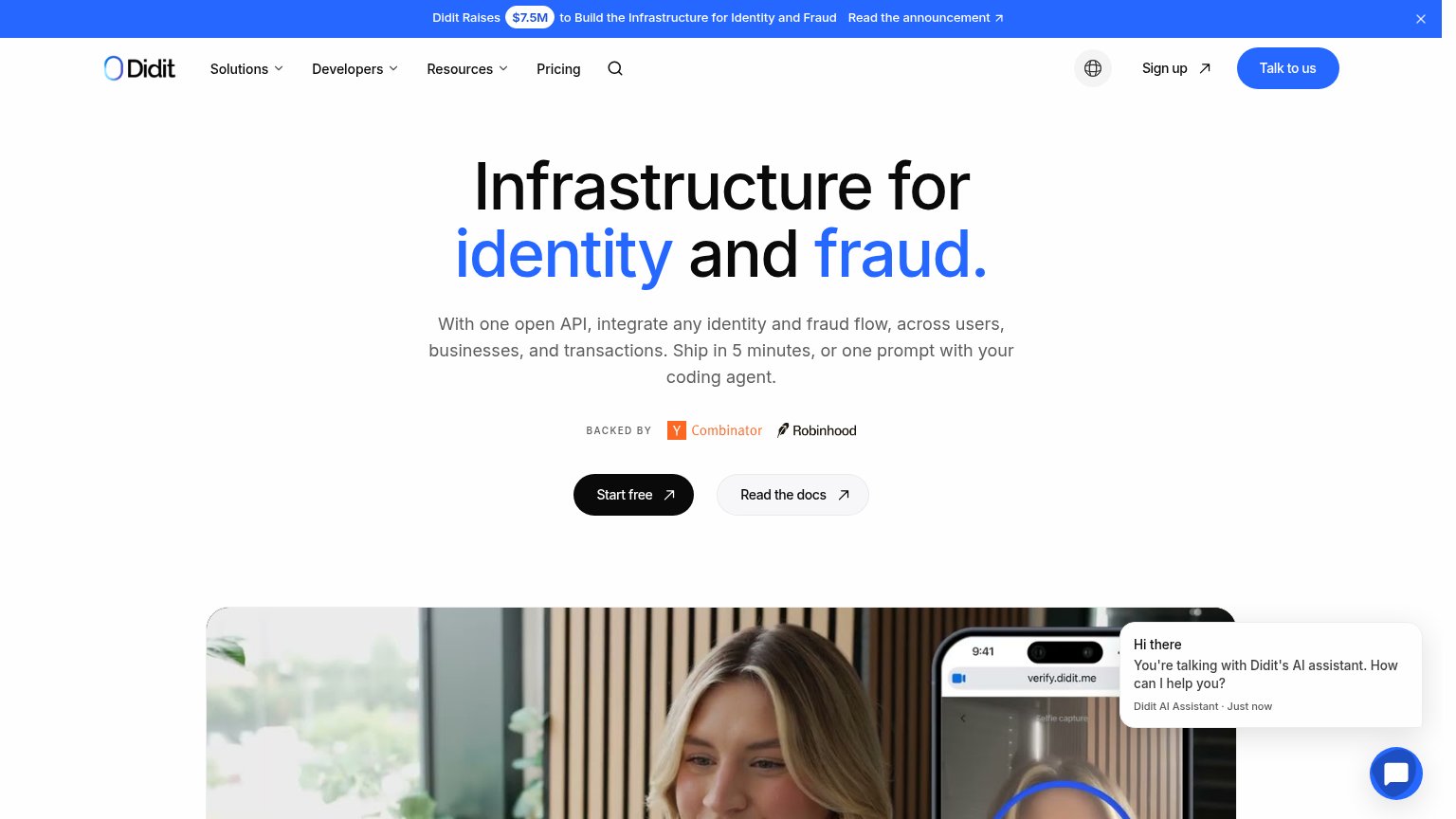
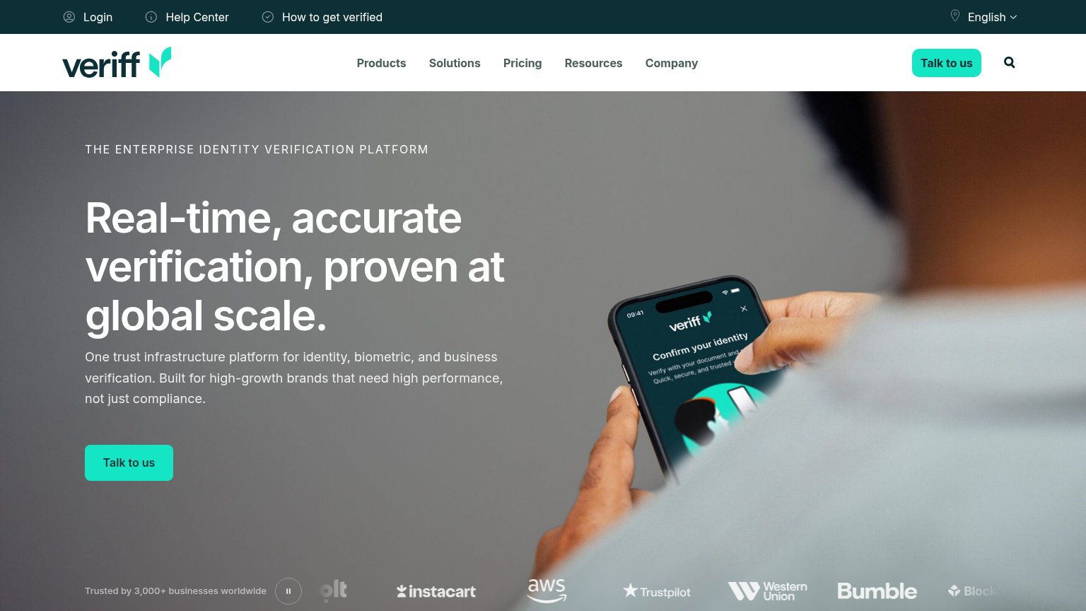
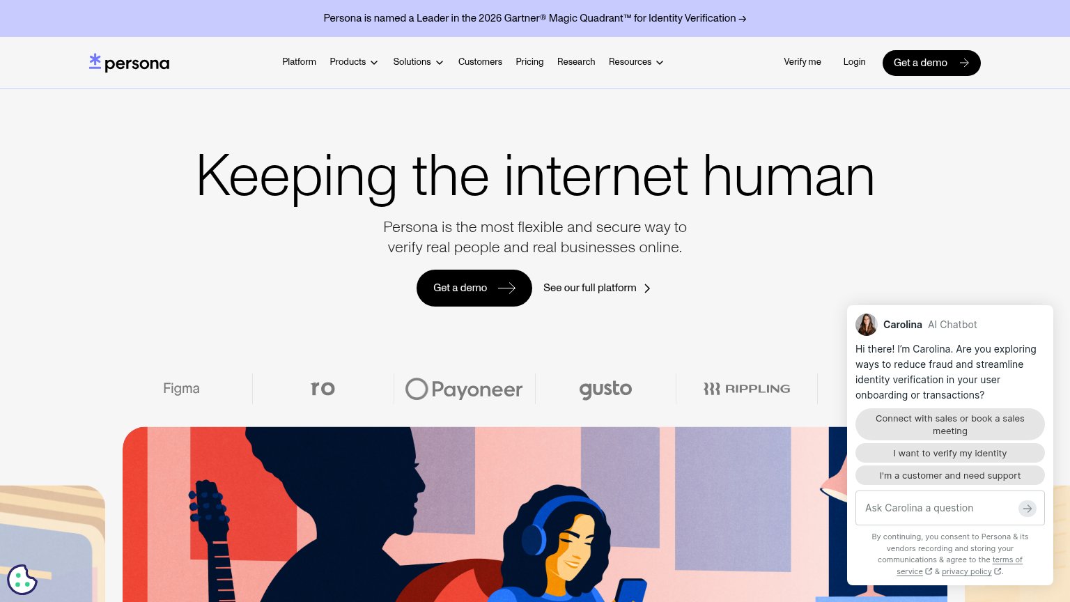
| Trust read | |
|---|---|
| Didit | "BACKED BY Y Combinator Robinhood" investor strip above the Start free CTA |
| Customer logo strip below the hero CTA (Bybit, BingX, Gate and others) | |
| "Persona is named a Leader in the 2026 Gartner® Magic Quadrant™ for Identity Verification" banner | |
| "Trusted by 3,000+ businesses worldwide" with logo strip (Instacart, AWS, Trustpilot, Western Union, Bumble) | |
| implicit context Onfido may benefit from pre-existing familiarity among its target audience. | |
| News banner: "Jumio’s selfie.DONE™ Eliminates ID Scan for Trusted Users — Read the News" |
Information hierarchy
72FairDoes the design help or inhibit what the page is trying to say?
1234- Talk to us button — Filled blue pill rivals the black Start free CTA, splitting the primary action's weight.
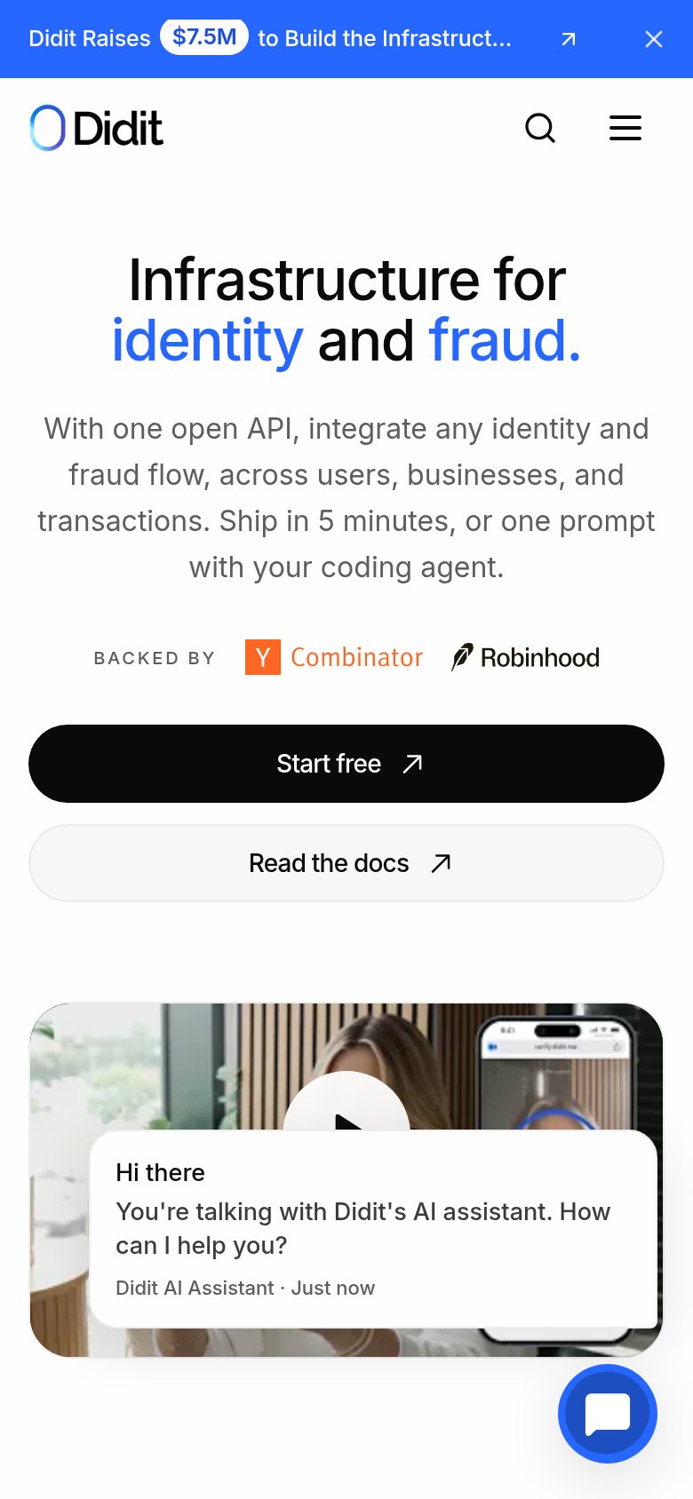
- AI assistant popup — Auto-opened chat card covers the hero video; on mobile it hides the play button entirely.
- Announcement banner — Top-of-page $7.5M banner with a link is the first exit path visitors see before the value prop.
- Read the docs button — Same size and shape as Start free, sitting beside it and diluting the single conversion path.
Value props
72FairTitle, subtitle, hero — do they sell the product's true value?
Didit’s headline
Infrastructure for identity and fraud.
With one open API, integrate any identity and fraud flow, across users, businesses, and transactions. Ship in 5 minutes, or one prompt with your coding agent.
Working
Could improve
Mobile web
72FairThe phone experience as a first-class citizen.
What works
What to improve
CTA
88StrongCopy, size, verb, cost-feel — does the primary CTA earn the click?
How Didit compares
Recommended rewrites