
Your landing page’s weakest score is Mobile web.
How Wealthfront ranks
Mobile web
48PoorThe phone experience as a first-class citizen.
 123
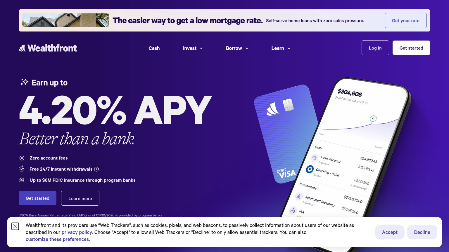
- Cookie consent sheet — Covers roughly half the viewport with a dead blocker whose only taps are Accept/Decline — pure friction with no conversion CTA.
- Mortgage promo banner — Off-topic message occupies the very top of the fold before the logo, pushing the hero and its CTA further down.
- FDIC insurance line — Text is clipped mid-word ('banks') by the consent sheet, making a trust claim look broken.
Trust
66FairProof that the product is real, competent, and safe to try.
| Trust read | |
|---|---|
| Wealthfront | Up to $8M FDIC insurance through program banks |
| "Astor is the new SEC-registered AI investment advisor built for busy professionals" | |
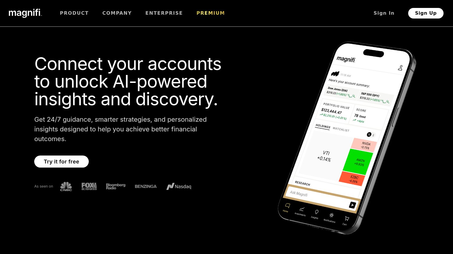
| "As seen on" press logo strip: CNBC, Fox Business, Bloomberg Radio, Benzinga, Nasdaq | |
| implicit context Betterment may benefit from pre-existing familiarity among its target audience. | |
| Phone mockup showing "We found 14 actions that can save you $3,457" with a Tax Strategy card: "Save $2,200 on childcare" | |
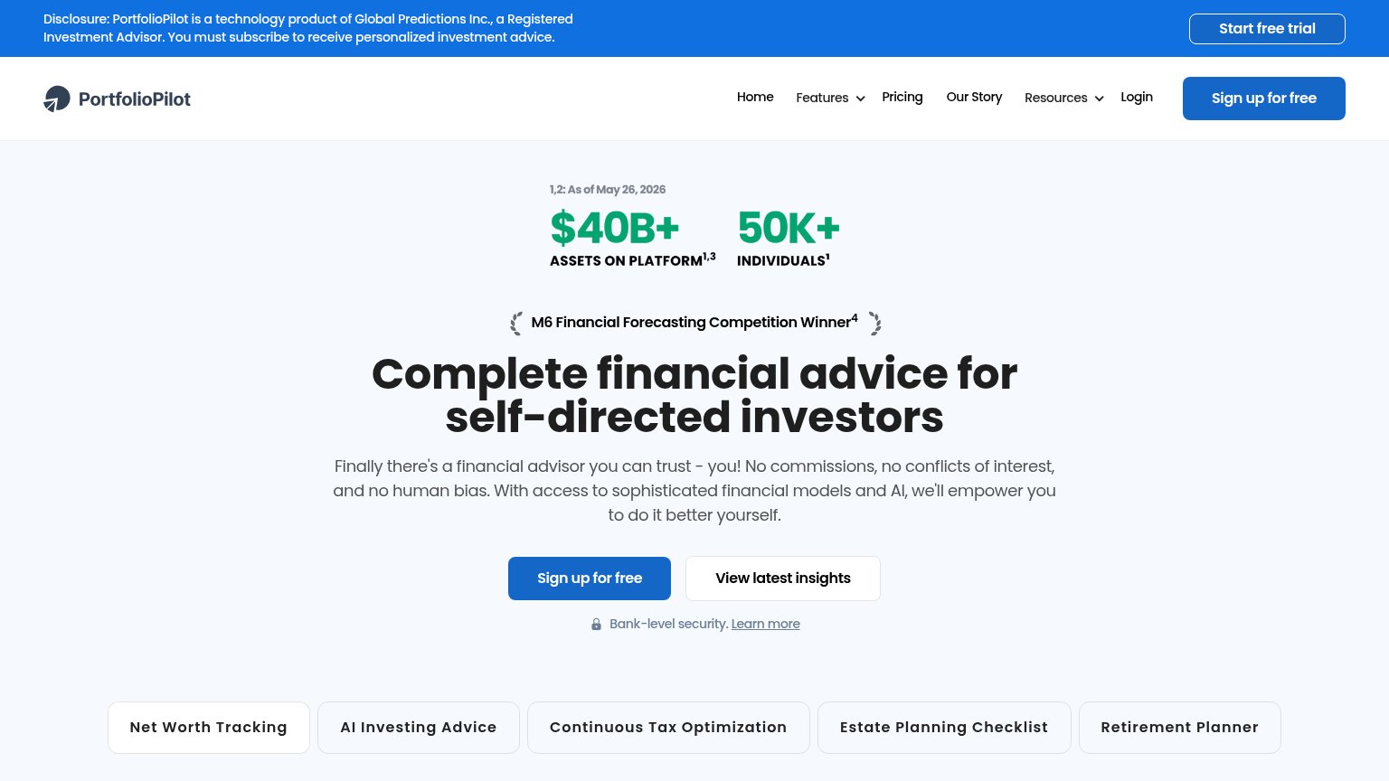
| "$40B+ Assets on Platform / 50K+ Individuals" stat block dated "1,2: As of May 26, 2026" |
Information hierarchy
74FairDoes the design help or inhibit what the page is trying to say?
What works
What to improve
CTA
74FairCopy, size, verb, cost-feel — does the primary CTA earn the click?
How Wealthfront compares
Recommended rewrites
Value props
76FairTitle, subtitle, hero — do they sell the product's true value?
Wealthfront’s headline
Earn up to 4.20% APY
Better than a bank
Working
Could improve