
Your landing page’s weakest score is Trust.
How Viome ranks
78Growth scoreupdated
category scores
category scoresShowHide
Trust
74FairProof that the product is real, competent, and safe to try.
| Trust read | |
|---|---|
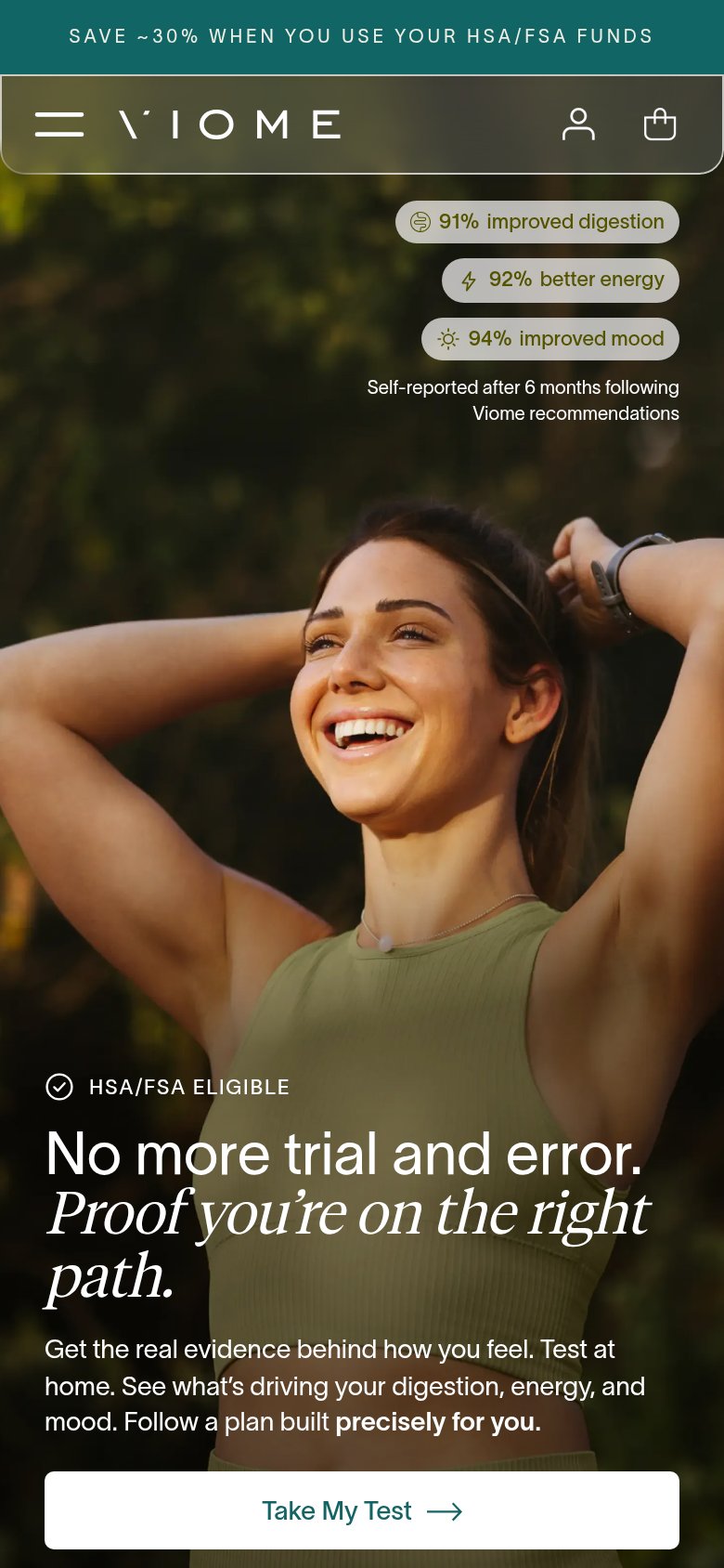
| Viome | Outcome stat badges: "91% improved digestion / 92% better energy / 94% improved mood — Self-reported after 6 months foll |
| "Backed by Y Combinator" badge below the hero product shot | |
| "Designed by ZOE gut health scientists" subheadline claim | |
| Phone mockup showing the Ombre Score report UI ("Ombre Score 84" with Diversity, Comparison, Ecosystem, Symptoms score b | |
| "Developed by researchers from" strip with Johns Hopkins, Stanford, Mayo Clinic, Washington University, Cornell, and Har | |
| Rated 4.5 on ★ Trustpilot · 326 verified reviews |
Information hierarchy
76FairDoes the design help or inhibit what the page is trying to say?
 1234
- Stats badges bottom-right — Three stacked stat pills sit far outside the left scan path, adding a competing block visitors read after the CTA instead of with the headline.
- Header nav links — Five nav destinations (Shop, About, Refer a Friend, Healthcare Providers, account/cart) plus 'Get Started' create exit paths before 'Take My Test' is seen.
- Get Started button — A second boxed CTA in the header competes at equal weight with the hero's 'Take My Test', splitting the primary action into two labels.
- Testimonial ticker strip — Scrolling quotes creep into the fold half-cropped, adding moving text at the exact moment the visitor reaches the hero CTA.
CTA
76FairCopy, size, verb, cost-feel — does the primary CTA earn the click?
How Viome compares
Recommended rewrites
Mobile web
78FairThe phone experience as a first-class citizen.
What works
What to improve
Value props
84StrongTitle, subtitle, hero — do they sell the product's true value?
Viome’s headline
No more trial and error. Proof you're on the right path.
Get the real evidence behind how you feel. Test at home. See what's driving your digestion, energy, and mood. Follow a plan built precisely for you.
Working
Could improve