
Your landing page’s weakest score is Trust.
How Gutgutgoose ranks
70Growth scoreupdated
category scores
category scoresShowHide
Trust
52FairProof that the product is real, competent, and safe to try.
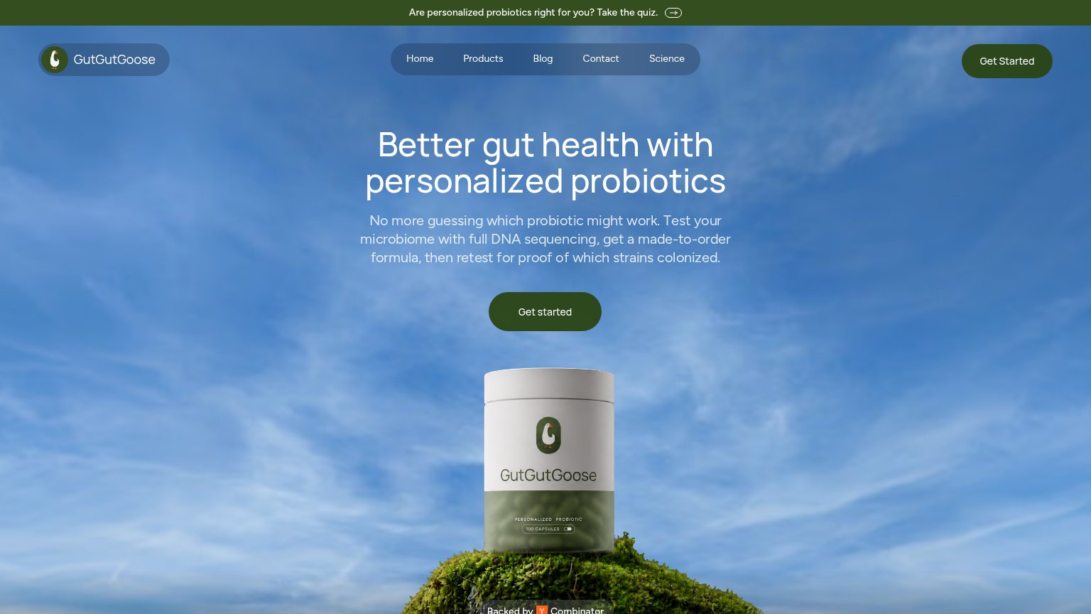

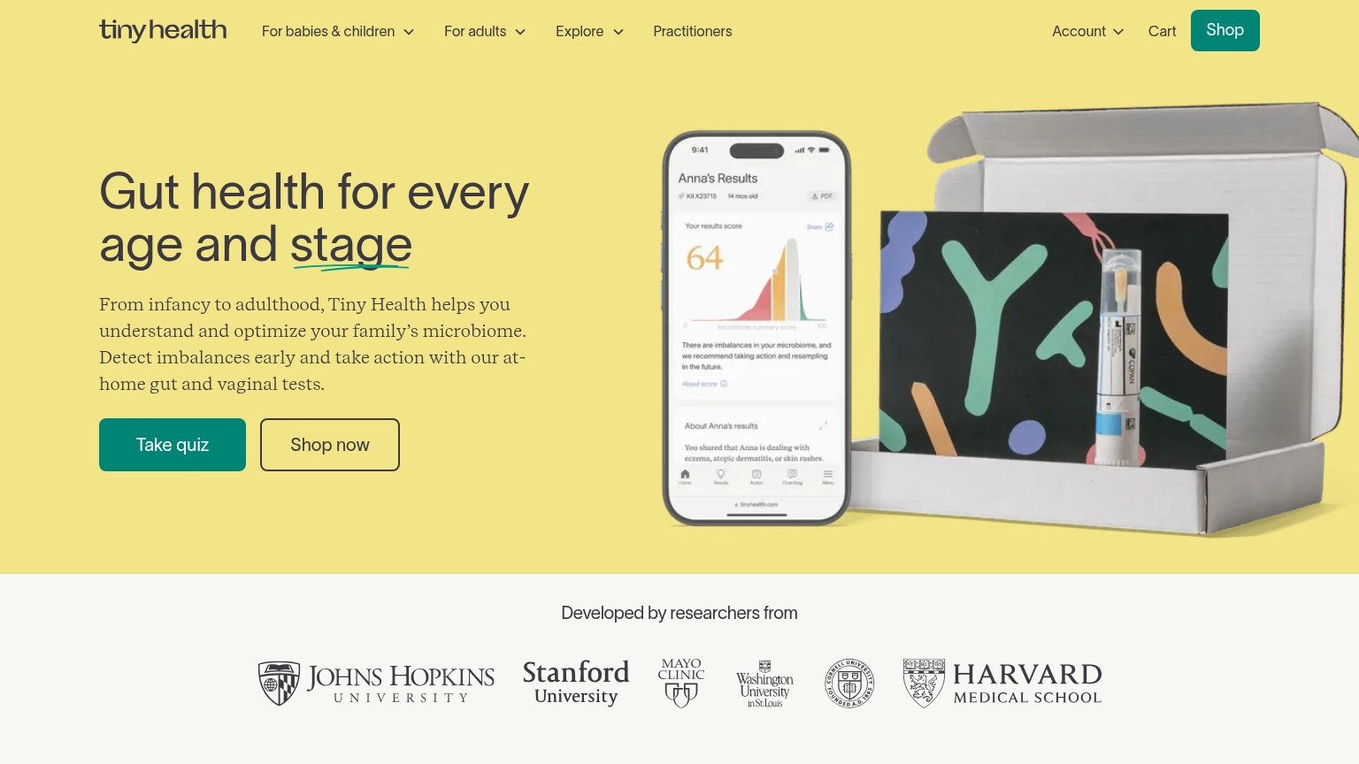
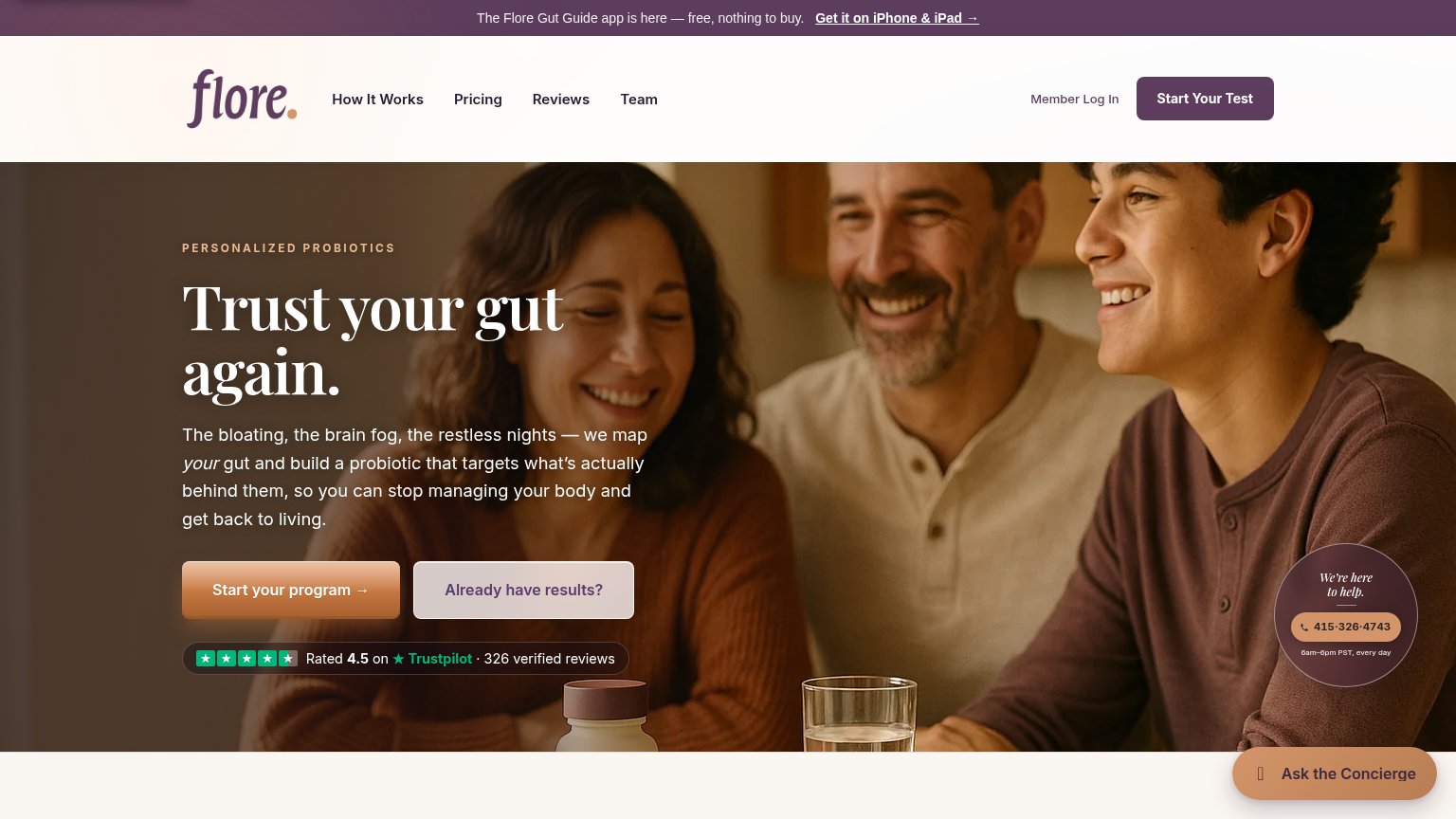
| Trust read | |
|---|---|
| Gutgutgoose | "Backed by Y Combinator" badge below the hero product shot |
| Outcome stat badges: "91% improved digestion / 92% better energy / 94% improved mood — Self-reported after 6 months foll | |
| "Designed by ZOE gut health scientists" subheadline claim | |
| Phone mockup showing the Ombre Score report UI ("Ombre Score 84" with Diversity, Comparison, Ecosystem, Symptoms score b | |
| "Developed by researchers from" strip with Johns Hopkins, Stanford, Mayo Clinic, Washington University, Cornell, and Har | |
| Rated 4.5 on ★ Trustpilot · 326 verified reviews |
Information hierarchy
72FairDoes the design help or inhibit what the page is trying to say?
1234- Header Get Started button — Dark green button nearly disappears into the dark navy sky background, and it duplicates the hero CTA at equal weight.
- Top quiz banner — A second conversion path ('Take the quiz') sits above everything, competing with 'Get started' before the value prop is read.
- Hero Get started button — Dark green on mid-blue sky yields low contrast for the single most important element on the page.
- Nav pill bar — Five nav links float in a highlighted pill at the fold's center-top, drawing eye-level attention away from the headline.
CTA
72FairCopy, size, verb, cost-feel — does the primary CTA earn the click?
How Gutgutgoose compares
Recommended rewrites
Value props
78FairTitle, subtitle, hero — do they sell the product's true value?
Gutgutgoose’s headline
Better gut health with personalized probiotics
No more guessing which probiotic might work. Test your microbiome with full DNA sequencing, get a made-to-order formula, then retest for proof of which strains colonized.
Working
Could improve
Mobile web
78FairThe phone experience as a first-class citizen.
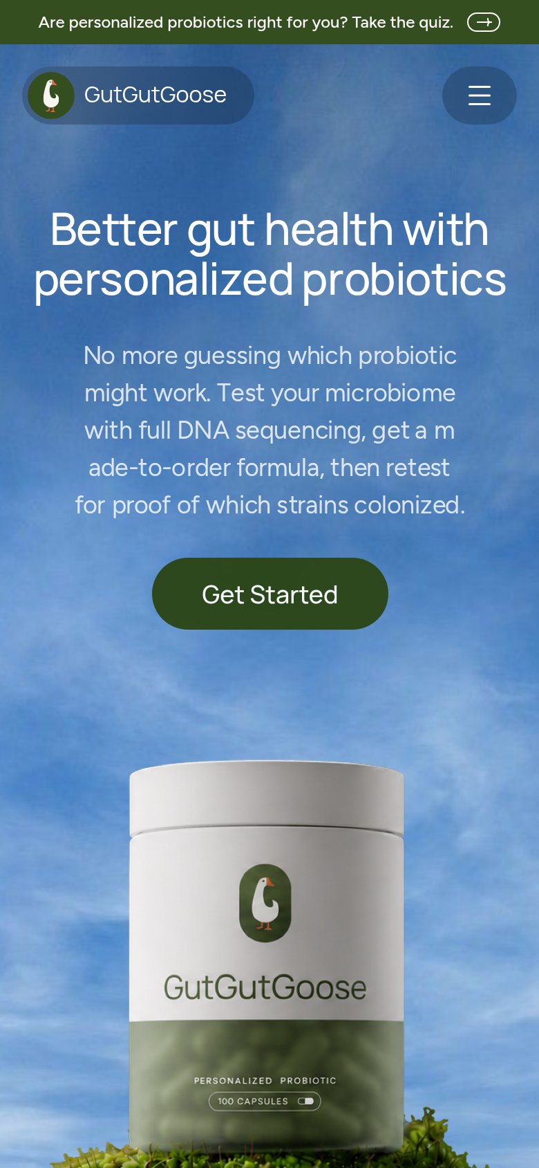
What works
What to improve