
Your landing page’s weakest score is Trust.
How Userpilot ranks
Trust
42PoorProof that the product is real, competent, and safe to try.
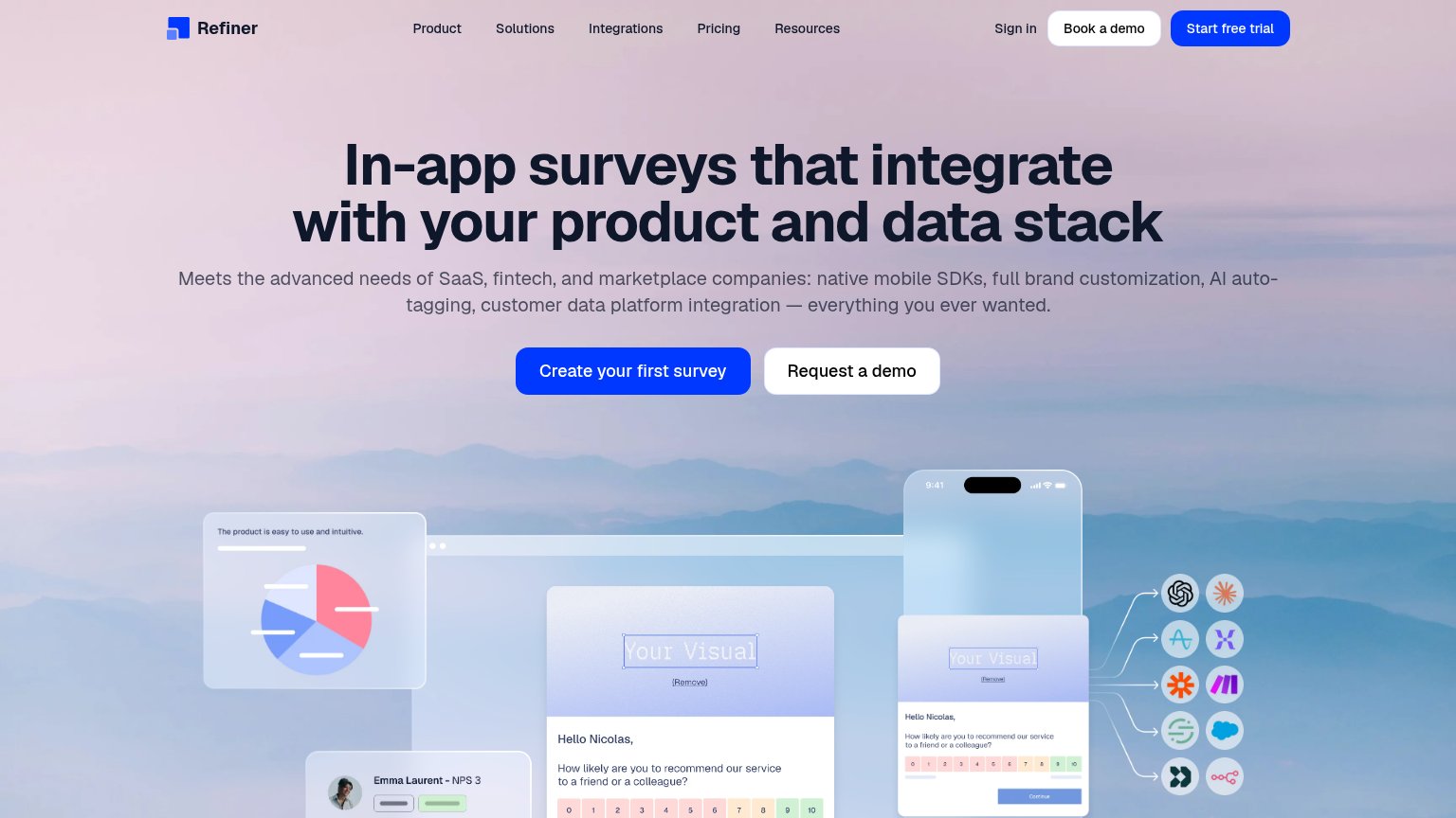
| Trust read | |
|---|---|
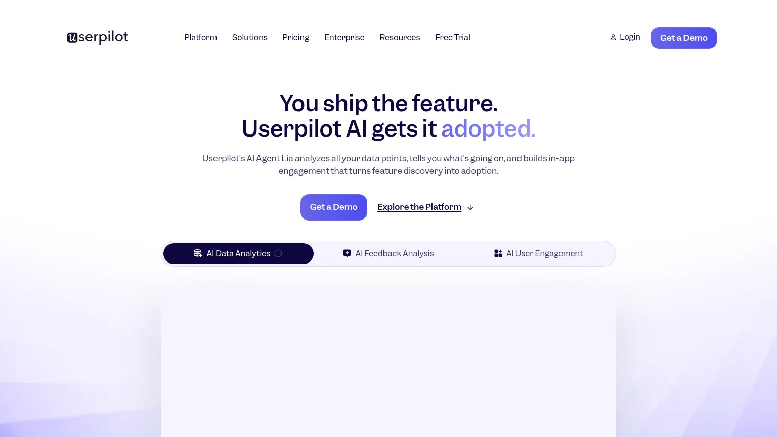
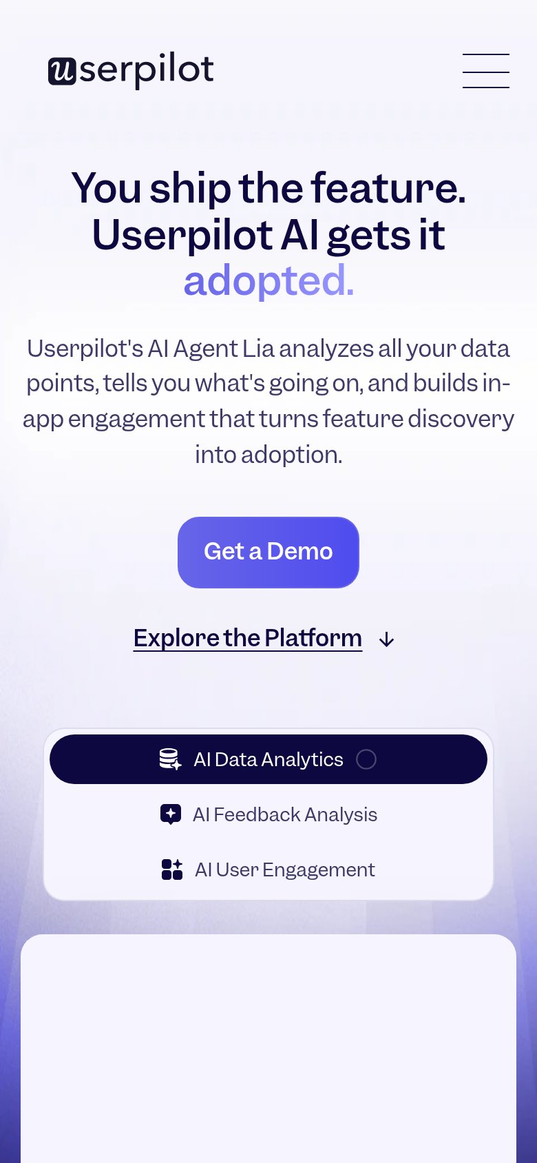
| Userpilot | Feature tab bar listing "AI Data Analytics / AI Feedback Analysis / AI User Engagement" |
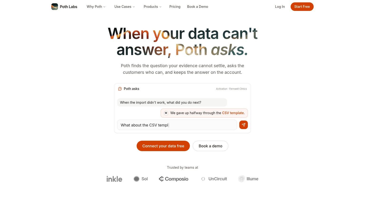
| "Trusted by teams at" logo strip (inkle, Sol, Composio, UnCircuit, Illume) | |
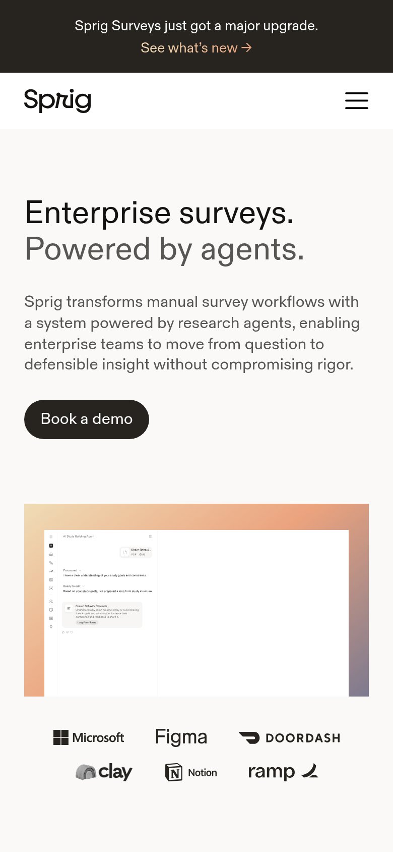
| Customer logo row: Microsoft, Figma, DoorDash, Clay, Notion, Ramp (mobile fold) | |
| In-product NPS survey widget mockup ("How likely are you to recommend our service to a friend or a colleague?") with 0–1 | |
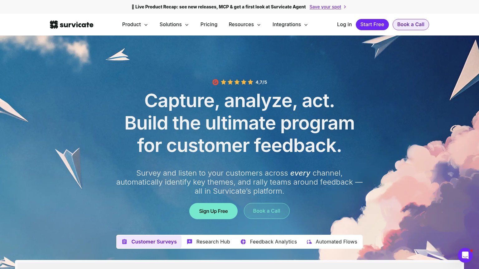
| 4,7/5 star rating badge above the hero headline | |
| implicit context Wynter may benefit from pre-existing familiarity among its target audience. |
CTA
68FairCopy, size, verb, cost-feel — does the primary CTA earn the click?
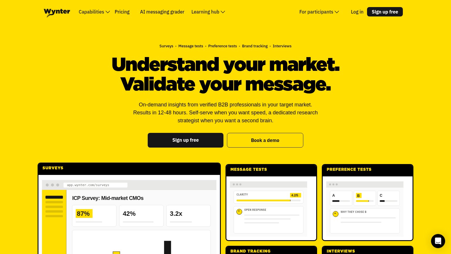
Problems
- no 'free' despite Free Trial in nav
- demo click feels sales-heavy
- free trial buried in nav menu
Value props
78FairTitle, subtitle, hero — do they sell the product's true value?
Userpilot’s headline
You ship the feature. Userpilot AI gets it adopted.
Userpilot's AI Agent Lia analyzes all your data points, tells you what's going on, and builds in-app engagement that turns feature discovery into adoption.
Working
Could improve
Mobile web
78FairThe phone experience as a first-class citizen.
What works
What to improve
Information hierarchy
82StrongDoes the design help or inhibit what the page is trying to say?
What works
What to improve