
Your landing page’s weakest score is Trust.
How Wynter ranks
Trust
48PoorProof that the product is real, competent, and safe to try.
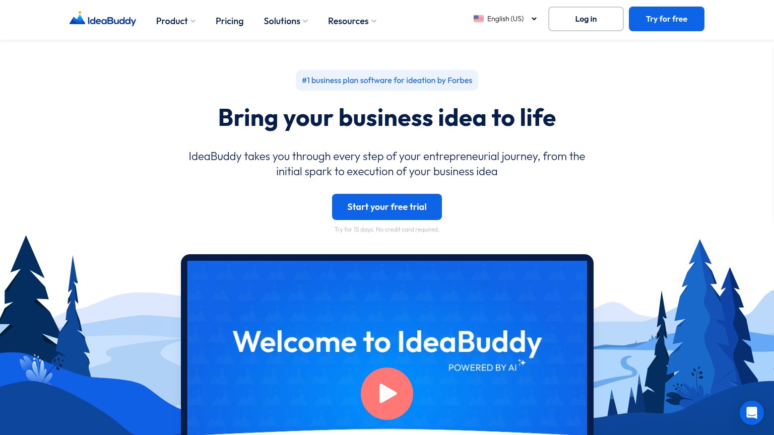
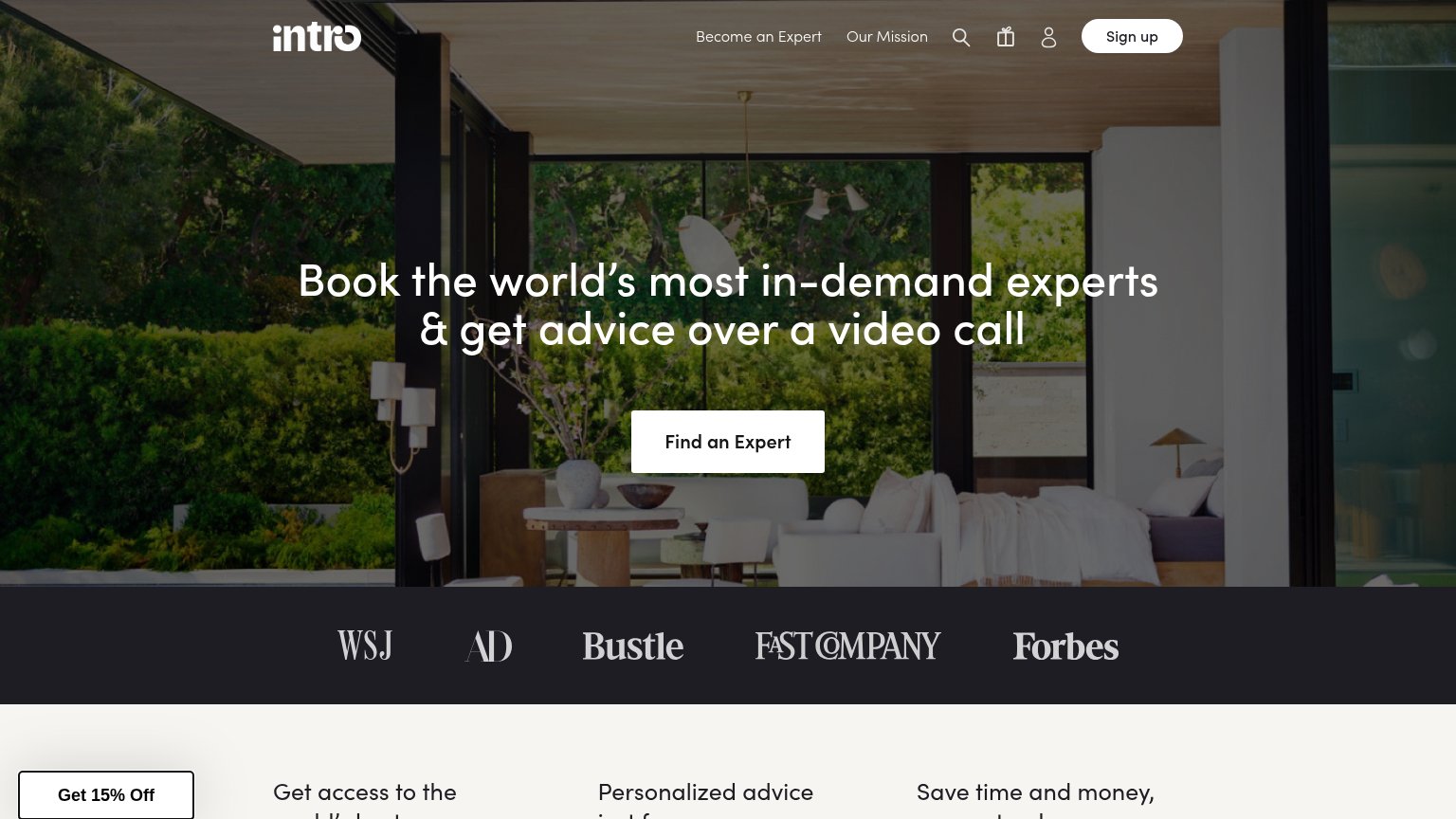
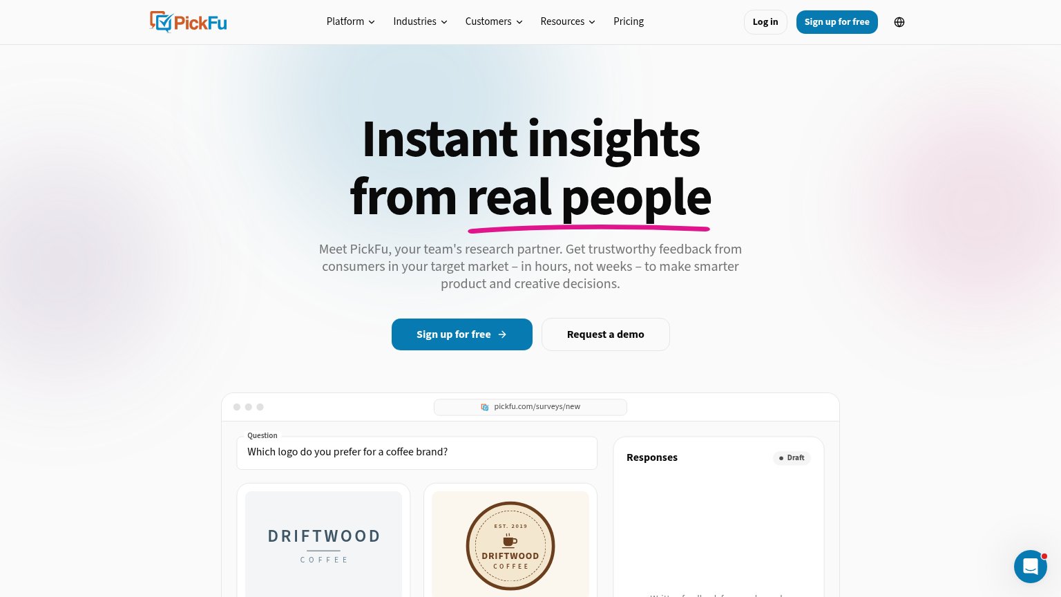
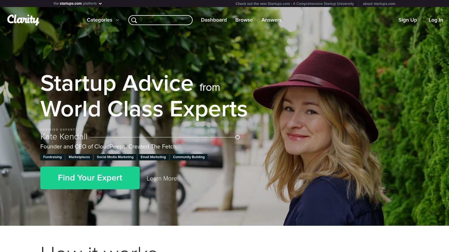
| Trust read | |
|---|---|
| Wynter | implicit context Wynter may benefit from pre-existing familiarity among its target audience. |
| No visible trust signal identified. | |
| "#1 business plan software for ideation by Forbes" badge above the headline | |
| Embedded survey demo UI: "Which logo do you prefer for a coffee brand?" with Option A/B vote results and "Collecting res | |
| "VERIFIED EXPERT — Kate Kendall, Founder and CEO of CloudPeeps. Created The Fetch." | |
| Press logo bar: WSJ, AD, Bustle, Fast Company, Forbes |
Mobile web
64FairThe phone experience as a first-class citizen.
 1234
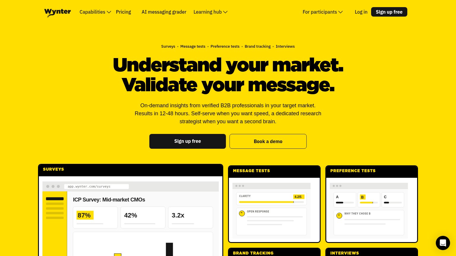
- Oversized hero headline — Wraps into six cramped lines and shoves the CTA to the viewport's bottom edge.
- Category dot strip — Five wrapping nav-style labels crowd the fold before the value statement lands.
- Chat bubble overlap — Intercom bubble covers the surveys card content — pure friction with no conversion CTA.
- Four-line subhead block — Dense paragraph adds another screen of reading between headline and CTA.
Information hierarchy
74FairDoes the design help or inhibit what the page is trying to say?
What works
What to improve
Value props
84StrongTitle, subtitle, hero — do they sell the product's true value?
Wynter’s headline
Understand your market. Validate your message.
On-demand insights from verified B2B professionals in your target market. Results in 12-48 hours. Self-serve when you want speed, a dedicated research strategist when you want a second brain.
Working
Could improve
CTA
86StrongCopy, size, verb, cost-feel — does the primary CTA earn the click?
How Wynter compares
Recommended rewrites