
Your landing page’s weakest score is Mobile web.
How TrueAccord ranks
- 1.
January77
- 2.
Audun69
- 3.
InDebted67
- 4.
Ophelos64
- 5.
receeve61
- 6.
TrueAccord58
Mobile web
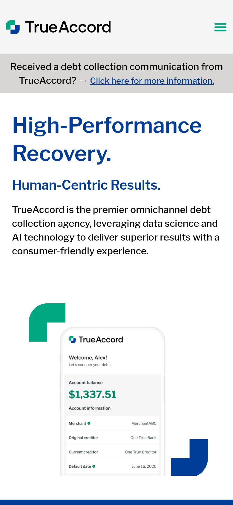
44PoorThe phone experience as a first-class citizen.
 12
- Debt notice banner — Three-line gray banner with an underlined link eats the top of the fold and routes consumer traffic before the value proposition appears.
- Oversized H1 headline — 'High-Performance Recovery.' barely scaled down from desktop, wrapping into two towering lines that push the body copy and any CTA far down.
Trust
52FairProof that the product is real, competent, and safe to try.
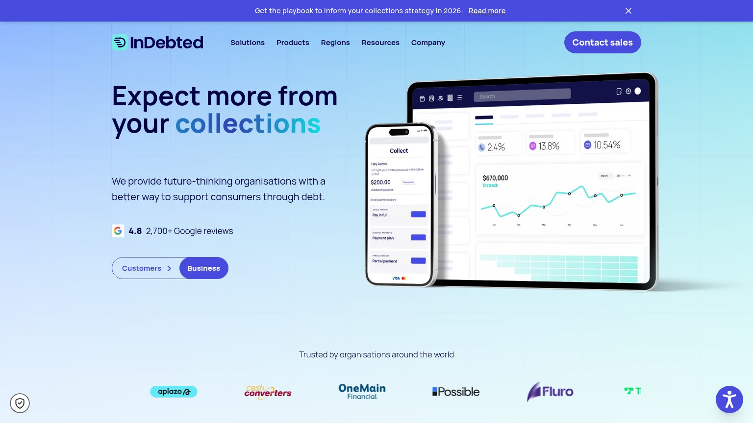

| Trust read | |
|---|---|
| TrueAccord | Consumer app UI mockup showing "Welcome, Alex!" with account balance $1,337.51 and creditor details |
| No visible trust signal identified. | |
| 4.8 2,700+ Google reviews | |
| ISO 27001, PCI & GDPR compliant | |
| "Part of intrum" parent-company badge in the top bar | |
| "$20B+ in debt worked across 20M+ consumers" stat block |
CTA
62FairCopy, size, verb, cost-feel — does the primary CTA earn the click?
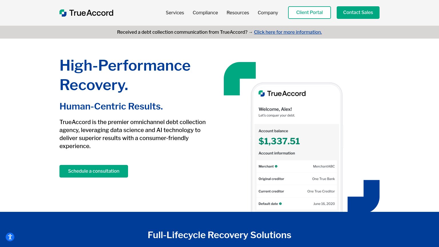
How TrueAccord compares
Recommended rewrites
Information hierarchy
66FairDoes the design help or inhibit what the page is trying to say?
What works
What to improve
Value props
68FairTitle, subtitle, hero — do they sell the product's true value?
TrueAccord’s headline
High-Performance Recovery.
Human-Centric Results.
Working
Could improve