
Your landing page’s weakest score is Trust.
How Ophelos ranks
64Growth scoreupdated
category scores
category scoresShowHide
Trust
42PoorProof that the product is real, competent, and safe to try.
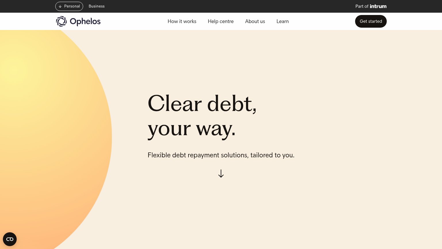
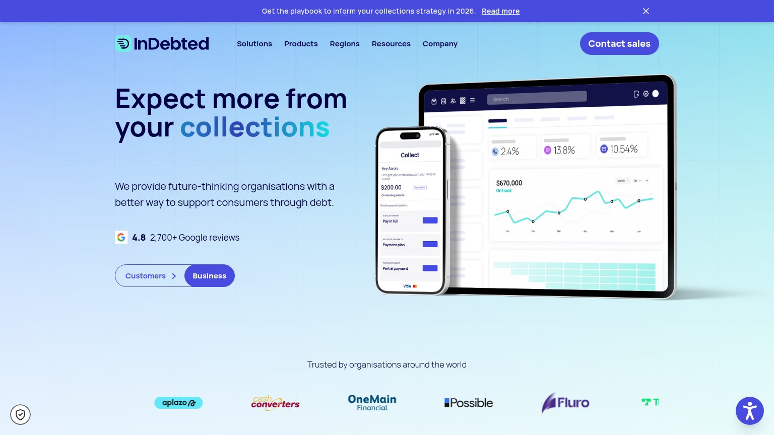

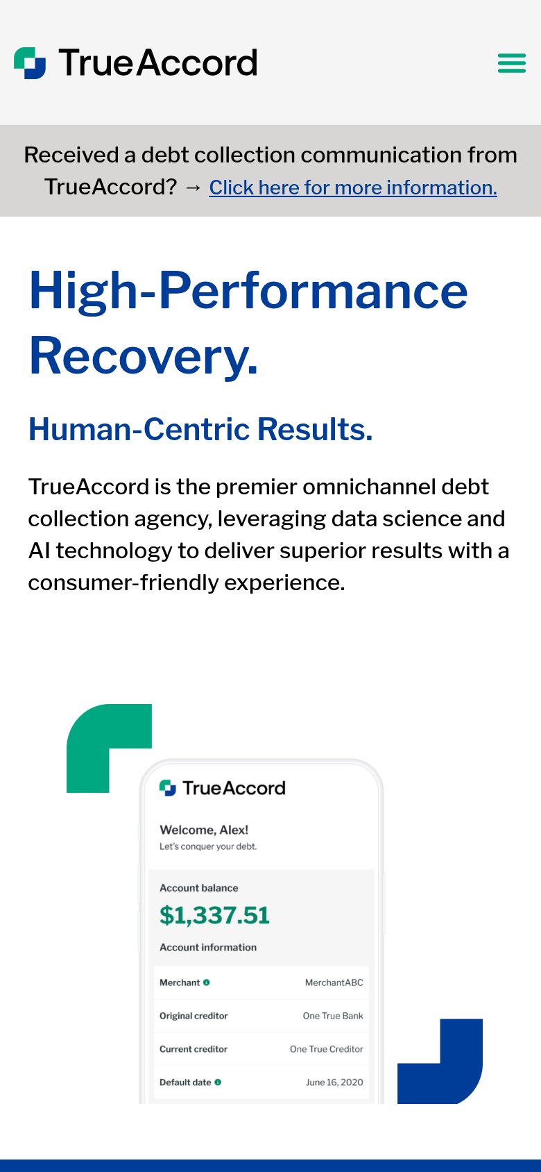
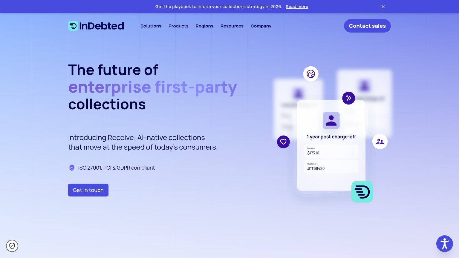
| Trust read | |
|---|---|
| Ophelos | "Part of intrum" parent-company badge in the top bar |
| No visible trust signal identified. | |
| Consumer app UI mockup showing "Welcome, Alex!" with account balance $1,337.51 and creditor details | |
| 4.8 2,700+ Google reviews | |
| ISO 27001, PCI & GDPR compliant | |
| "$20B+ in debt worked across 20M+ consumers" stat block |
Value props
62FairTitle, subtitle, hero — do they sell the product's true value?
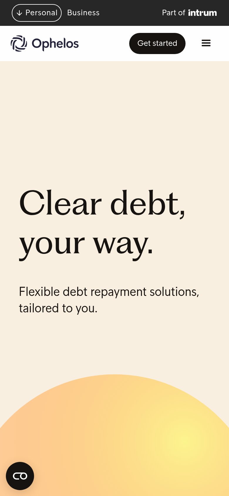
Ophelos’s headline undersells
Clear debt, your way.
Flexible debt repayment solutions, tailored to you.
Working
- Names the real outcome: debt cleared
- "Ophelos's way" signals control and dignity
- Calm tone fits an anxious audience
Could improve
- No numbers or proof points in fold
- Subhead restates headline, adds little
- Hero orb decorates, shows no product
CTA
68FairCopy, size, verb, cost-feel — does the primary CTA earn the click?
How Ophelos compares
Recommended rewrites
Mobile web
70FairThe phone experience as a first-class citizen.
What works
What to improve
Information hierarchy
78FairDoes the design help or inhibit what the page is trying to say?
What works
What to improve