
Your landing page’s weakest score is Value props.
How tldraw (computer/make) ranks
- 1.
pen.dev74
- 2.
Onlook70
- 3.
Paper70
- 4.
Figma (Dev Mode / Make)64
- 5.
tldraw (computer/make)61
61Growth scoreupdated
category scores
category scoresShowHide
Value props
15PoorTitle, subtitle, hero — do they sell the product's true value?
Working
- Live canvas shows the product itself
- Zero-friction: usable before sign-in
- SDK link hints at developer offering
Could improve
- No headline or value statement at all
- SDK pitch buried in tiny corner banner
- Nothing tells new visitors what tldraw is
Information hierarchy
62FairDoes the design help or inhibit what the page is trying to say?
 123
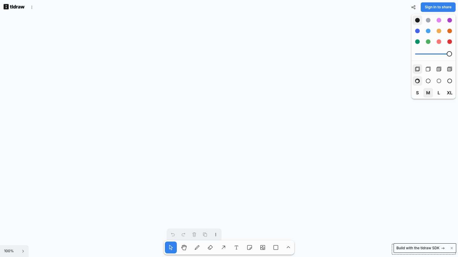
- Expanded style panel — Opens by default with ~20 unlabeled swatches and toggles, front-loading complexity before the visitor has drawn anything.
- Sign in to share — The only styled CTA offers no context for a first-time visitor and competes with nothing that explains the product.
- Build with SDK banner — Dashed developer banner in the corner splits the fold's action between end users and SDK buyers with equal ambiguity.
Trust
62FairProof that the product is real, competent, and safe to try.
How tldraw (computer/make) compares
Trust read
Mobile web
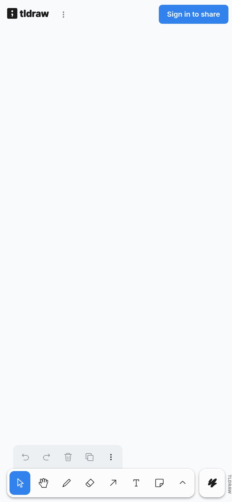
78FairThe phone experience as a first-class citizen.
What works
What to improve
CTA
86StrongCopy, size, verb, cost-feel — does the primary CTA earn the click?
How tldraw (computer/make) compares
Recommended rewrites