
Your landing page’s weakest score is Trust.
How Paper ranks
Trust
58FairProof that the product is real, competent, and safe to try.

| Trust read | |
|---|---|
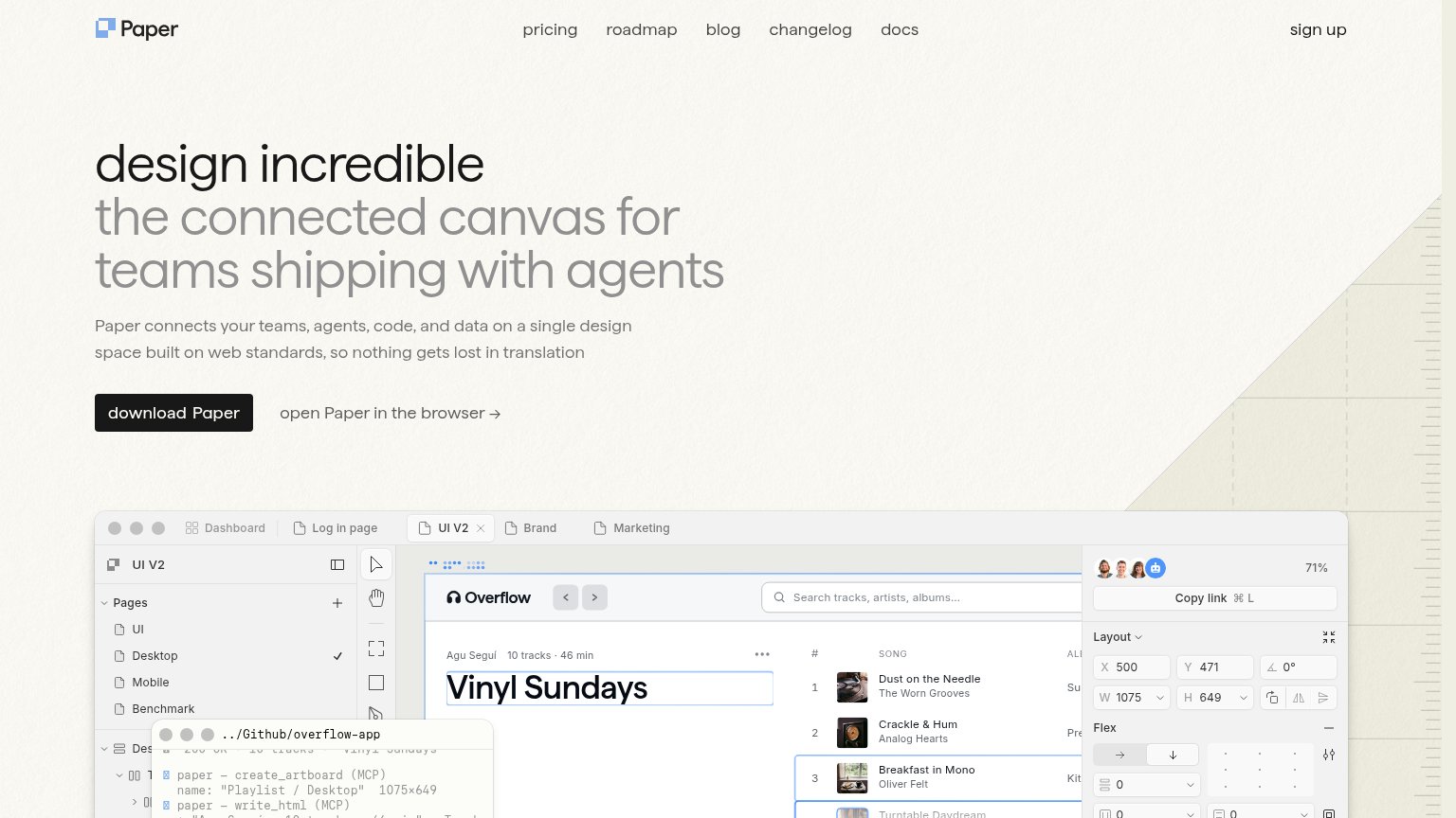
| Paper | Real product UI screenshot showing the canvas editor with a terminal overlay of agent MCP commands ("paper — create_artb |
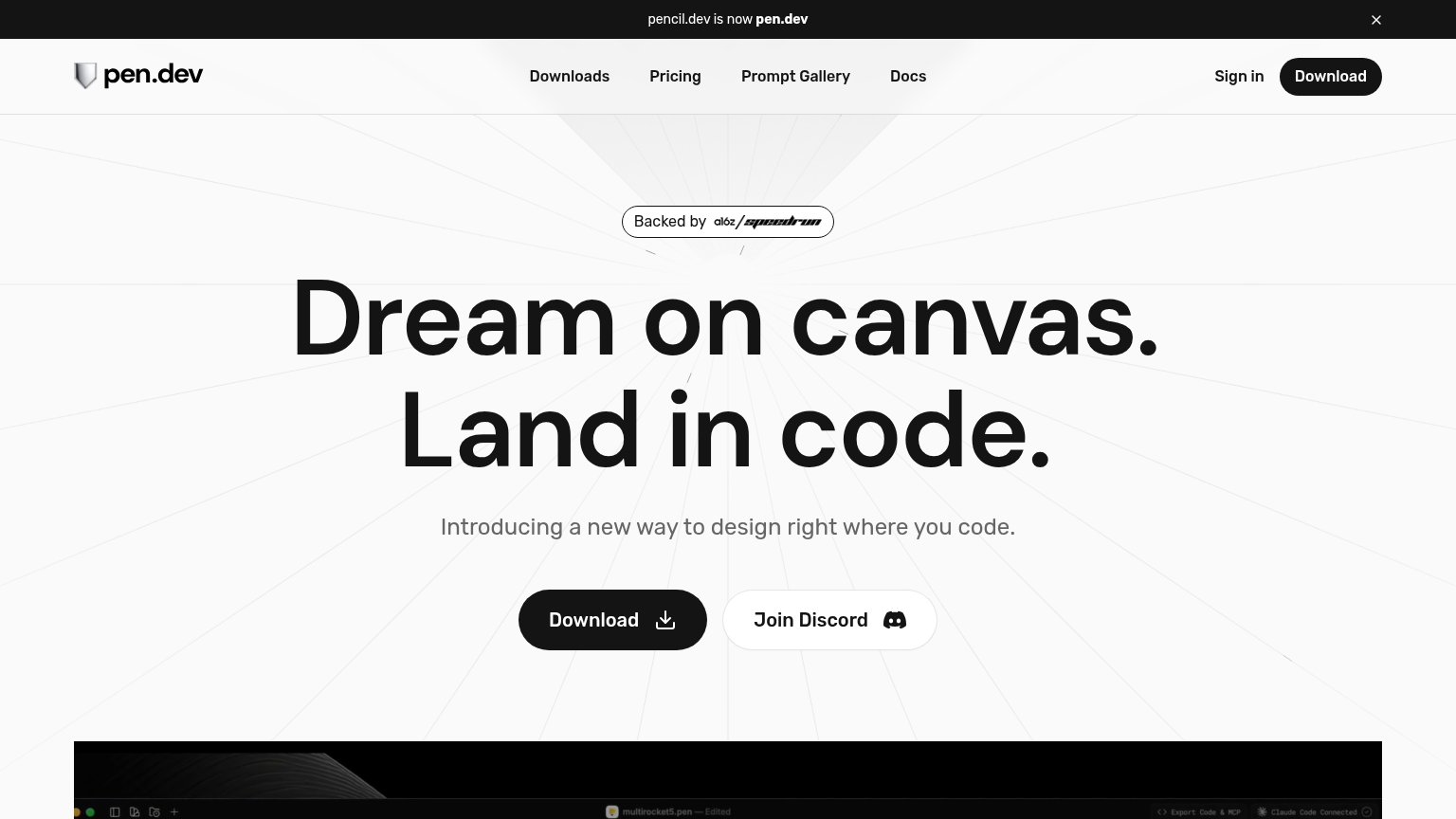
| "Backed by a16z speedrun" badge above the hero headline | |
| GitHub star count "26.6k" shown in the navigation bar | |
| implicit context tldraw (computer/make) may benefit from pre-existing familiarity among its target audience. | |
| implicit context Figma (Dev Mode / Make) may benefit from pre-existing familiarity among its target audience. |
Mobile web
68FairThe phone experience as a first-class citizen.
 123
- Oversized wrapping subhead — Wraps into five cramped lines and pushes the primary CTA to the fold's edge.
- download Paper button — Half-width desktop proportions instead of a thumb-friendly full-bleed tap target.
- Terminal log panel — Raw MCP command text is illegible noise on a phone and adds no story.
CTA
72FairCopy, size, verb, cost-feel — does the primary CTA earn the click?
How Paper compares
Recommended rewrites
Value props
72FairTitle, subtitle, hero — do they sell the product's true value?
Paper’s headline
design incredible the connected canvas for teams shipping with agents
Paper connects your teams, agents, code, and data on a single design space built on web standards, so nothing gets lost in translation
Working
Could improve
Information hierarchy
82StrongDoes the design help or inhibit what the page is trying to say?
What works
What to improve