
Your landing page’s weakest score is Trust.
How Fabulous ranks
71Growth scoreupdated
category scores
category scoresShowHide
Trust
56FairProof that the product is real, competent, and safe to try.
| Trust read | |
|---|---|
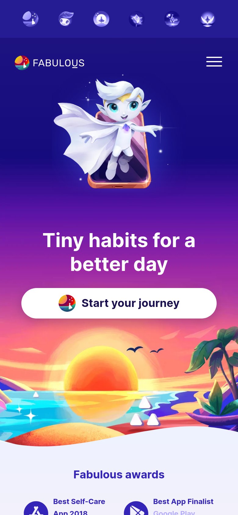
| Fabulous | "Fabulous awards" section citing "Best App Finalist — Google Play" (mobile capture) |
| No visible trust signal identified. | |
| "Join over 4 million Habiticans" usage claim in the subheadline | |
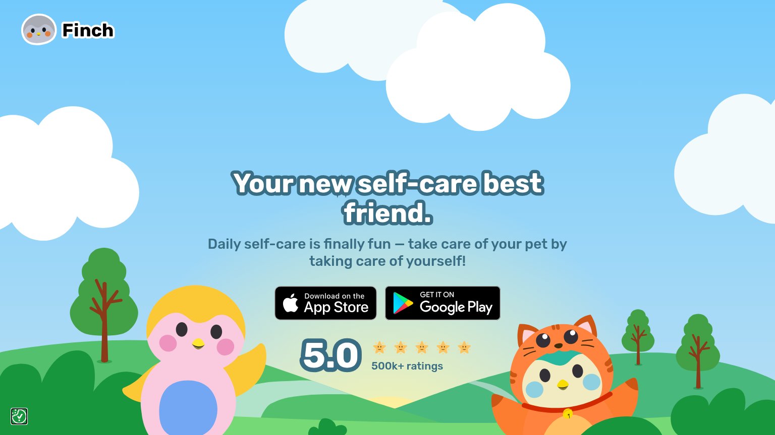
| 5.0 ★★★★★ 500k+ ratings | |
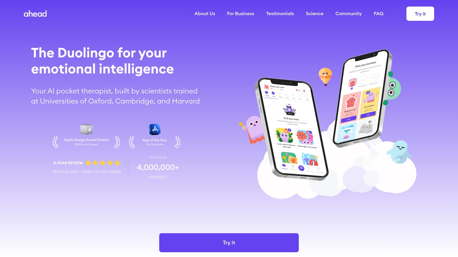
| 5-STAR REVIEW FROM 20,000+ USERS ON APP STORE / TRUSTED BY 4,000,000+ MEMBERS badge row | |
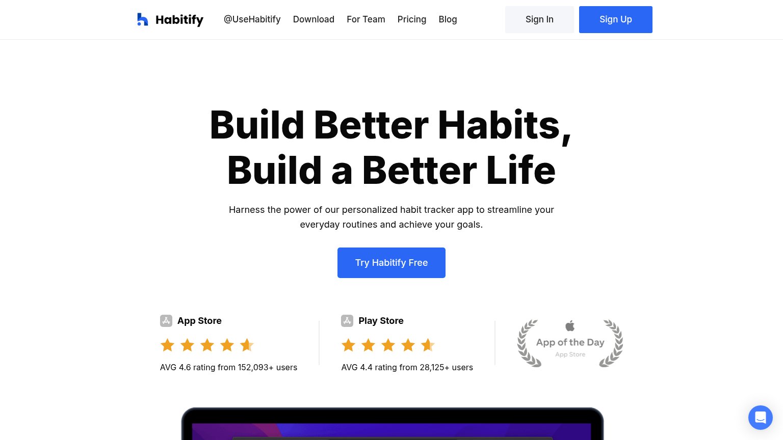
| AVG 4.6 rating from 152,093+ users (App Store) |
Information hierarchy
72FairDoes the design help or inhibit what the page is trying to say?
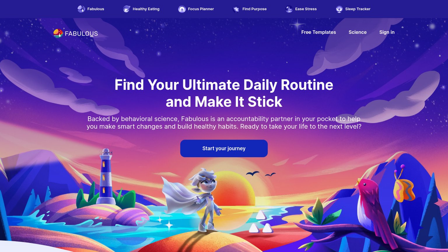 123
- Top mini-app nav strip — Six equal-weight product links above the main nav split attention before the headline is read.
- Start Fabulous's journey CTA — Dark blue button sinks into the purple twilight background; low contrast slows the one-second find.
- Secondary nav links — Free Templates, Science and Sign in sit at the same visual weight, adding three exits with no subordinate primary action beside them.
Value props
72FairTitle, subtitle, hero — do they sell the product's true value?
Fabulous’s headline
Find Your Ultimate Daily Routine and Make It Stick
Backed by behavioral science, Fabulous is an accountability partner in your pocket to help you make smart changes and build healthy habits. Ready to take your life to the next level?
Working
Could improve
CTA
76FairCopy, size, verb, cost-feel — does the primary CTA earn the click?
How Fabulous compares
Recommended rewrites
Mobile web
78FairThe phone experience as a first-class citizen.
What works
What to improve