
Your landing page’s weakest score is Mobile web.
How Habitify ranks
76Growth scoreupdated
category scores
category scoresShowHide
Mobile web
68FairThe phone experience as a first-class citizen.
 123
- App Store promo bar — Sticky blue banner under the header pushes the hero down and duplicates the store badges further below.
- Stacked store badges — Two small, standard-proportion badges split the primary action instead of one full-width tap target.
- Chat bubble — Floating chat launcher overlaps the lower-right of the viewport and adds a dead blocker with no conversion CTA.
Information hierarchy
76FairDoes the design help or inhibit what the page is trying to say?
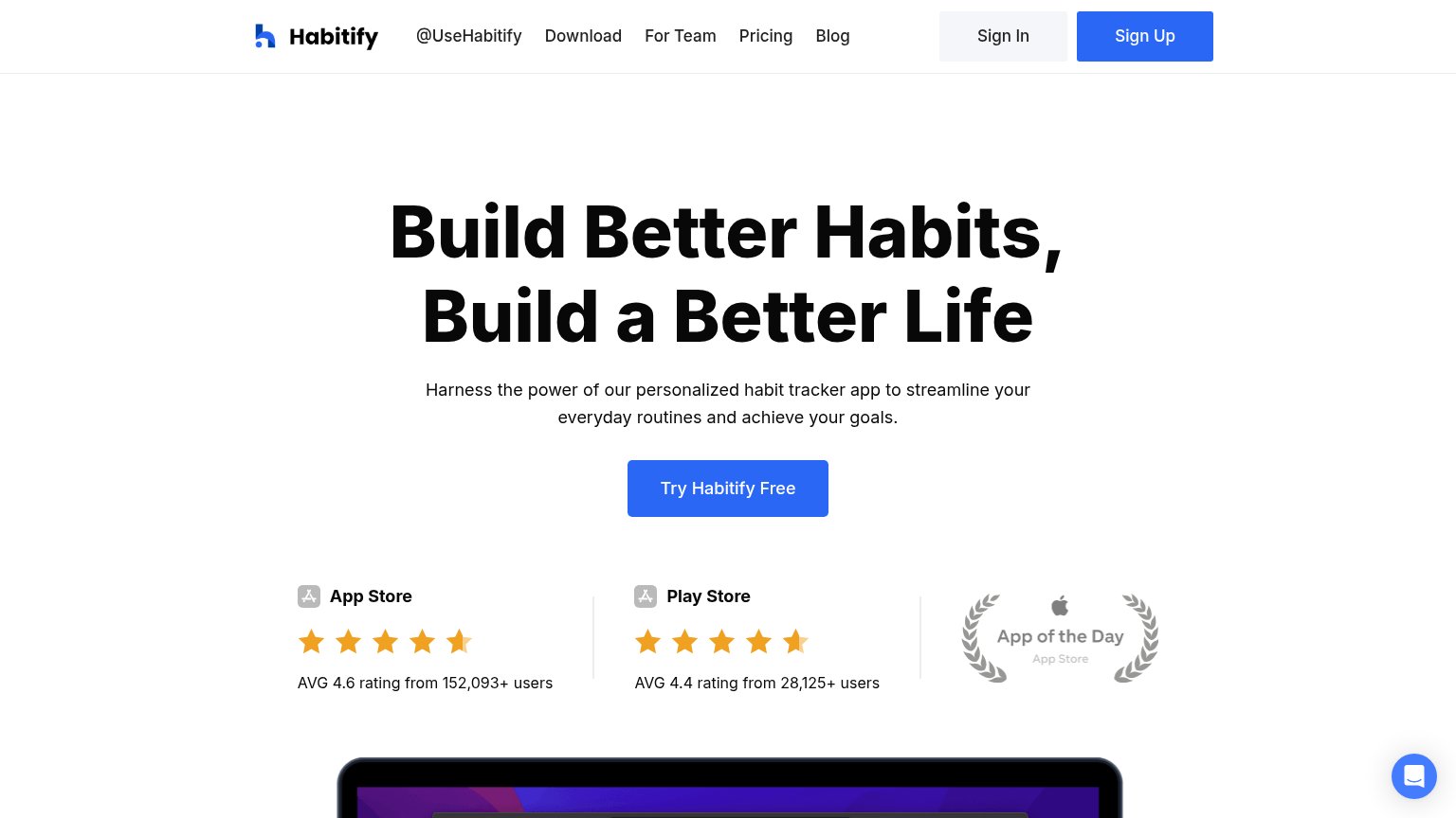 123
- Sign Up nav button — Styled identically to the hero CTA in the same blue, creating two equal-weight primary actions above the fold.
- Nav link row — Six exits (@UseHabitify, Download, For Team, Pricing, Blog, Sign In) at full weight compete with the conversion before the headline is read.
- App of the Day badge — Low-contrast gray laurel reads as faded decoration and visually unbalances the two crisp rating columns beside it.
Value props
78FairTitle, subtitle, hero — do they sell the product's true value?
Habitify’s headline
Build Better Habits, Build a Better Life
Harness the power of our personalized habit tracker app to streamline your everyday routines and achieve your goals.
Working
Could improve
Trust
78FairProof that the product is real, competent, and safe to try.
How Habitify compares
Trust read
CTA
82StrongCopy, size, verb, cost-feel — does the primary CTA earn the click?
How Habitify compares
Recommended rewrites