
Your landing page’s weakest score is Mobile web.
How Ahead ranks
Mobile web
68FairThe phone experience as a first-class citizen.
 123
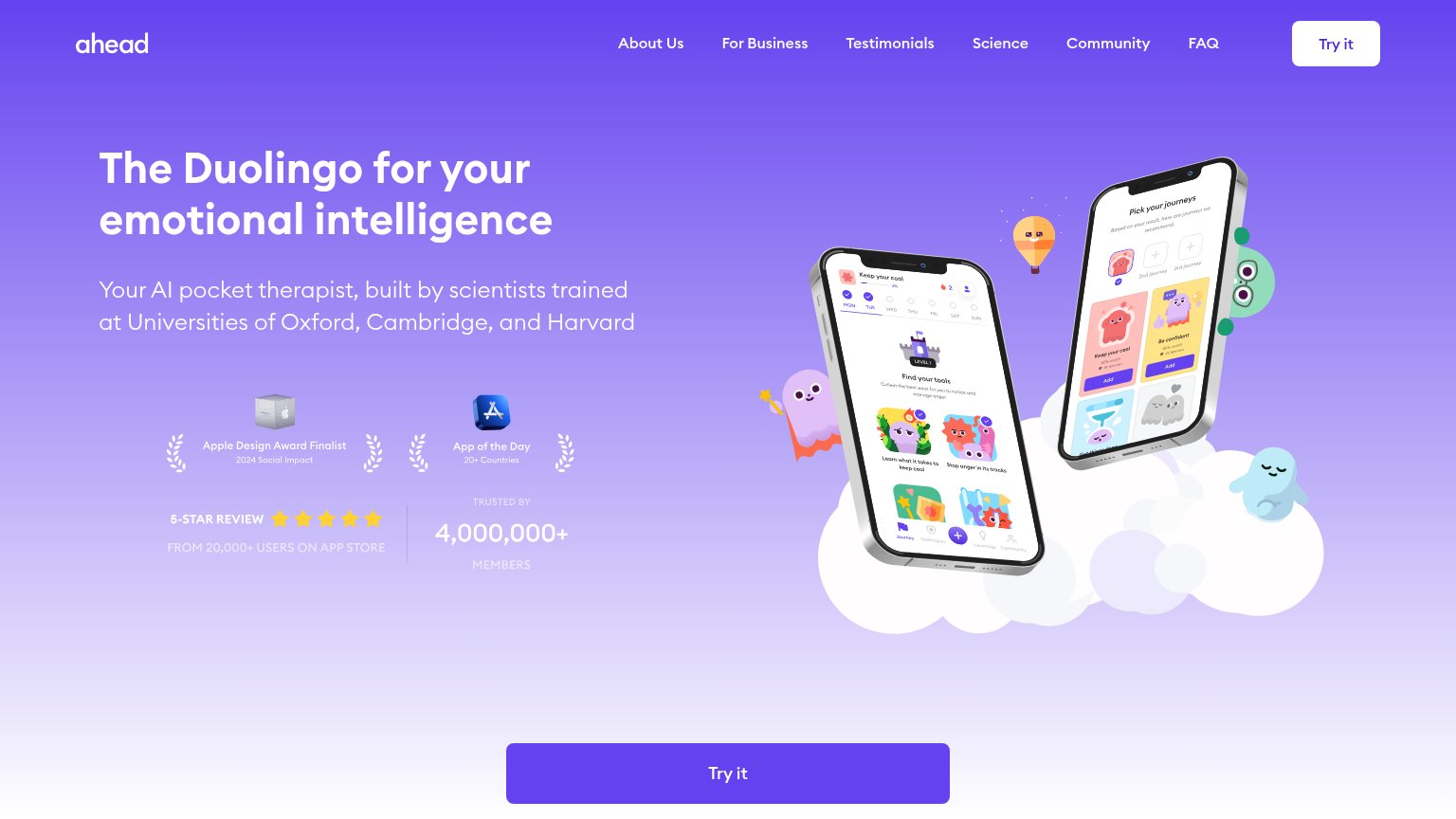
- Try it button — The primary CTA sits at the very bottom of a long first scroll, below the headline, two trust blocks, and a large phone illustration — most visitors never see it without scrolling.
- Trust badge stack — Two stacked trust rows (award badges plus ratings/members) consume roughly a third of the viewport before any product visual or CTA, pushing the action down.
- As seen in — A press-logos section header is cut off mid-fold with no logos visible, adding another message between the hero and the CTA.
CTA
74FairCopy, size, verb, cost-feel — does the primary CTA earn the click?
Problems
- 'it' is vague — no payoff named
- no headline echo
- no free/price signal visible
Information hierarchy
78FairDoes the design help or inhibit what the page is trying to say?
What works
What to improve
Value props
82StrongTitle, subtitle, hero — do they sell the product's true value?
Ahead’s headline
The Duolingo for your emotional intelligence
Your AI pocket therapist, built by scientists trained at Universities of Oxford, Cambridge, and Harvard
Working
Could improve
Trust
82StrongProof that the product is real, competent, and safe to try.
How Ahead compares
Trust read