
Your landing page’s weakest score is Mobile web.
How Habitica ranks
Mobile web
32PoorThe phone experience as a first-class citizen.
 1234
- Headline overlaps Continue — Six-line desktop-size headline collides with the Continue button and form column.
- Truncated Confirm Password — Field is too narrow for the phone, cutting the label to 'Confirm Passwo'.
- Characters cover form — Pixel-art hero art overlaps the Email and Password inputs, obscuring the signup form.
- Oversized Log In header — Un-collapsed header stacks a large centered Log In button, eating the top of the viewport.
Trust
52FairProof that the product is real, competent, and safe to try.
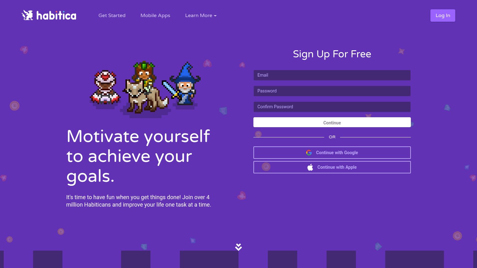
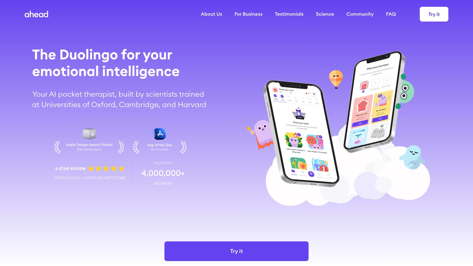
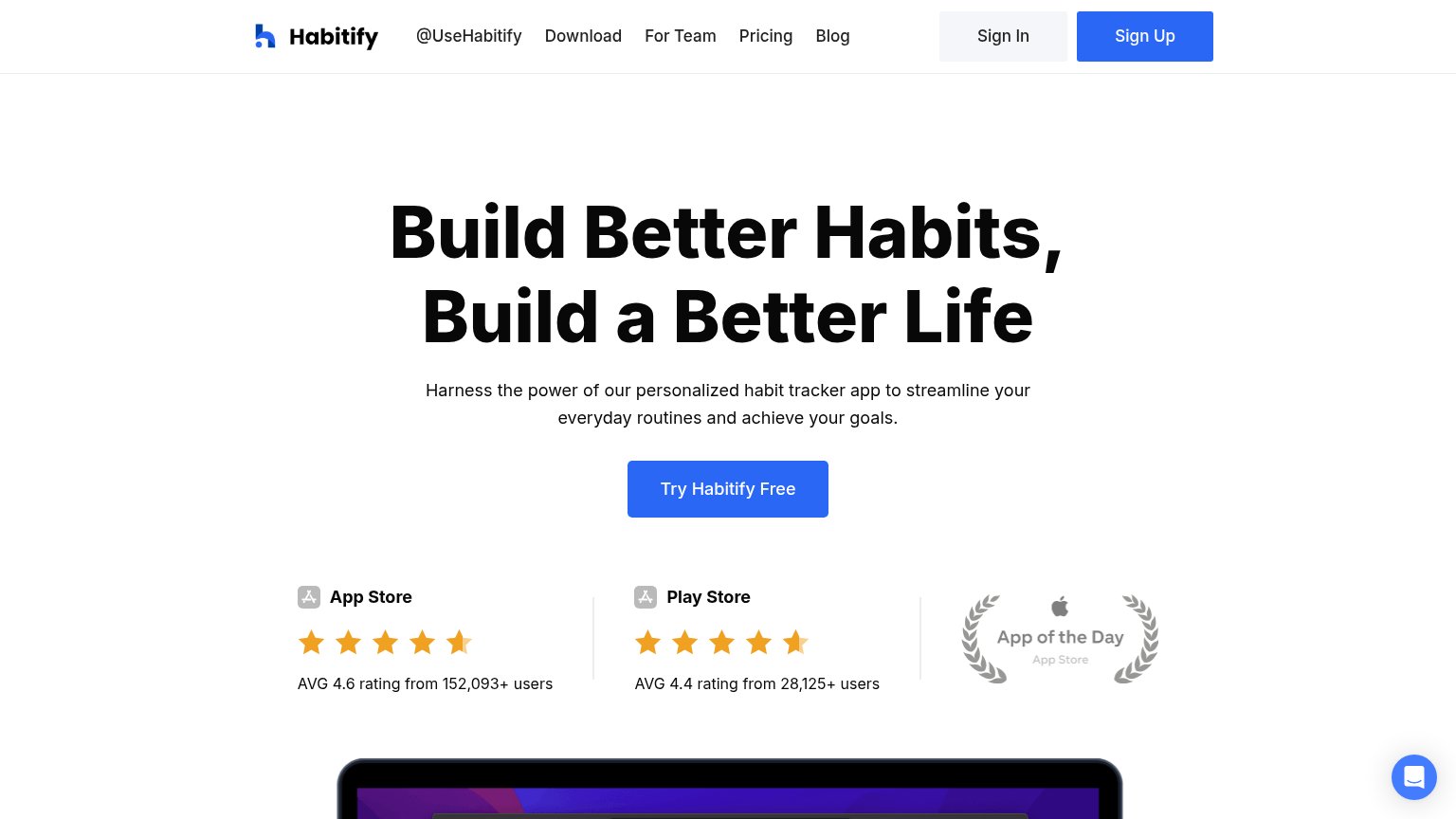
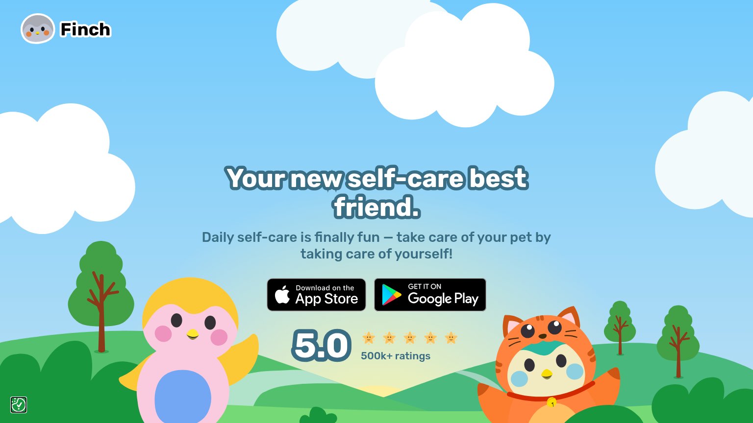
| Trust read | |
|---|---|
| Habitica | "Join over 4 million Habiticans" usage claim in the subheadline |
| No visible trust signal identified. | |
| 5.0 ★★★★★ 500k+ ratings | |
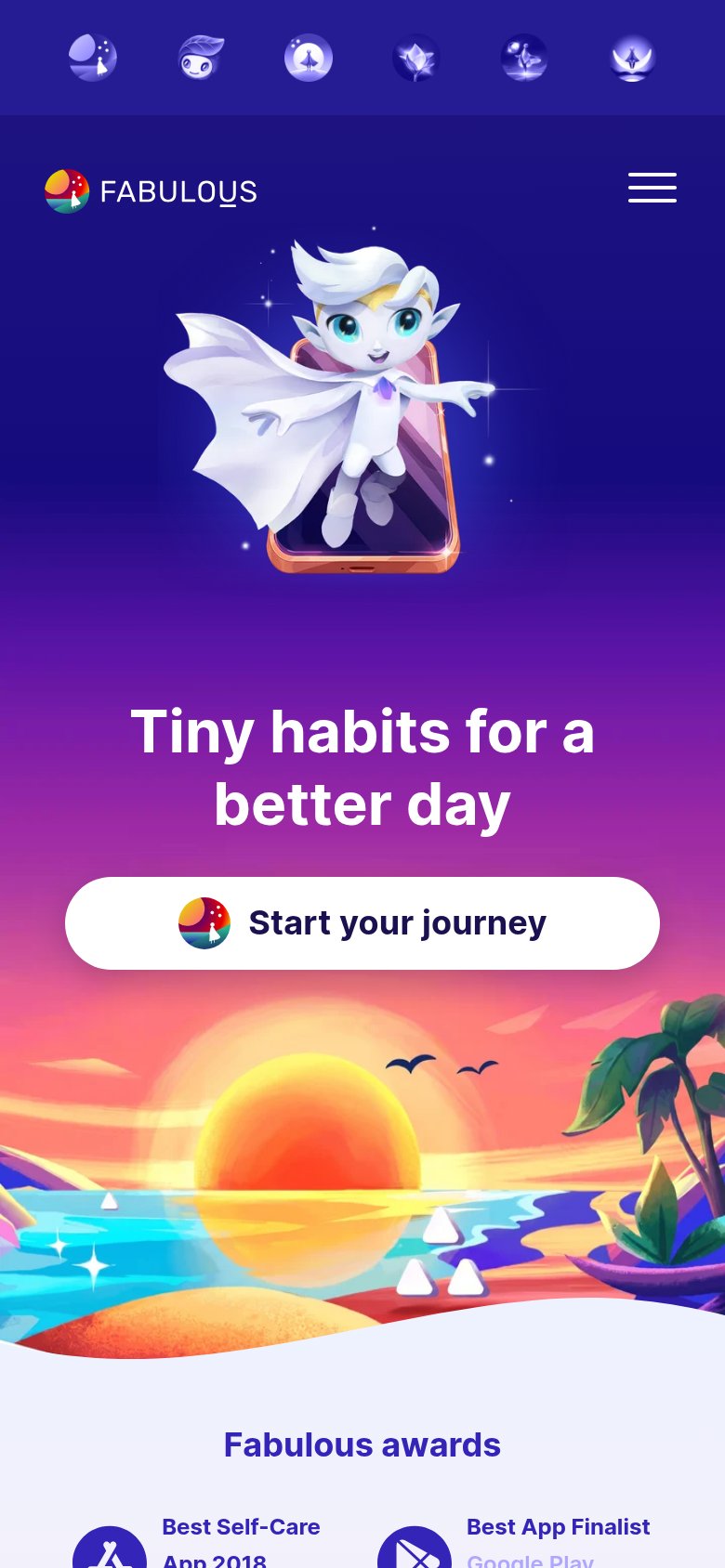
| "Fabulous awards" section citing "Best App Finalist — Google Play" (mobile capture) | |
| 5-STAR REVIEW FROM 20,000+ USERS ON APP STORE / TRUSTED BY 4,000,000+ MEMBERS badge row | |
| AVG 4.6 rating from 152,093+ users (App Store) |
CTA
62FairCopy, size, verb, cost-feel — does the primary CTA earn the click?
How Habitica compares
Recommended rewrites
Value props
62FairTitle, subtitle, hero — do they sell the product's true value?
Habitica’s headline
Motivate yourself to achieve your goals.
It's time to have fun when you get things done! Join over 4 million Habiticans and improve your life one task at a time.
Working
Could improve
Information hierarchy
72FairDoes the design help or inhibit what the page is trying to say?
What works
What to improve