
Your landing page’s weakest score is Trust.
How Tavus ranks
72Growth scoreupdated
category scores
category scoresShowHide
Trust
62FairProof that the product is real, competent, and safe to try.
| Trust read | |
|---|---|
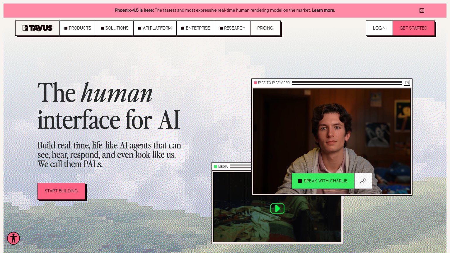
| Tavus | Interactive "SPEAK WITH CHARLIE" live face-to-face video demo |
| Embedded "// LIVE DEMO" avatar panel with a "Start Call" button | |
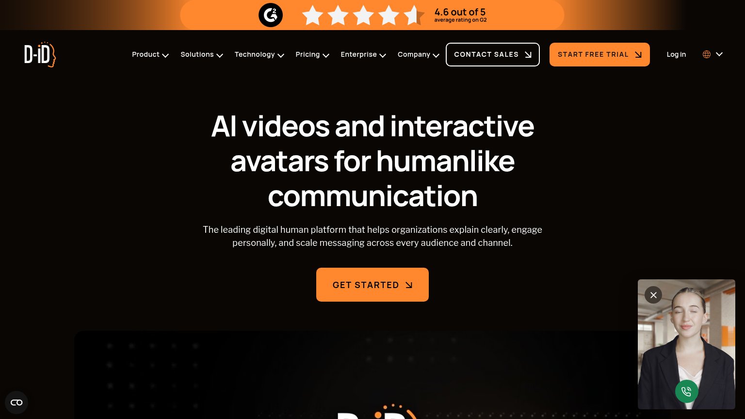
| Row of realistic AI avatar video examples beneath the hero showing generated talking-head clips | |
| "4.6 out of 5 average rating on G2" banner with star graphic at the top of the page | |
| Photorealistic digital human avatar in the hero, showing the actual product output | |
| "Trusted by over 8,000 builders" |
Information hierarchy
66FairDoes the design help or inhibit what the page is trying to say?
1234- Speak With Charlie button — Bright green competing CTA styled at equal-or-higher weight than 'Start Building', splitting the primary action.
- Announcement banner — Hot pink Phoenix-4.5 banner with 'Learn more' link outranks the hero on contrast and adds an exit at the very top.
- Overlapping media window — Second 'Media' video panel peeks out behind the face-to-face window, adding a third competing focal block above the fold.
- Get Started button — Pink header CTA duplicates the hero action, giving the fold three same-colored buttons pulling the eye in different directions.
CTA
78FairCopy, size, verb, cost-feel — does the primary CTA earn the click?
How Tavus compares
Recommended rewrites
Value props
78FairTitle, subtitle, hero — do they sell the product's true value?
Tavus’s headline
The human interface for AI
Build real-time, life-like AI agents that can see, hear, respond, and even look like us. We call them PALs.
Working
Could improve
Mobile web
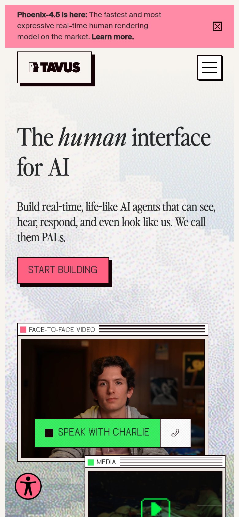
78FairThe phone experience as a first-class citizen.
What works
What to improve