
Your landing page’s weakest score is Mobile web.
How D-ID ranks
72Growth scoreupdated
category scores
category scoresShowHide
Mobile web
68FairThe phone experience as a first-class citizen.
 12
- Avatar chat overlay — Video call widget covers half the viewport width and blocks the demo video and trusted-by logos below the fold line.
- G2 rating banner — Sticky promo strip eats the top slice of the first viewport before the brand or headline appears.
Information hierarchy
72FairDoes the design help or inhibit what the page is trying to say?
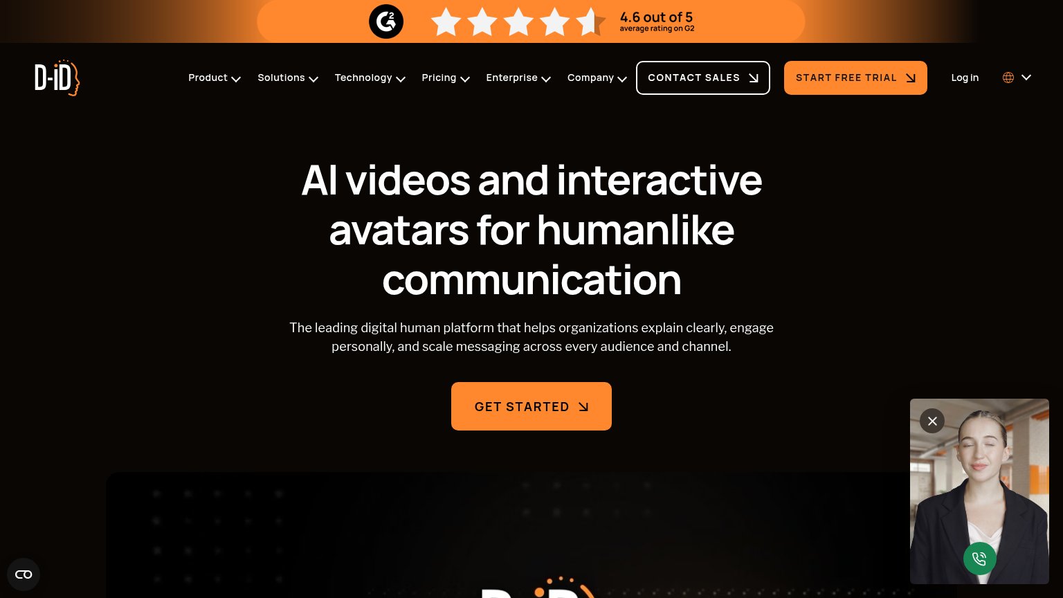 1234
- Start Free Trial button — Same orange weight as the hero's GET STARTED, splitting the primary action into two competing CTAs.
- Six-item dropdown nav — Product, Solutions, Technology, Pricing, Enterprise, Company — six equal-weight exit paths before the visitor reaches the headline.
- Live avatar widget — Floats over the fold uncollapsed and, on mobile, covers most of the product demo video beneath it.
- G2 rating banner — Full-width orange strip is the brightest element on the page, outranking the headline in the initial scan.
CTA
72FairCopy, size, verb, cost-feel — does the primary CTA earn the click?
How D-ID compares
Recommended rewrites
Value props
72FairTitle, subtitle, hero — do they sell the product's true value?
D-ID’s headline
AI videos and interactive avatars for humanlike communication
The leading digital human platform that helps organizations explain clearly, engage personally, and scale messaging across every audience and channel.
Working
Could improve
Trust
76FairProof that the product is real, competent, and safe to try.
How D-ID compares
Trust read