
Your landing page’s weakest score is Information hierarchy.
How Take Command Health ranks
- 1.
Counterforce Health82
- 2.
Claimable75
- 3.
Fight Health Insurance70
- 4.
Insurf68
- 5.
Take Command Health64
64Growth scoreupdated
category scores
category scoresShowHide
Information hierarchy
48PoorDoes the design help or inhibit what the page is trying to say?
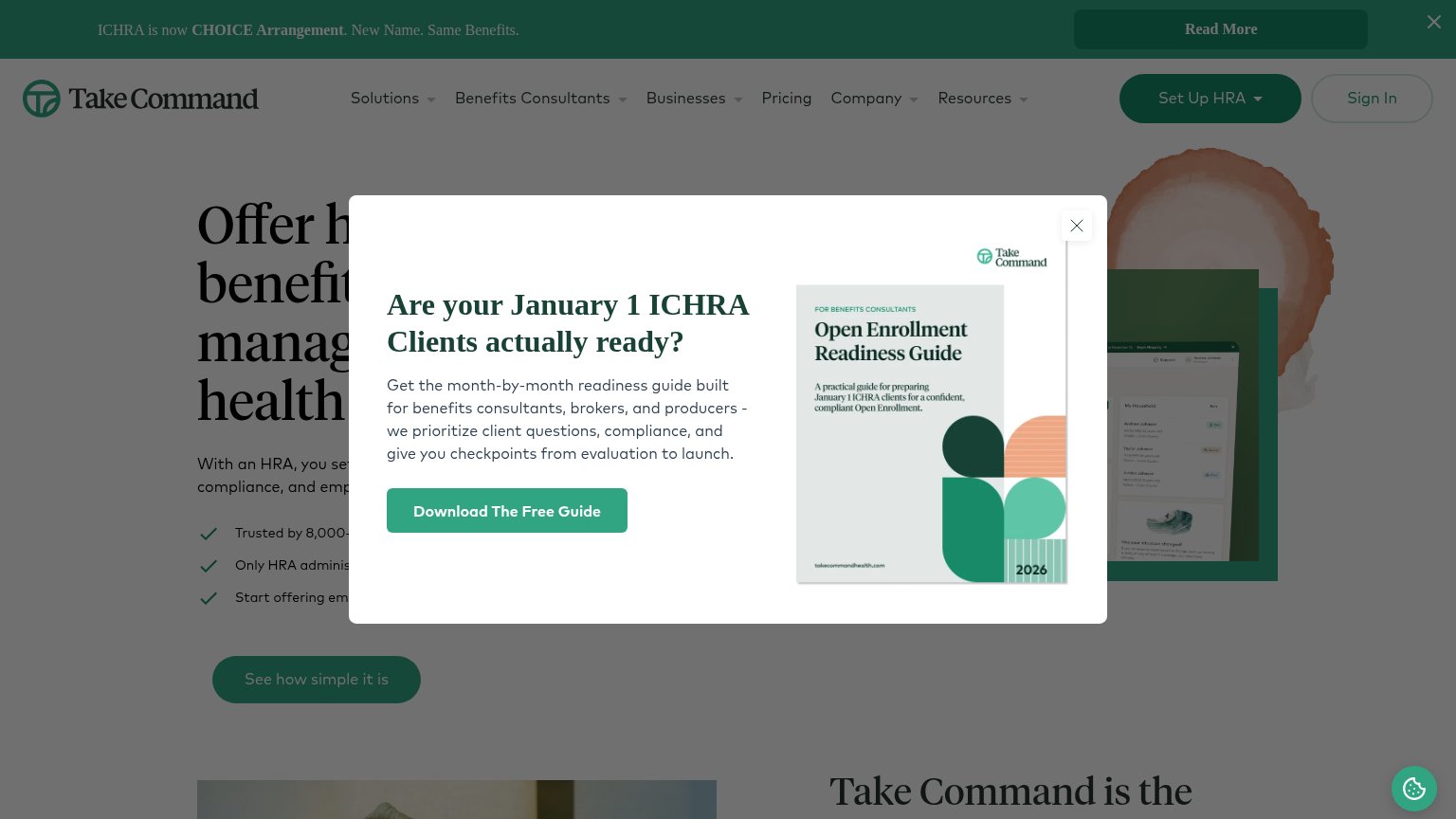 1234
- Open Enrollment popup modal — Interstitial covers the headline and value prop, hijacking the first second with a secondary lead-gen offer aimed at a niche audience.
- Announcement bar Read More — Dark banner with its own bold button sits above the nav and competes with 'Set Up HRA' for the first click.
- Six-item dropdown nav — Solutions, Benefits Consultants, Businesses, Pricing, Company, Resources plus Sign In create heavy exit density before the primary CTA.
- See how simple CTA — Styled at the same green weight as 'Set Up HRA', so the fold has two equal-weight primary actions pulling in different directions.
Trust
58FairProof that the product is real, competent, and safe to try.

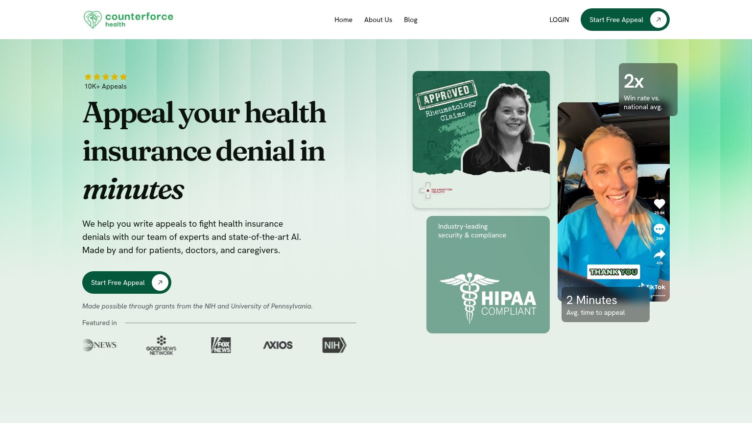

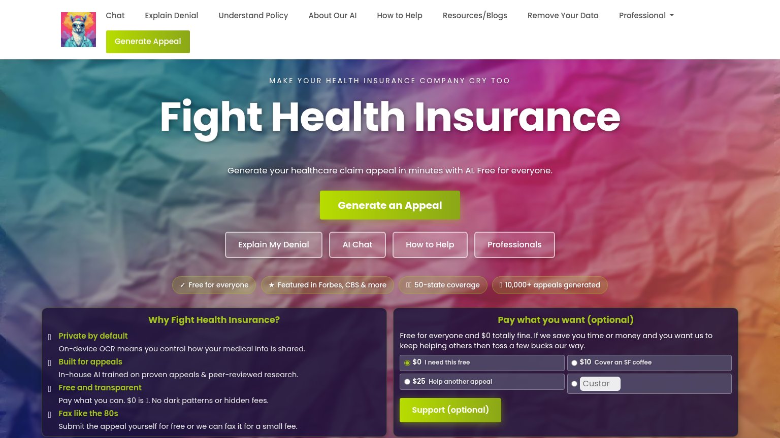
| Trust read | |
|---|---|
| Take Command Health | Real product dashboard screenshot showing balances ($1,800.00, $405.10) and household enrollment UI |
| "BACKED BY Y COMBINATOR" badge above the hero logo | |
| "Our Work and Stories Covered In:" press bar with The New York Times, Bloomberg, POLITICO, and TIME logos | |
| "10,000+ appeals generated" badge beneath the hero CTA | |
| "Made possible through grants from the NIH and University of Pennsylvania." beneath the hero CTA |
CTA
66FairCopy, size, verb, cost-feel — does the primary CTA earn the click?
How Take Command Health compares
Recommended rewrites
Value props
70FairTitle, subtitle, hero — do they sell the product's true value?
Take Command Health’s headline
The HRA platform that started it all.
You set the budget. We handle enrollment, compliance, and employee support. No one has been doing this longer, and no one does it better.
Working
Could improve
Mobile web
78FairThe phone experience as a first-class citizen.
What works
What to improve