
Your landing page’s weakest score is Information hierarchy.
How Fight Health Insurance ranks
- 1.
Counterforce Health82
- 2.
Claimable75
- 3.
Fight Health Insurance70
- 4.
Insurf68
- 5.
Take Command Health64
70Growth scoreupdated
category scores
category scoresShowHide
Information hierarchy
62FairDoes the design help or inhibit what the page is trying to say?
 1234
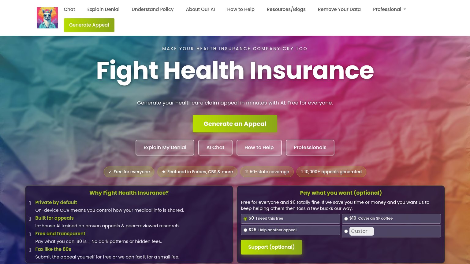
- Four secondary hero buttons — Explain My Denial, AI Chat, How to Help, and Professionals sit directly under the primary CTA at similar footprint, splitting the click.
- Nine-item nav row — Nine top links plus a Professional dropdown offer more exits than the fold has arguments, all before the hero pitch.
- Duplicate Generate Appeal button — A second green Generate Appeal in the header competes with the hero CTA and wraps awkwardly to a second nav row.
- Pay-what-Fight Health Insurance-want panel — A donation form with radio prices and a green Support button appears above the fold before the visitor has generated anything, adding a second same-weight conversion surface.
Trust
62FairProof that the product is real, competent, and safe to try.
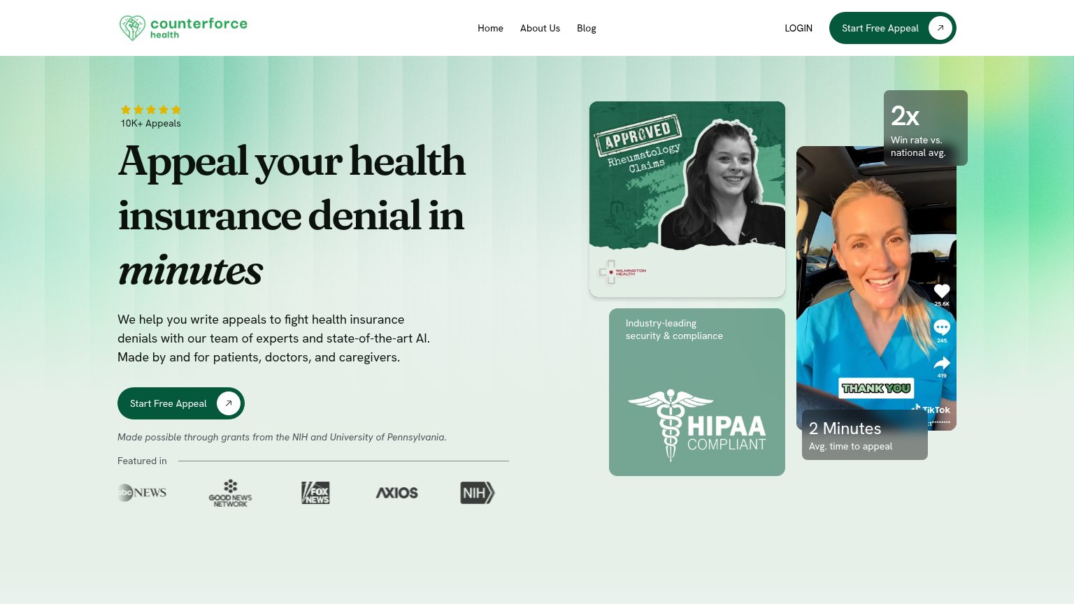
| Trust read | |
|---|---|
| Fight Health Insurance | "10,000+ appeals generated" badge beneath the hero CTA |
| "BACKED BY Y COMBINATOR" badge above the hero logo | |
| "Our Work and Stories Covered In:" press bar with The New York Times, Bloomberg, POLITICO, and TIME logos | |
| "Made possible through grants from the NIH and University of Pennsylvania." beneath the hero CTA | |
| Real product dashboard screenshot showing balances ($1,800.00, $405.10) and household enrollment UI |
Mobile web
68FairThe phone experience as a first-class citizen.
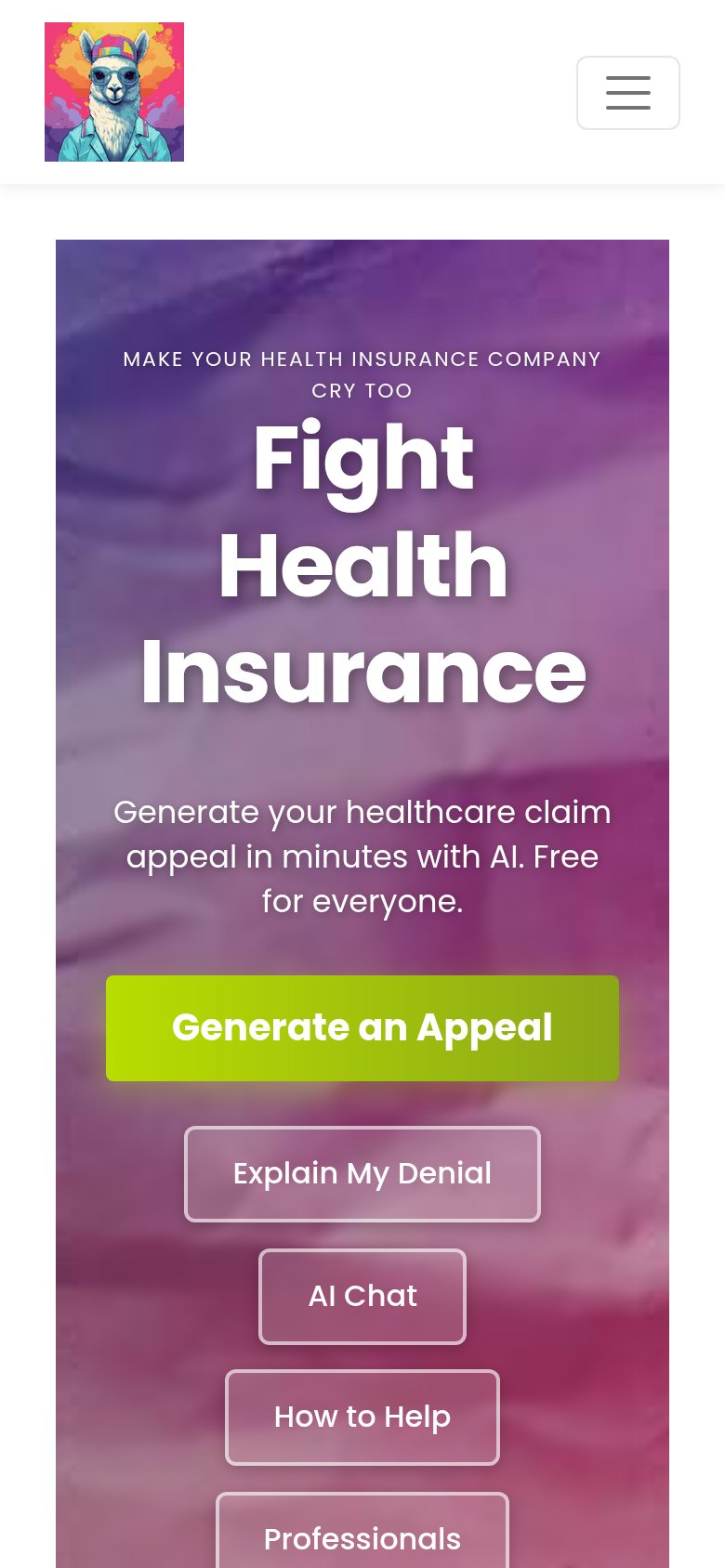
What works
What to improve
CTA
76FairCopy, size, verb, cost-feel — does the primary CTA earn the click?
How Fight Health Insurance compares
Recommended rewrites
Value props
82StrongTitle, subtitle, hero — do they sell the product's true value?
Fight Health Insurance’s headline
Fight Health Insurance
Generate your healthcare claim appeal in minutes with AI. Free for everyone.
Working
Could improve