
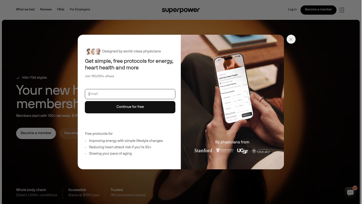
Your landing page’s weakest score is Information hierarchy.
How Superpower ranks
66Growth scoreupdated
category scores
category scoresShowHide
Information hierarchy
48PoorDoes the design help or inhibit what the page is trying to say?
 1234
- Email capture modal — Fires on first paint and occludes the headline and hero CTA before the value prop is read.
- Occluded hero headline — "Superpower's new h... membersh..." is cut off mid-word by the modal, so the core promise never lands.
- Become a member nav — Styled at equal weight to the modal's "Continue for free", splitting the visitor between two conversion paths.
- Nav link row — Four links plus Log in offer exits before the primary action is even visible.
Mobile web
55FairThe phone experience as a first-class citizen.
 123
- Obscured hero CTAs — 'Become a member' and 'See what we test' are pinned under the modal card, visible but untappable.
- Chat bubble badge — A '1' notification counter pulls attention away from the buried primary CTAs at the fold's edge.
- Detached close button — The X floats top-left, disconnected from the modal card where users expect to dismiss it.
Value props
68FairTitle, subtitle, hero — do they sell the product's true value?
Superpower’s headline
Your new health membership
Members start with 100+ lab tests. $199…
Working
Could improve
CTA
78FairCopy, size, verb, cost-feel — does the primary CTA earn the click?
How Superpower compares
Recommended rewrites
Trust
80StrongProof that the product is real, competent, and safe to try.
How Superpower compares
Trust read