
Your landing page’s weakest score is Trust.
How niahealth app ranks
64Growth scoreupdated
category scores
category scoresShowHide
Trust
38PoorProof that the product is real, competent, and safe to try.
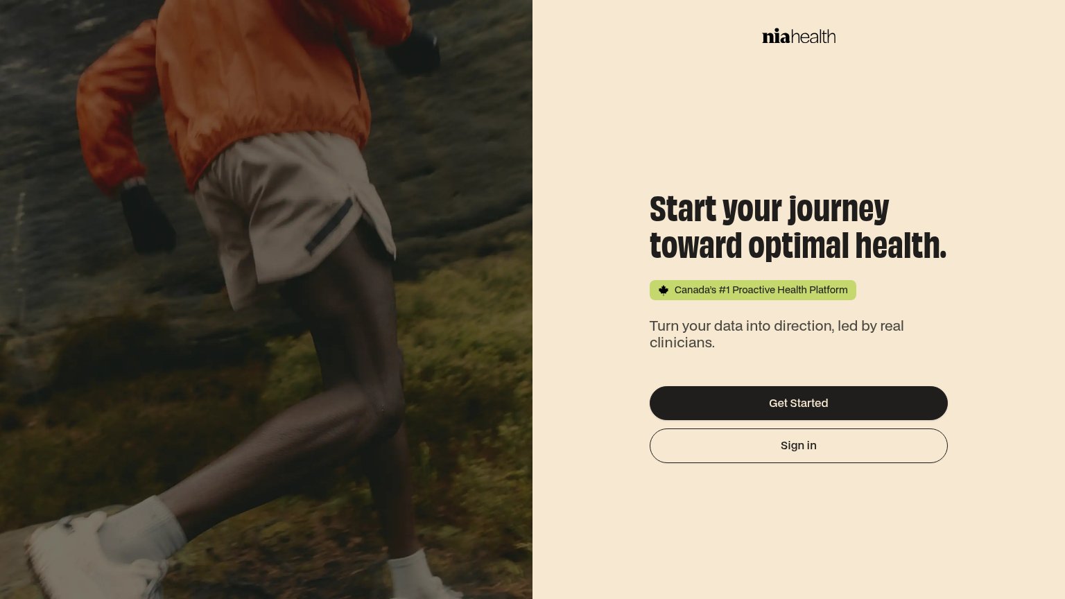
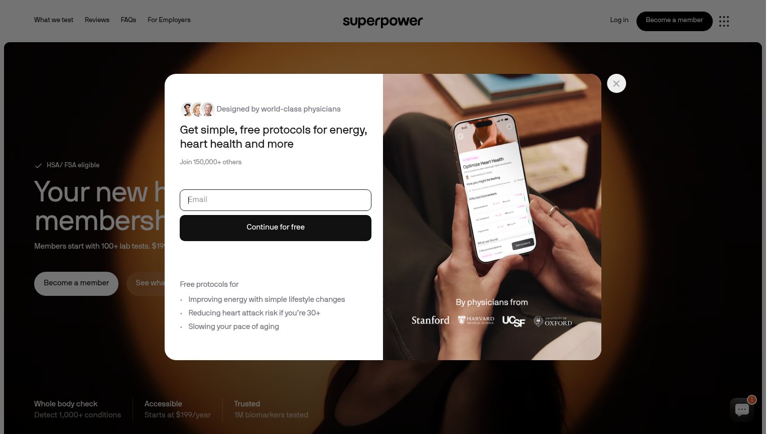
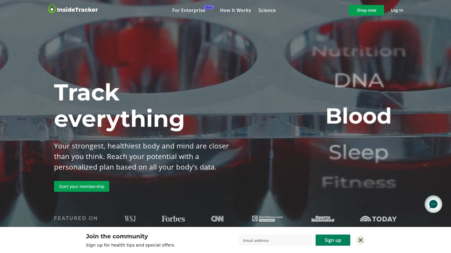
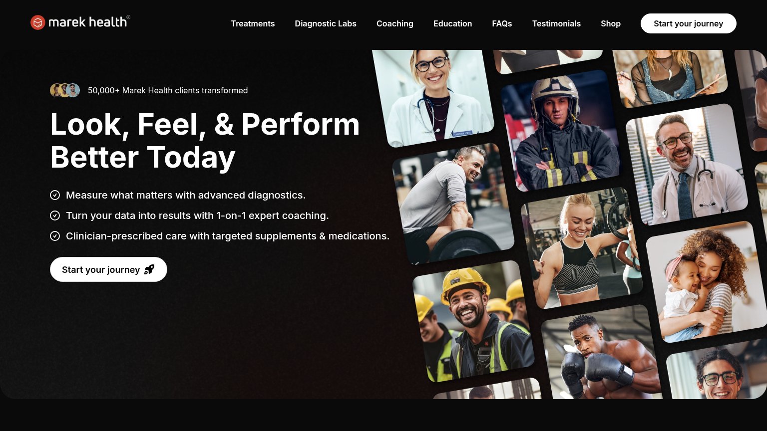
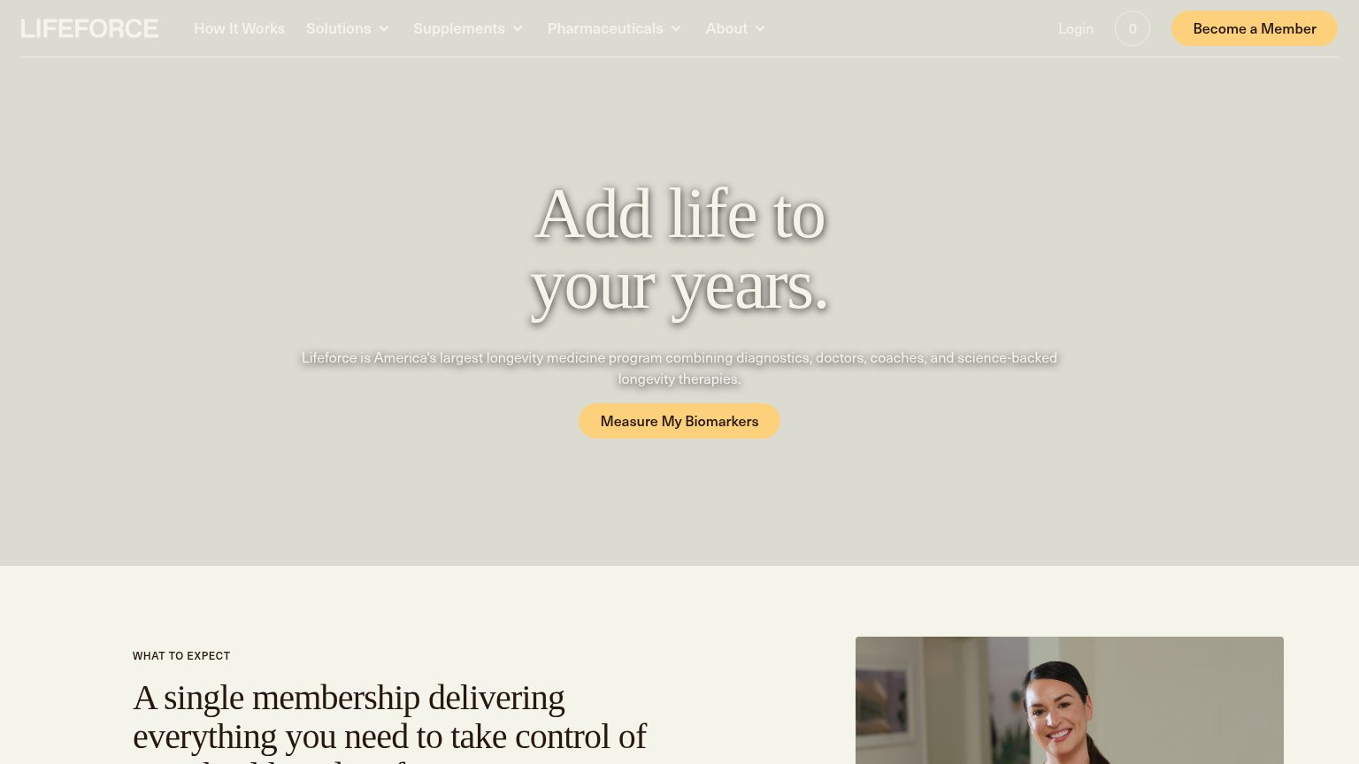
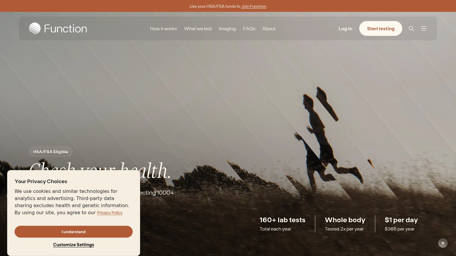
| Trust read | |
|---|---|
| niahealth app | "Canada's #1 Proactive Health Platform" badge |
| "HSA/FSA Eligible" badge above the headline | |
| "FEATURED ON" press bar with WSJ, Forbes, CNN, Sports Illustrated, and TODAY logos | |
| "By physicians from" logo strip: Stanford, Harvard Medical School, UCSF, University of Oxford | |
| "50,000+ Marek Health clients transformed" with avatar thumbnails | |
| "Lifeforce is America's largest longevity medicine program combining diagnostics, doctors, coaches, and science-backed l |
Value props
52FairTitle, subtitle, hero — do they sell the product's true value?
niahealth app’s headline vague
Start your journey toward optimal health.
Turn your data into direction, led by real clinicians.
Working
- "real clinicians" is a concrete differentiator
- Badge asserts Canada #1 category positioning
- Subhead gestures at data-to-action value
Could improve
- Headline is a generic wellness platitude
- No numbers, tests, or biomarkers named
- Mobile fold hides all value prop copy
Mobile web
72FairThe phone experience as a first-class citizen.
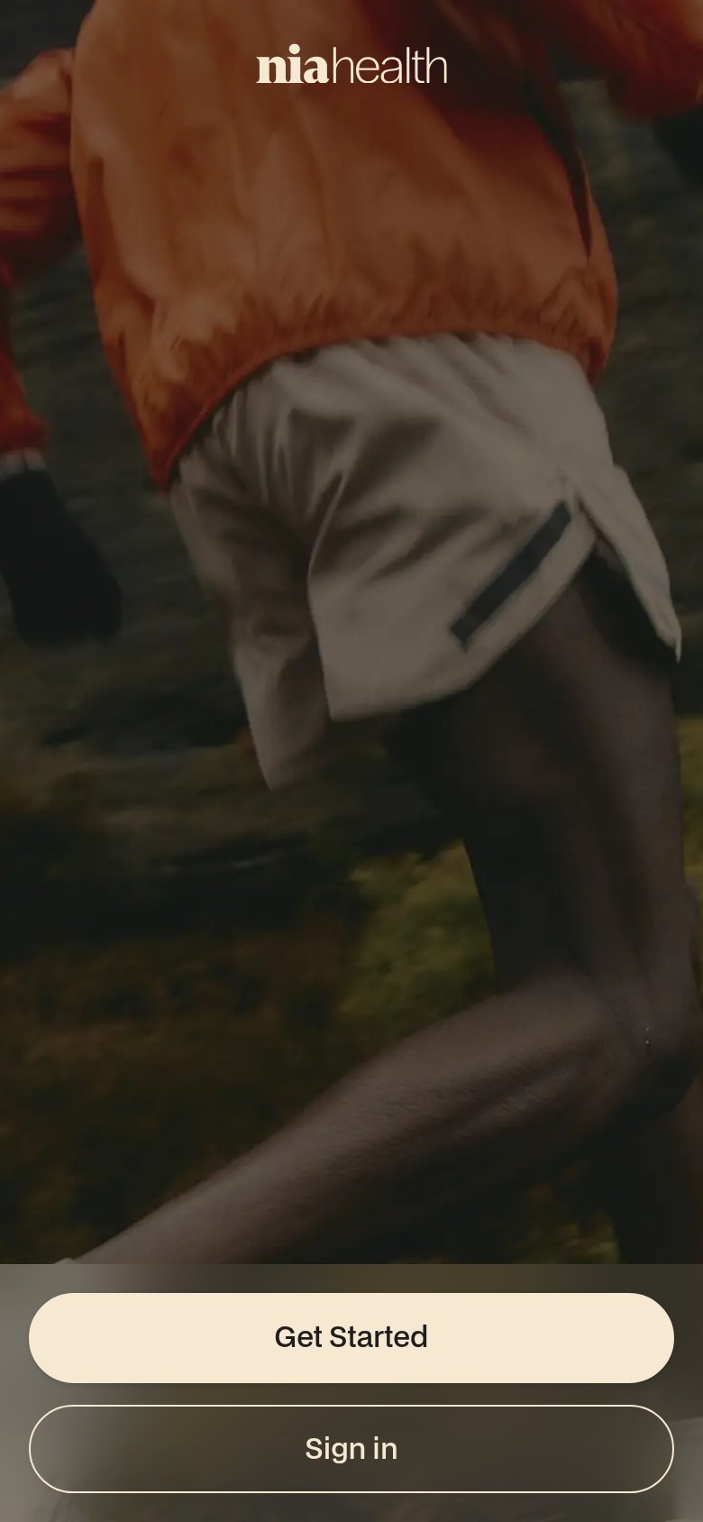
What works
What to improve
CTA
76FairCopy, size, verb, cost-feel — does the primary CTA earn the click?
How niahealth app compares
Recommended rewrites
Information hierarchy
82StrongDoes the design help or inhibit what the page is trying to say?
What works
What to improve